What Can You Learn from Scammy-looking Clickbank Sales Pages?
Why you hate them, and why you can't stop reading them
13 do's and don'ts
Scam. Trick. Swindle. Hustle. Flimflam.
You know the type.
The hard-selling, hyped-up, over-the-top, badly designed, super long sales pages for get rich quick schemes, programs to give you a 6 pack in 5 minutes, or much less respectable ends.
What about them? Well, here's a question.
We KNOW the products sold on those pages are huge scams.
So what is this force that keeps us reading? And why does it still work?
I paid a visit to the gutters of the internet to see if there was anything worth salvaging for higher purposes.
What do you think?
Can you get some of the benefits of hype without the icky, scammy stuff?
Here's what I found.
1. DO try The dreaded autoplay video
How's that for a start, eh?
The overwhelming majority of scammy info product sales pages these days use some form of autoplaying video sales letters.
Open the page, and the video starts blaring.
Yes, videos are cool and all, but surely I'm not suggesting you do the same thing for your products?
Well...
No. But.
What is it that works about autoplaying videos?
Instant attention.
Now, everybody knows grabbing the attention of your prospect is important. After all, it's the first step of the time-tested AIDA formula.
But does the end always justify the means? No. That stuff will instantly kill your credibility in the long term.
So what's to save there? Some experts have weighed in on the subject and they offer interesting options and ideas for tests:
- You can test an autoplaying video on a small part of your traffic to avoid annoying everyone. If the gains you notice are considerable, maybe it's worth trying.
- If your traffic is in a demographic that is used to the practice, for example if they're regular users of Facebook or Twitter and they've experienced autoplaying videos, it may be okay for them.
- You can try a milder option, most notably autoplay without sound. After all, it's mostly the moving images that grab our attention, and they may be enough to wake up your visitors.
- Always leave the controls clearly visible so people can pause, change the volume and see how long the video is.
- Make sure you have a big and easily visible play button.
- Pick a good hero shot that will intrigue the viewer and make them want to see more.
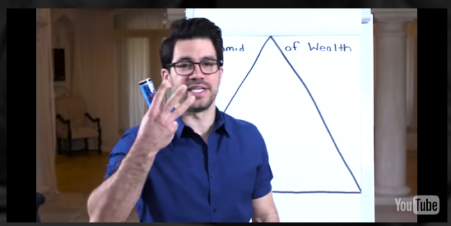
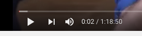
- Keep it short. The worst thing about the scammy videos is that THEY'RE INCREDIBLY LONG. Ain't nobody got time for that. Here's Tai "Lamborghini" Lopez at the start of one of his videos where he says he's about to give us "3 tips"... which should take about 1 hour and 18 minutes. Nope.
- What these videos do well is that they grab you right from the beginning. Know something else that can do that? A good headline! Much simpler to produce, and much less abrasive.
Verdict: the autoplaying video works, but it's probably too aggressive an option for most products and businesses.
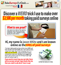
2. DON'T use this One weird trick I'd rather never see again
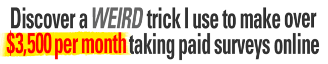
Oh, God.
This is the quintessential example of what I mentioned above: it sounds scammy as hell, and yet you can't stop reading "WTF? $3,500 taking SURVEYS? HOW?"
The "One weird trick" headline has been used a bazillion times.
It's so commonplace it even has its own page on Wikipedia!
I think it's fair to say that this "trick" is overused.
The principle on which it's based, though, is sound. There's 2 things headlines of this kind do to your brain:
- "Weird" makes you think there's a secret at work. There's something odd, curious, interesting, that most people don't know about. It makes you crave that missing information and promises you're going to discover it soon. In other words, it creates curiosity.
- The "trick" itself plays on a different appeal: the idea that not only is the solution secret and cool, but also that it's easy. It's just a trick you can learn and boom! You'll make money just like the creator of the product.
So, can you use similar "curiosity gap" headlines without sounding scammy, or sounding like a cheap Upworthy article headline?
Well, if you’re selling something that’s so good it doesn’t seem realistic, there has to be something weird, surprising, or spectacular to explain it. Something that people have never seen before and that differentiates you from others.
And you don't need to call it a "weird trick"!
Overusing "curiosity gap" headlines will also kill your credibility. So here's what you should do:
- Keep a swipe file of the good headlines you see when you browse the web. Copywriters don't reinvent the wheel every time they get to work. They repurpose headlines that have been proven winners. Just make sure they haven't become complete clichés like the "weird trick" headline.
- There's a fine line between hype and a good promise. Try to make your headline almost unbelievable, but don't bullshit your reader. Don't insult their intelligence.
- Use differentiation instead of curiosity, or create curiosity through differentiation to justify it instead of just tricking (hehe) the reader into reading. ("Discover how this patented manufacturing process will increase your yields by up to 28%"). Specificity over hype.
3. DO Adapt your message to your audience
As I was browsing one of those Clickbank landing pages, I found one that did something interesting.
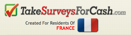
It immediately picked up on the fact that I was connecting from a computer located in France, and showed me a page with copy tailored to my location.
In the last few years, that kind of personalization has been pretty trendy as far as marketing technology goes. The more targeted the message, the more likely it is to convince, or so the theory goes.
If you’re offering a product to an audience that is well identified, whether by geography, occupation, age, or any other criterion, it may be a good idea to show them that you know who they are. Why?
That kind of identification plays on the Cialdini “Liking” principle, according to which people prefer buying from people they like, and people who are like them.
The tactic is actually quite a bit older than the theory: if you've ever gotten any direct mail campaign in your mailbox, you probably saw it at work when you opened the letter and read "Dear Mrs Whatever-your-name-is."
The goal is always to create more rapport and sound more personable by disclosing the fact that you know and understand your customer well.
Now, it's hard to get to that level of personalisation online (although it's by no means impossible). But you can address your reader as part of a given group they identify with: avid travelers, accountants, fashion-forward women, BMW owners, who knows.
That point is by no means restricted to copy, and also applies to visuals, which you can adapt to the audience just as well.
If you're going to personalize your copy, though, personalize on relevant variables. Does it really matter if I'm connecting from France or some other country here? Meh. Not really.
But it does give some specificity to the offer: I'm going to get rich by answer french surveys! Well, supposedly.
4. DO Think hard about differentiation
How many info products do you think there are for a category like weight loss? How many fitness programs?
Bazillions. (Or more precisely, 332 products on Clickbank).
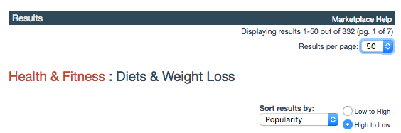
And how many different ways do you think there are to lose weight?
Roughly, two: eat less garbage, and exercise.
(Plus some minor variations)
So how do you square that circle? How can there be 332 different products chasing the same clients, and offering the same advice?
Differentiation.
People selling info products that virtually all contain the same advice need to work harder to differentiate themselves, and if you look at a sample of the product names, you can see that easily:
- "Fat Diminisher" : this is the most matter of fact approach. It does what it says on the tin. No special effects.
 "The Venus Factor": this one targets women first, a differentiation based on gender.
 "Old School New Body": differentiation based on age.
 "Xtreme Fat Loss Diet": differentiation based on the quickness of the effects. Note that to differentiate yourself from others, you don't need to do something they don't . You only need to say something they don't say they do. I'm sure most weight loss program offer similar results, but not all of them insist on the time it will take to get there.
 "My Bikini Body": differentiation based on the goal. Other similar ones would be "Flat Abs Fast"
 "Eat Stop Eat": differentiation based on the method, process, system, etc. In the case of weight loss here, you could include variations based on different types of diets, like paleo.
 "Weight Destroyer (in French)": differentiation based on geography. There are similar programs in Spanish, German, etc.
 "The Achievable Body": differentiation based on the effort required, the ease of use, etc.
If you're also selling a product in a competitive niche — and even if you aren't, competitors may be coming! — you can take a page from this book and think about how you can get an edge on your competitors, even if your products are similar.
There's nothing particularly "scammy" here for once, and one could go as far as saying it testifies to the creativity of some of the marketers who sell these products.
5. DO Make them pay attention to what you're saying
As we've seen with headlines, many scammy pages go over the top, but often, the principles are sound.
It's the same with visuals.
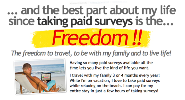
Take a look at this baby:
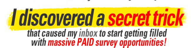
Ewww, right?
Sure. "Overblown" would be quite an understatement. But remember what we said about that "weird trick" headline: it's all about attention.
And there are few things that are as efficient as bright yellow highlighting and red text.
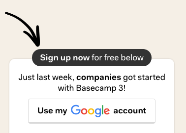
But you could use the same technique in a more subtle way! Take a look at this example taken from an older version of Basecamp's landing page:
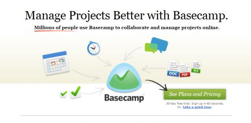
Notice how your eyes are naturally attracted towards the "millions of people" who use the product?
They didn't need yellow highlighting.
As you can see, it's a matter of execution and design taste.
Compare and contrast again. Here's how you grab attention on a scammy landing page, with bright red text, circle and arrows:
And here's how you attract attention to your call to action button in a more subdued fashion:
What's the lesson here? Don't always let the reader dictate the conversation.
If there's something they need to pay attention to, make it visually obvious.
And no, that doesn't mean you have to strong-arm them into looking at your stuff.
6. DON'T Use stock photos & other ugly visuals
The hallmark of scammy landing pages is terrible visuals.
There's nothing here to learn from, except if you want a masterclass in bad taste.
In way, it could signal that some people actually will buy stuff regardless of how crappy the design can be. But there's a caveat here.
The times, they are a-changin'.
Here's how this Fast Company article puts it:
"For Millennials, design is not a differentiator—it’s a cost of entry."
That's why this is now impossible:

I'm not sure what the model was screaming into the megaphone, but it was probably some insults aimed at the designer who picked that picture.
There's no way this crap is going to fly with a young, Apple-design-educated audience.
So don't use corny stock photos.
It's as simple as that.
There's nothing that screams "crappy, unprofessional website" as much as a bad stock photo. And the worst part is people pay for some of those!
Why would you do that when there's ample choice for you to pick from?
Don't use ugly special effects from the 80s. No drop shadow, no golden or silvery text, no halos, no nothing.
If you're not a designer and you find the above nicely designed, get a designer. If you can't afford one and you don't have an eye for design, go with a successful template.
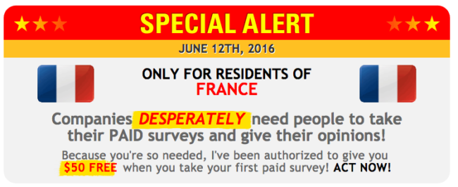
7. DON'T make bullshit offers
Special offers. Who could resist them, right? See, they even say it themselves:
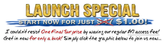
What's wrong with that?
Aside from the fact that no business in their right mind would sell a $47 product at $1 and that it destroys your credibility right away? Not much.
When there's a special offer, there must be a valuable reason to make that offer, and that offer itself must be reasonable.
Now, there IS a reason given here: it's a special offer for the launch of the product. Of course, that product's been on sale for about as long as it's existed, so the offer is bullshit.
Don't do the "crossed price" thing if you give no reason for it.
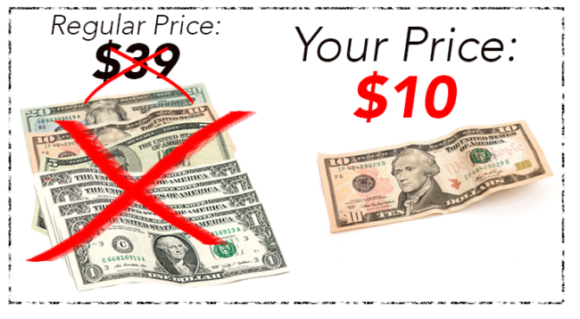
If you never sell at the "regular price", you're just bullshitting people. And they know it.
But the ridiculous part is the pricing. While discounts up to 30% for a launch offer would seem acceptable, a 98% discount sounds a bit fishy, doesn't it?
Of course, it doesn't mean people won't gladly accept your offer out of sense that they're benefiting from such a great offer at the expense of the seller.
8. DO make a huge CTA button
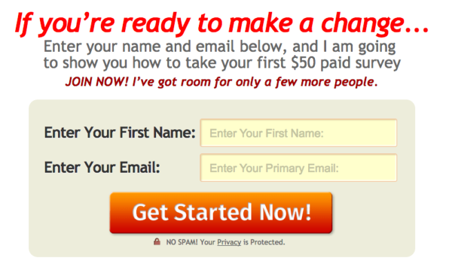
You can certainly chastise scammy landing pages for trying to appeal to the lowest common denominator, but in some cases it seems justified.
When it comes to the UX of landing pages, one rule dominates: don't make me think.
Look at the call to action above:
- Instructions at the top, telling people to enter their name and email. Seems too obvious for you? You can't be too obvious.
- Restate the benefit they're getting, in this case, you're supposedly getting information about how to take a paid survey.
- Obvious labels, made redundant by the placeholder text in the field that repeats the label. There's no way people are going to get it wrong.
- Obvious button. Make it biiiig. Almost ridiculously big. It must be impossible to miss it.
9. DON'T use fake testimonials
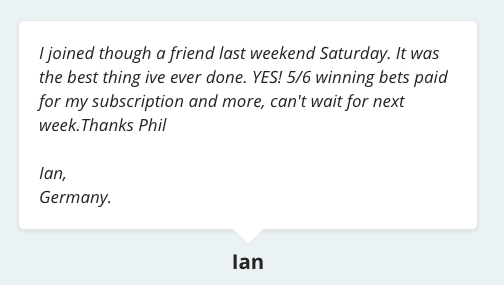
I'm sure it's hard to find someone who's willing to give their name, not to mention their picture, for it to be displayed on some scammy website.
But frankly, anonymous testimonials like the one above may just as well be fake ones.
While I wouldn't trust the person who created the product to talk about it in an objective way, I wouldn't trust some random person who probably doesn't exist either.
Testimonials work when they look genuine. Which means you need the full name, and a picture of the person.
Even better if you can say where they work, where they live, or whichever other relevant information about them, like how long they've been a client, or what gains they've gotten from the product.
But just a first name won't cut it.
10. DON'T create fake urgency
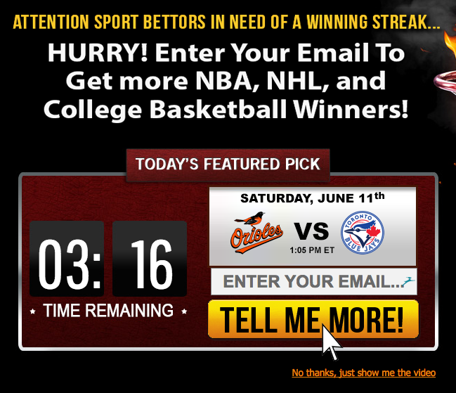
When you create a sales page, your goal is to close the sale now.
And you must give people reasons they should buy now rather than think about it and maybe come back later.
One (lame) way to do that is to add a count down: you've only got minutes to act!!
Problem? They're fake. You could wait for the count down to go down to zero and it wouldn't matter in the least. The page would still act the same way.
And people aren't stupid. They see through that shit immediately, and that can mean lost business for you.
11. DO anticipate big objections
When you work in a field that has a bad reputation, people will always have this nagging suspicion that you're trying to slip one past them.
And that suspicion must be crushed immediately.
Suppose you were selling some sports betting system for example.
The betting and gambling industry isn't exactly a paragon of morality. Even people who gamble feel guilty about it. So what would you do?
Something like this:
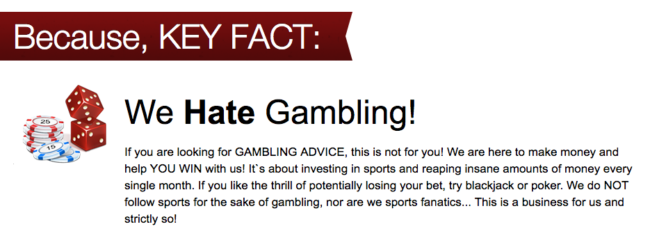
Boom. They're selling a gambling system but they hate gambling. Say what?
You see, it's not a gambling system. It's an investment system! Much more respectable.
That kind of reframing from the badly connoted terms is very common when selling in such markets.
Here's another, again from the page about paid surveys:
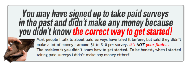
See, it's not that it doesn't work and it's a huge scam. You just didn't do it the right way. Very important here: saying it's not your fault. You justify their past failure to do something by putting the blame on other solutions they used to differentiate yours.
Another classic:
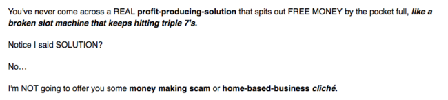
Best way to make sure people don't think you're a get rich quick scheme? Just say it. It's not a scheme, it's a solution.
Interestingly, it's the opposite approach to the previous example that works here: you need to blame the reader for even thinking you could be a get rich quick scheme. "A GET RICH QUICK SCHEME? US? Take that back immediately."
Careful, though.
Anticipating objections is a double-edged sword. What if the reader had never thought about that objection before you raised it?
That's probably going to create more doubt and confusion than anything.
That's why you need to only anticipate big, well-known objections to your product. You should probably address the question of safety when you're selling anything health related. Same with security if you're selling enterprise software. Each industry raises concerns that are specific to it, so be mindful of that.
There are always many more, smaller objections. You can address those in an FAQ. But don't bring them up if they're unlikely to kill a sale right away.
12. DO prove your claims beyond reasonable doubt
I'm sure you know about the usual elements of proof you can find on most landing pages: testimonials, client logos, Amazon ratings, social proof numbers (number of clients, number of Likes on Facebook, etc.).
That's all well and good but it's nothing extraordinary.
Unfortunately for our budding scammy marketers, when you're making extraordinary claims, you do need extraordinary evidence.
And if there's one thing scammy landing pages do well and have in common with "good" infomercials, it's that they care a lot about proof.
More precisely, they care a lot about demonstrating the product.
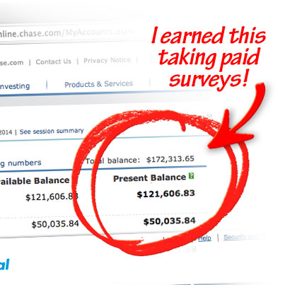
Don't get me wrong, a lot of the "evidence" on those pages could be a complete fabrication for all I know. But the effect is undeniable:
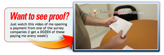
This guy promises you'll make money taking surveys. And he shows how he receives checks for taking surveys, in a video.
As I said, the checks could be phony. But that's not the point.
The psychological effect of seeing the results of the product with your own eyes is what makes it work.
Same reason infomercials sell OxiClean and Ginsu knives by the boatload (as well as other... things).
If the benefits of your product are easy to demonstrate, and especially if they're visually impressive, you'd be stupid not to at least try to go the "Billy Mays" way.
Make a video that shows your product at work and that proves conclusively that it will bring the benefits you claim.
No other kind of proof is remotely as effective.
13. DO understand what makes people tick
Something many (most?) landing pages get wrong is the way they talk about benefits.
That topic is probably one of the most covered by all marketing and copywriting blogs, and that's because it's really important. Realllly important.
You're probably familiar with the difference between features (objective characteristics of the product) and benefits (what people get from using that product), and have heard that you're supposed to "sell the sizzle, not the steak" or that people "don't buy a quarter inch drill, they buy a quarter inch hole."
That's true. And it seems obvious in retrospect.
Problem is: most people don't really know how to apply that, and they end up with fake benefits. So what are real benefits?
Things like that:
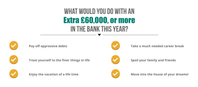
Or that:
They want to be free from debt and from work. They want to enjoy luxuries. They want to take a vacation. To spoil their friends.
Benefits must coincide with deep human desires and motivations.
That's why the "quarter inch hole" quote can be somewhat misleading, because no one really wants a "quarter inch hole."
People want to impress their wife by looking like they know what they're doing with power tools. They want to keep up with the Joneses by setting up a new swing for their kids in their garden. They want to save money by not using crappy drill bits.
Who knows why they bought that drill?
I'm pretty sure the reason is not "to make quarter inch holes."
So what does that mean for you? It means you need to take your product and ask yourself: why would people want it?
And the good news is that people mostly want the same things. Of course, not everyone's the same, but there are desires that are almost universal.
Psychologist Steven Reiss came up with a list of 16 basic desires:
Acceptance, the need to be appreciated
Curiosity, the need to gain knowledge
Eating, the need for food
Family, the need to take care of one’s offspring
Honor, the need to be faithful to the customary values of an individual’s ethnic group, family or clan
Idealism, the need for social justice
Independence, the need to be distinct and self-reliant
Order, the need for prepared, established, and conventional environments
Physical activity, the need for work out of the body
Power, the need for control of will
Romance, the need for mating or sex
Saving, the need to accumulate something
Social contact, the need for relationship with others
Social status, the need for social significance
Tranquility, the need to be secure and protected
Vengeance, the need to strike back against another person
See how your product relates to those desires, and with a bit of refining you'll be on your way to finding the real benefits of your product.
Your product may tap into many of those, depending on what feature you're looking at: a sports car could fulfil desires for romance, social status, or independence. The job then is to rank those desires: which ones are the most intense? Which ones are the most common?
You may think that these are individual desires that don't apply for professional services and other B2B products. You'd be wrong.
They apply similarly, if you think about them in context: take acceptance for instance. It's not just about being appreciated. It could be about being appreciated by your boss. Or your employees. Or your coworkers.
So, you see? Scammy Clickbank pages aren't so bad after all, are they? What do you think about the tactics they use?
