Teardown: How BeachBody Sells Fitness Programs
For this teardown I looked at a product in one of the most competitive areas you can find for info products sold online: fitness programs.
The fact it's a competitive market is interesting for a few reasons:
- It means they have to hire the best marketers to sell their stuff
- It means they test their landing pages
- It means they must be masters at differentiation
I spoke about the last point in another article, but it's nice to visit it again here with an in-depth example. Beachbody alone sells 56 fitness programs, so I chose to look at the newest one called "22-minute Hard Corps" and I think it delivers a real masterclass in differentiating a product in a competitive space.
Let's dive in.
Leverage your brand
Over the years, Beachbody has become a popular name. They've flooded people with their infomercials, and they enjoy decent brand recognition.
That means they can start off with an advantage compared to other products. People don't think "Oh, yet another fitness program." They think "Oh, it's the new Beachbody fitness program!"
Beachbody has followed a pretty clear product line extension strategy, gradually covering newer niches and sub-segments of the market (men, women, bodybuilders, short workouts, long workouts, etc.) to expand its reach.
That brand recognition alone guarantees they will get more attention from people once they reach the page. It's an unfair advantage, but they'd be stupid not to use it.
Create trust by giving your phone number
Any serious business must have a phone number, right?
While the evidence that supports the case for increased conversions is not exactly convincing, it doesn't hurt to try it if you do have a phone number. If you can't be bothered to answer the phone, it may not be worth it for you.
Social (media) proof: don't overdo it

Social proof using social media numbers has become kind of a reflex for many marketers, often to the point of never being questioned.
At what point should you show your social media stats? In Beachbody's case, the numbers do seem impressive, but are they? It's hard to tell.
Some people have millions of Youtube followers. Same on Facebook.
The risk here is two-fold:
- Your numbers are not good enough to impress people. Worse, they could be bad and have a negative impact (people think your brand sucks because no one follows you on Facebook).
- You add more and more links that lead your visitor out of the landing page. The main goal of the landing page surely isn't social media shares (that can be implemented post-conversion), so having those links there is questionable.
Throw in the fact that many of those shares could have been bought, and that creates a type of proof that is light at best.
Give your company a face

Tony Horton is one of Beachbody's star trainer, and also the face of the company.
Ever since he launched P90X, one of his flagship products, he's been the face of the company.
Any company that deals with people on a personal level like in personal training must have a human face, not a cold, corporate identity.
The ultimate stage of that principle is that the face of the company becomes a celebrity spokesperson that conveys authority, and thus persuades people more easily.
Give your product a twist to differentiate yourself
As I said, the thing that Beachbody does best on this page is differentiation.
How would you go about creating a new fitness program?
There's many ways to go:
- Segment your audience by level: advanced vs. beginners
- Segment by their goal: gain muscle, or lose weight
- Segment by the commitment they can make: short workouts vs. longer workouts
- Segment by the results they're targetting: better abs, better cardio
And then you can imagine all sorts of combinations to create new products that target very precise needs (quick workouts to get abs for people who never work out, etc.).
But is that enough? At some point, all workout programs are kind of the same. People in a gym doing push ups.
So you need more. You need at twist.
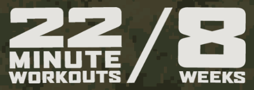
That's what Beachbody did with the "Hard Corps" army-themed program.
In a sea of products that is saturated with fitness programs that all look the same, even that seemingly superficial change is enough to make them stand out easily.
The army themed echoes everywhere in the design. It also appeals to people who like rigor, discipline, clear processes and guidance from authority.

It might seem stupid to think about such gratuitous types of differentiation when you could just make your product "better", but it's often what wins the war, because it's more likely to capture attention.
However, it can only work if it's executed well. It's not just about Tony Horton screaming at people.
Consider some of the elements that reinforce that differentiation:
- The name of the product: 22-minute Hard Corps
- The images used in the background (battleship, humvees, bootcamp)
- The camouflage textures used for the background
- The iconography that mimicks the design of medals
- The clothes worn by participants
- The bold typography
The easiest way to go if you want to give your product a precise feel like that is to create a mood board where you collect lots of images that relate to the theme you've picked. That will help you give a consistent look to your landing page and create the atmosphere you want to place your reader in.
Use word pictures for more vivid headlines
A tendency one could have when creating landing pages is to see them as a kind of mathematical proof. You go from step A to step B to step C... and boom, you close the sale.
In fact, when people read landing pages, they tend not to be quite as disciplined.
They skip steps, and they don't care about logic all that much.
However, most people are impressed by visually compelling ideas and phrases, in other words, word pictures.
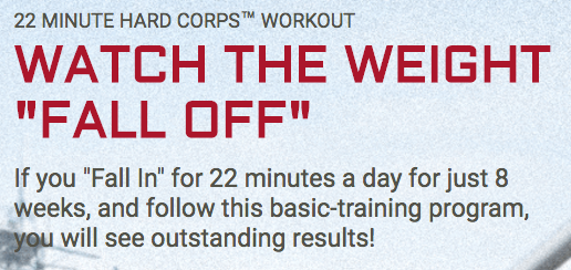
The headline here uses a word picture. It doesn't talk about losing weight, which would be a matter-of-fact but boring way of expressing the benefit, but about watching the weight fall off.
This appeal to our visual sense (the verb watch and the expression fall off) creates a movie in our head of someone literally shedding their excess fat down on the ground.
Compare that to "lose weight" which is abstract and doesn't really convey any precise image.
So, how do you do that?
Tap into the senses of the reader: what do they want see? what do they want to hear, what do they want to feel? If you want them to feel a certain way, you must compose an image out of these feelings and feed it back to them.
Reinforce their commitment with the call to action

Marketers over at Marketing Experiments have this framework according to which your goal on a landing page is to create a series of micro-yeses, that is, micro-agreements and commitments with your reader, that build to a big YES! (a sale, a sign-up, etc.).
I've already talked several times about commitment as a persuasion trick, and it's the same here. That tactic may have become a little too prevalent, and have gone a little too far.
The call to action used here is meant to reinforce the commitment people have made to finally start working out. The hidden subtext (that is made explicit in confirmshaming) is that if you don't click "YES!" it means you're not ready to workout. But people have decided they are, so they must click yes to stay true to their commitment.
There is something I'm not crazy about here, which is the first CTA position on the page. See for yourself, here's the hero section of the page.
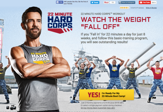
Is anyone really going to say they're ready for their bootcamp after seeing a headline and a subhead? Meh.
The CTA also introduces price before they've had any time to build up the value. Even though the price is probably not much of a deterrent here, it brings up friction in the mind of the reader that may be easier to overcome after a longer presentation.
If you make a video, make it obvious
A mistake I often see on non-professional landing pages is a lack of an obvious CTA for the video, when there is one.
It's especially important when you're paying (a lot of) money to get a nice video made that you don't hide it behind an almost invisible play button.
Beachbody invests a lot of money in creating high production value videos, and they want to showcase those videos so that people get a better idea of what they can expect.
In this case, the video is not just a demonstration of the product like in many landing pages, but it's also a free sample of the quality the buyer can expect.
Condense your Value proposition
Many businesses and startups have a hard time to explain what they do in a 5 minute pitch. And they're often asked to do it in a couple sentences.
Worse, they're told that they need to boil it down to a headline so they can transmit their value proposition faster.
And it seems impossible.
And it is impossible... if you try to say everything you say in your five minute pitch in one sentence.
So you need to boil it down to the essentials. Keep the most striking characteristics of the product. A bit like this:
Does that say everything about that workout program? Of course not. But it creates a simple, condensed description that gives the essentials.
The main claim characteristic of the program here is that the workouts are short. The word minute is used 30 times on the landing page.
Try to see if you can condense the description of your product the same way, with just a couple of memorable numbers, in telegraphic style.
Demonstrate the results of your product

Proving your claims is one of the pillars of building a good landing page.
It doesn't matter if you make incredibly attractive promises if you're unable to back them up.
Fitness program aren't exactly very innovative in that department.
Care to guess what kind of proof they use?
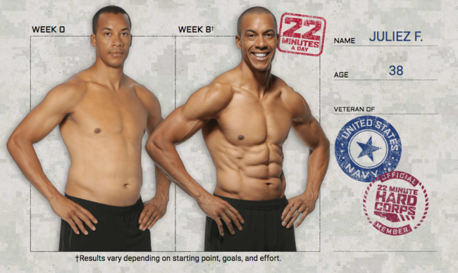
Before-and-after pictures, of course!
Now, there's something to be said about "tried and true" in marketing.
No matter how many literally scammy before and after pictures people have seen, their power is as strong as ever.
I wouldn't put it past any fitness company to doctor those images, and the techniques are well known, but they have an answer to it: it's not magical. See what it says there at the bottom? "Depends on starting point, goals and effort."
It's not just a disclaimer, it's also a persuasive trick, like many we've seen before: by telling people they won't get results without effort, they disclose a "flaw" in their product, which makes them sound more honest.
And like the CTA, it reinforces the buyer's commitment: people tell themselves "I'm not one of those idiots falling for magic weight loss program, it's going to take work to get there!"
Anticipate objections head-on
No matter how persuasive before-and-after pictures may be, people will still be somewhat skeptical.
People tend to be lazy, and finding excuses not to work out isn't a very hard task.
That's why Beachbody can't just rest on their laurels: they need to actively convince the reader that this program is right for you by tackling the latent objections they may have.
They do it in a particularly blunt fashion:
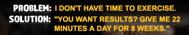

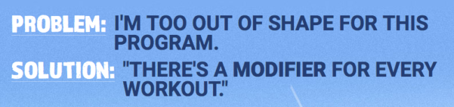
PROBLEM. SOLUTION.
I really like what they're doing here. The language is important: the simple fact of saying it's a solution makes the reader feel "Phew, so there's a solution to my problem."
And like that, the objection is crushed.
The offer: details, details, details
People want to know what they're getting when they buy something.
Duh? Yes, I know. But then why do I see so many sales pages where what I'm getting is so vague?
Beachbody doesn't fall for that, and they give a thorough breakdown of the contents of the product:
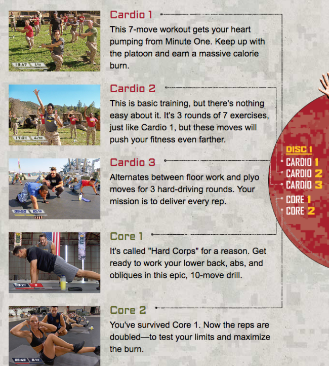
It's not rocket science here.
Just one paragraph per element of the offer (each video here).
I'm not crazy about the names of the workouts, which are kind of lazy, although they may correspond to the kind of classification the army uses for... stuff (a bit like a "college" themed product would use 101, 102, 201, etc.).
Categorize the content
Another way to make it seem like your customer is getting a better bang for their buck is to categorise the contents of your offer.
Instead of having ONE big list of stuff, you create two, or three lists.
Here, Beachbody separates the fitness program videos from the accompanying material they call fitness tools:
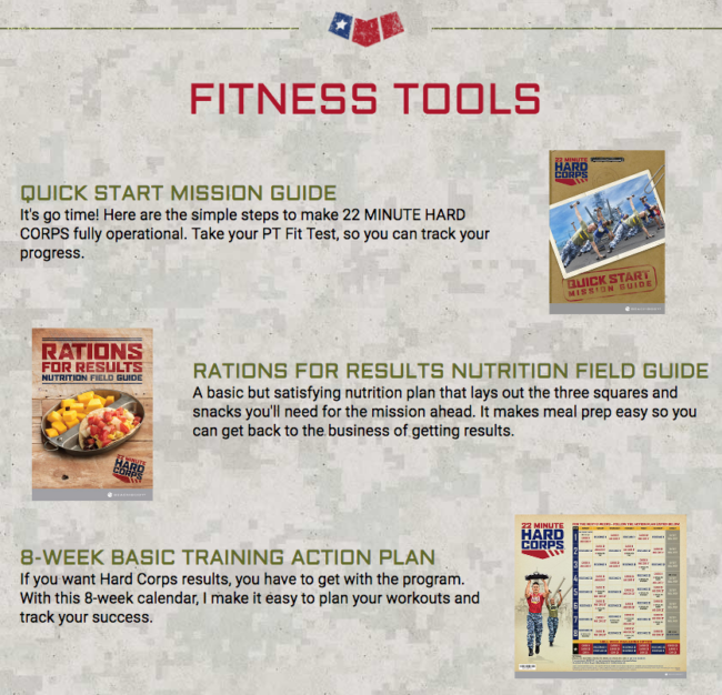
Notice how the first thing in that category is a "Quick Start Mission Guide." That's basically the (smartly renamed) instructions manual. But it's there!
Can't repeat enough that you need to be thorough when you describe the product.
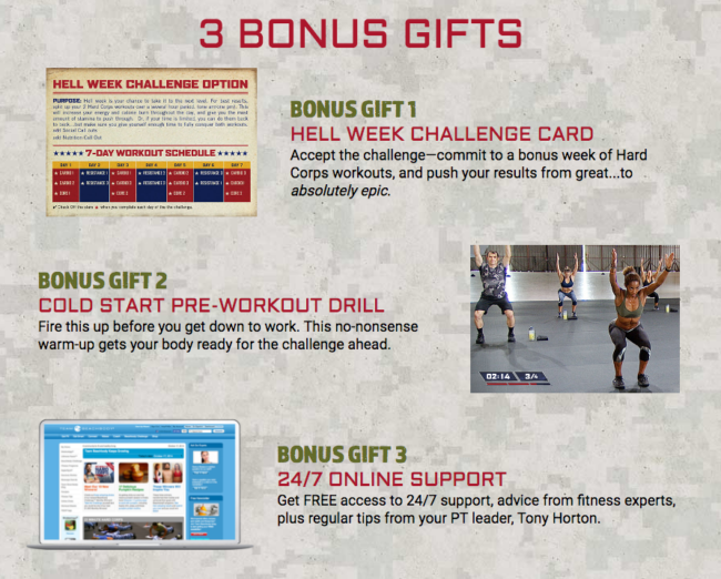
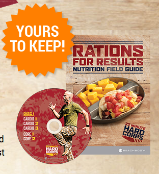
Give bonuses
In keeping with what we just said, bonuses are just one more category of stuff in the product.
The division between all of these categories is pretty superficial, which means what matters most here is the word BONUS itself and what it conveys: you're getting free stuff!!
Summarize the Offer visually
It's nice to give the contents of your offer in a list, but as we've seen with the before-and-after pictures, images are often more powerful than words.
So if you can give your reader a visual overview of allll they're getting, you want to do that:
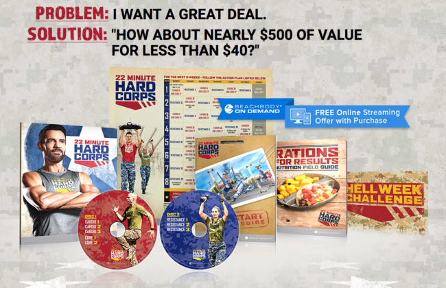
Notice the PROBLEM/SOLUTION tactic makes another appearance here.
Trivialize Price
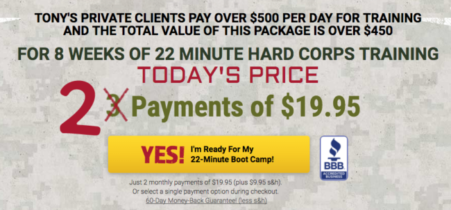
It's time to talk about money.
If you look at the previous section, you'll see that they talked about "Nearly $500 of value for less than $40."
It's always a good idea to insist on the value people are getting instead on the price they're paying. As long as they're getting more value, it should be a good deal, right?
The trouble comes in the way you justify that value. Who's to say how much what you're offering is worth?
Here, Beachbody has a golden opportunity to leverage their star trainer's reputation and market value: his clients pay him over $500 per day!
So surely if you get him for 8 weeks every day, that must be worth a lot of money.
The argument makes sense, but I'm not sure why they shift gears and start talking about $450. Where does that figure come from?
Offer an unbeatable guarantee
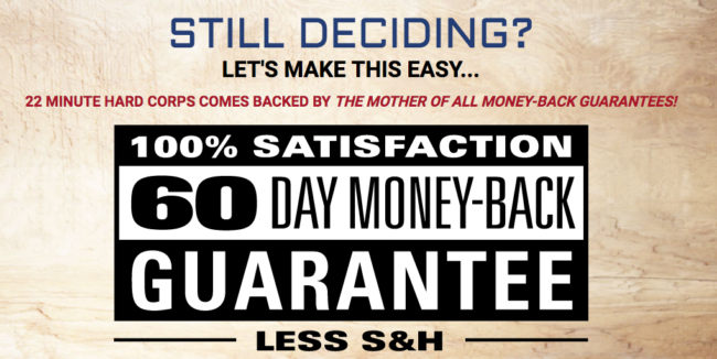
After making their offer, Beachbody strategically introduces their guarantee to remove the risk for the buyer. This is textbook sales practice, nothing particular to see here, except that 60 day money-back is a pretty lenient guarantee.
They do however sweeten the pot a little, with this:
You can even keep some of the stuff even if you send the product back! Crazy.
No hidden costs
Hidden costs tend to piss people off.
They're about to buy your product, they start the check out process and boom: $15 shipping and handling. WHAT? No thank you.
If you look at the fine print under the call to action and under the guarantee, you will see that Beachbody chooses to disclose the shipping and handling costs quite clearly.

It's better to be upfront about the real price people are about to pay than to surprise them with additional fees.
But we're not done with that yet...
Challenge the reader
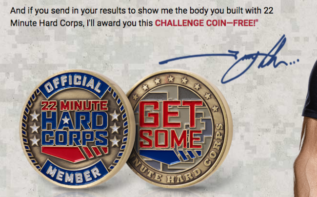
I found this idea really cool. If you complete the program, you can get a challenge coin from Beachbody.
It's common in sales letter to issue challenges to the reader to motivate them by playing on their competitive muscle, but here they do it in a particularly smart way: not only does it motivate the reader to achieve something, it gives them proof that they've achieved something so they can feel like they're part of a club, it's a nice collectible item for people who like trinkets, and it's something they can use to show off.
And many people like to do all of the above.
Give one time-sensitive incentive
Remember those hidden shipping and handling costs Beachbody chose to disclose?
They're not just being nice.
They're priming the reader. They're saying: remember that you will have to pay 10 bucks more to actually get this.
What's the point? Here's the point:

When people have accepted the idea that they must pay for shipping... they magically lift those fees! Boom. Another bonus!
Ask for the sale one last time
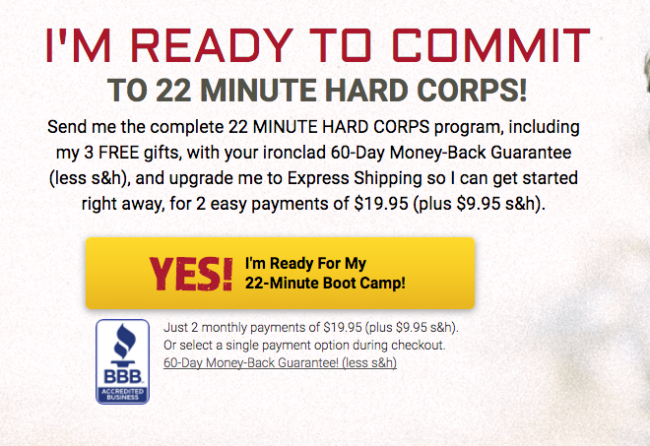
Last call to action.
They give a pretty good summary of the offer, and the title, again plays quite explicitly on the idea of commitment.
Short, sweet, and efficient.
