Course Landing Pages : Lessons from 6-Figure Launches
Get the template top marketers use to sell thousand-dollar web courses
Today I'm looking not at one... not at two... but at THREE FULL, super-long sales pages.
The kind of pages people with no marketing experience say they look like scams and they would never buy from... and that still generate millions in revenue.
The three pages are for three products from three highly successful marketers :
- Zero To Launch by Ramit Sethi
- Blog That Converts 2.0 by Derek Halpern
- Get 10,000 Subscribers by Bryan Harris
All three are roughly in the same "make money online" market and I thought it'd be interesting to dive into the tactics they use to sell products that are reallllly expensive (Ramit's Zero To Launch "Platinum" plan is about $11,000), and yet do it by the boatload.
Even though the 3 sales letters are not exactly the same if you look into the details, what's interesting here is that they have a lot in common, and you can pick up many tactics from it and create better sales pages faster.
The pages are very long, so let's take it step by step so we don't get overwhelmed too much.
1. Sell to a hot list
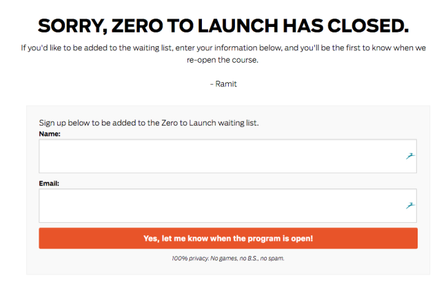
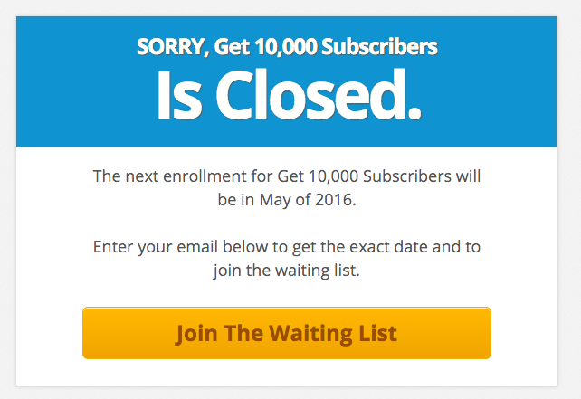
The first thing you'll notice if you try to find the websites for these products, is that they're likely to be unavailable.
You just can't go there and sign up. That's why I went and took big screenshots so you can follow along or put them in your swipe file here:
Anyway, moving on.
As we've seen with Ramit before, marketers in this space tend to rely on email marketing to create large lists of subscribers, warm them up with regular content through email or funnel them through an autoresponder sequence, and then only do they pitch their product and send traffic to their sales page.
It's no surprise that one of these courses is called "Get 10,000 Subscribers."
For example, it takes Ramit 9 emails before sending a link to his sales page, and he repeats that offer several times afterwards to catch the laggards.
The whole sequence is about 16 emails long, and that's assuming no complex branching is going on.
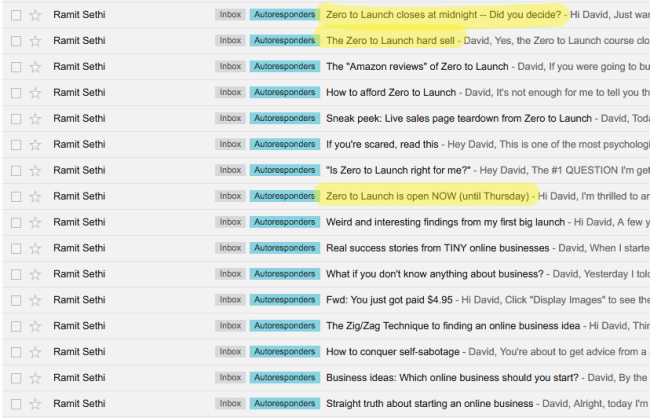
PRO-TIP: if you want to study autoresponder sequences, use Gmail labels so you can tell which sequence corresponds to which opt-in form. Sign up as your-email+productname@gmail.com, and then create a label for that address.
2. Start with a good headline
Duh.
You knew this one was coming, right? Headlines.
The subject of about 80% of blog articles published on copywriting.
Yes, they're that important.
Let's deconstruct two headlines used by Bryan and Ramit here:

This is actually kind of a "formulaic" headline. It uses and combines a bunch of classic copywriting tips and tricks, and you'll find similar headlines in many swipefiles (just Google "headline swipe file" and see for yourself).
Here's why it works:
- Finally. People like NEW things. Put that on innate human curiosity. The word "finally" implies there was nothing like it before, and it tickles curiosity and makes us want to read further.
- a PROVEN. Proof is a pretty huge deal when you're selling expensive products over the internet. People's credit cards aren't just going to fly out of their wallets before they know what they're buying. And they want to know that what they're buying works. Here, the product says itself that it's "proven", which starts building up trust in the product right away.
- Step-by-step system. The classic problem with info products is that buying a book or a bunch of PDF files isn't going to do much for you if you can't apply what's in them. That's why they're often pitched as systems. It's not just information, it's a recipe, that you can follow, even if you're stupid. Just follow the steps! It reassures people that it's both easy, and repeatable, and thus will work for them.
- Build an email list from scratch. The product is good even if you're starting from zero, already addressing a potential objection.
- Turn it into reliable income. That's the main benefit of the product: make money. Making it reliable means it's a serious business, not a get rich quick scheme (we'll get back to that).
- (That gives you more freedom). This is more of an "aspirational" add-on that taps into people's hopes and dreams of freedom.
That's a whole lot of stuff packed into a headline, but you can easily reuse it as a blueprint.
Let's look at Ramit's headline and deck now:
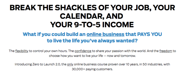
Compared to Bryan's headline, this one is a lot more emotional and aspirational. Here's how he does it:
- "Break the shackles of your job, your calendar, and your 9-to-5 income." Unlike Bryan's headline, Ramit starts with the pain. Or more precisely, the pains. Putting three painful problems in a row paints a picture of the problem the reader is facing as a massive issue that Ramit will work on solving for the reader.
- "What if you could build an online business that PAYS YOU to live the life you've always wanted?" Here's a classic use of "what if" questions. They compel the reader to imagine what his life would be like after purchasing the product. Making the reader think past the sale puts them in a position where they're already mentally convinced that they have the product, and thus more likely to buy it.
- "The flexibility to control your own hours. The confidence to share your passing with the world. And the freedom to choose how you want to live your life — now and tomorrow." Notice the parallelism here between the headline (3 pains) and this subhead with 3 benefits. Flexibility, confidence, freedom vs. shackles of the job, calendar, 9-to-5 income.
Using the power of imagination and tapping into pains, desires, and hopes, using visual metaphors like "shackles" can be a lot more powerful than relying on more rational appeals like in Bryan's headline, depending on the audience.
3....Or with a video
Another approach to starting your sales letter is to put a short intro video there.
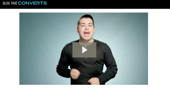
It's kind of reminiscent of super salesy "VSLs" (video sales letters) you see on the crappier info product sales pages, but it can work, and that's what Derek decided to go with on his landing page.
Note that Derek is known for producing most of his content in the form of videos, so it also caters to the preferences of his audience.
Now, the auto-play can piss off a lot of people, so I would suggest being cautious.
And I would especially suggest NOT trading a headline for a video. Just use both. (Unless you've conclusively tested a single video works better for you).
Here, if I pause the video, I have to start reading the text below, and that's a missed opportunity to help me get started with a good headline.
4. Give them a quick pitch...
Ramit and Derek both make a quick pitch for the whole product.
It helps set the stage for the upcoming details.
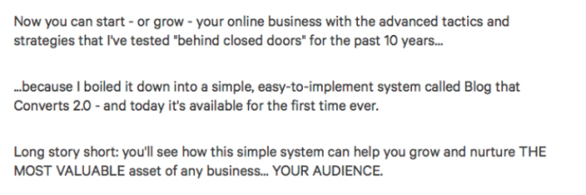
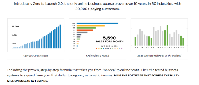
Nothing fancy here, just the one-sentence description of the product, generally referred to as a system, or formula to emphasize the inevitability of the results, and adding elements of proof ("tested for the past 10 years", "proven over 10 years, in 50 industries, with 30,000+ paying customers").
You'll notice throughout the page that all claims must be backed by proof in one shape or another.
5....and immediately start countering objections
Selling products in the "make money online" niche is tough.
Why? Because people are always going to assume you're trying to scam them.
In fact, that's one thing all three courses have to address explicitly, like here:
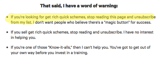
(Notice the subtle reframing from "I'm not selling a get rich quick scheme" to "I'm not interested in selling to people looking for get rich quick schemes").
No matter how much effort you've put into your brand. No matter if you're straight as an arrow.
People are just extremely suspicious, and after reading such claims, the alarm bell is going to start ringing in their head, and they're going to come up with a massive number of objections to your product.
You know the kind. It's not for me. It's not even going to work. I don't have the time. I've never done something like this before. And who are you anyway?
As we'll see, a lot of content is devoted to answering those objections.


Notice any pattern here?
The use of the phrase "even if". "Even if" is easiest formula to start addressing objections. You can get value from the course even if... [insert a bunch of objections].
Now, the difference between scammers and legit people is whether they can convincingly prove the "system" works in spite of the objections.
Which is why you need to...
6. Prove you're able to address the objections
That's why Ramit and Derek follow that objection countering with a few testimonials that conclusively show it's possible to get the results claimed before.
As I said above, all claims must be backed by proof, and testimonials are one form of proof.
To give you an idea of how important testimonials are, try guessing how many testimonials there are on Ramit Sethi's sales page for his business course.
How many did you guess?
By my count, the right answer is 55. FIFTY FIVE testimonials. Including many video testimonials. Derek has ONLY 32. Pssht! What a newbie, right?
I'm obviously not going to copy and paste all of them here, but here's what they look like.

Derek's testimonials are formatted differently, and highlight the results by putting them in a headline.
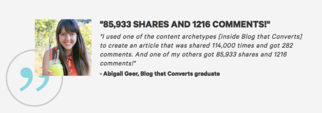
It works a little bit better for me from a design point of view, and it extracts the most important element to make it more obvious.
Although testimonials are an important element of proof, they may not be what people are most excited about reading, so giving them a tl;dr forces even the skimmers to grasp the added element of credibility.
7. Don't sell right away, begin by teasing
Before introducing the details of the product and asking people to buy, there's a fairly long section of "teaser" copy in all three sales letters.
The purpose of this section is to make people salivate. Make them want to know what your product exactly is, how much it costs and how they can buy it.
There are many ways to do that, and the 3 sales letters differ quite a bit in their approach here, but a pretty common one is the "PAS" or Problem—Agitate—Solve technique.
- You start by painting the problem the reader is facing
- Then you make it look more and more painful by emphasizing how horrible it is
- And then you show you've got a solution for it
Ramit and Bryan use that technique on their landing page, and it works pretty well.
Look at Ramit's take on agitating a problem here:
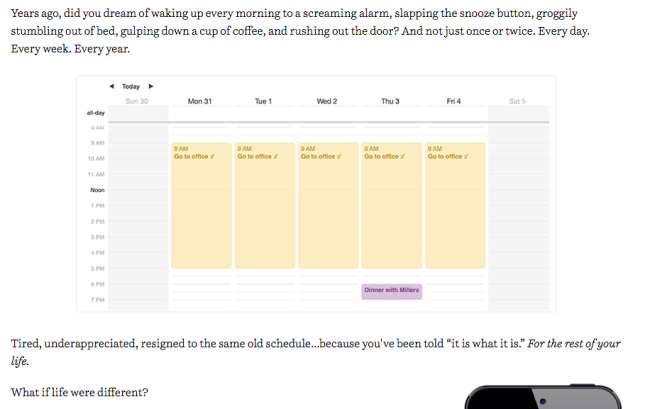
See how the language is crafted to emphasize the pain:
- Did you dream of waking up to a screaming alarm
- groggily stumbling out of bed
- rushing out the door
- And not just once or twice. Every day. Every week. Every year.
- Tired, underappreciated, resigned to the same old schedule...
- For the rest of your life
Is that enough drama for you?
It works because it uses very emotional language that is full of imagery, and that evokes things everyone's felt once (hitting the snooze button).
And once he's found that pain, he makes it linger on, extends it in time ("for the rest of your life"), so he transforms what you might think of as a minor annoyance into a long lasting, excruciating pain that will follow you forever.
Notice the image of the boring calendar, too. "Go to office :/"
Bryan uses a different twist, by using a personal story to illustrate the pain. He's talking about how he himself was frustrated by not being able to succeed at creating and selling an app.
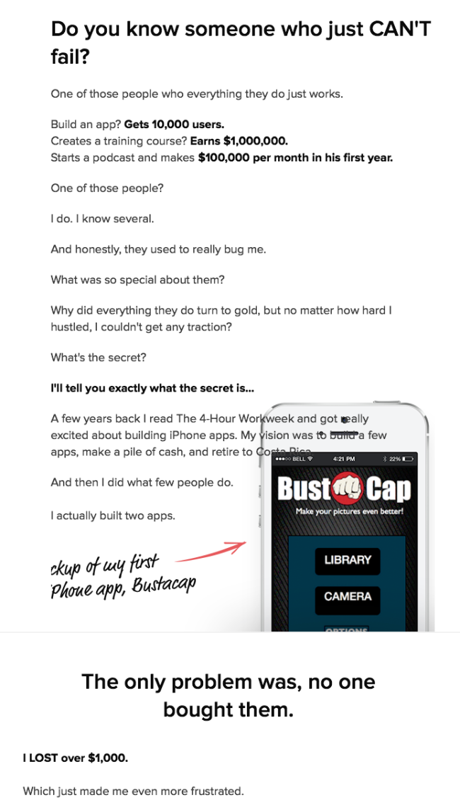
The goal is always the same: make the problem look big, and empathise with the reader before you show them the solution to their problem.
8. Sell The Dream
After painting the dark side of the reader's current situation, the goal is to sell them the dream of their future self after they've bought the product. Then all that's left to do is show your product is a bridge toward that future.
Ramit does that particularly well on his page:
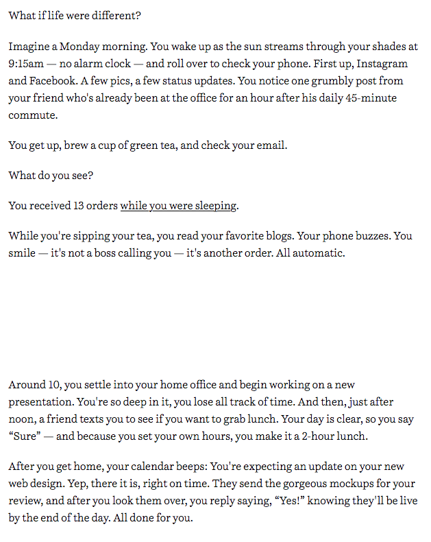
The keyword here is what if. He's already used it earlier, but it really is the perfect prompt for people to start daydreaming about the potential of the product.
Another thing people constantly get wrong when they try to do this is that they do not use the present tense. Using the present tense makes the story more compelling, it makes you feel as if it were happening right now, and removes all hypotheticals.
You don't have to go super dramatic like Ramit, though.
Derek simply starts off by describing his product.
The trick here is that he can't tell everything about his product on his sales page, because he'd have nothing left to sell. So he needs to stay in teasing mode.
9. Introduce yourself and show why They should listen to you
If you're going to sell a super expensive product, and you claim you're going to teach people something, you'd better be able to prove you know what you're talking about.
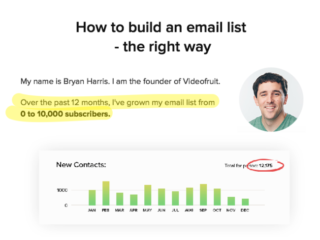
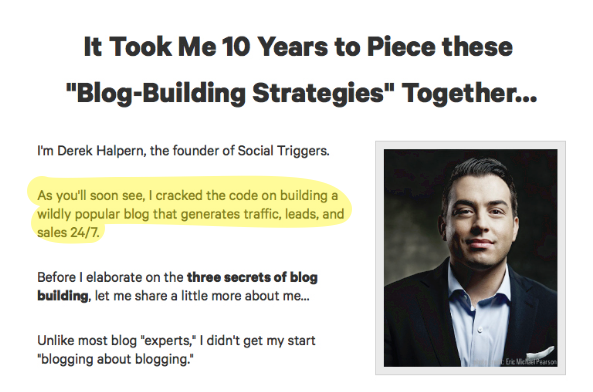
The least you could do is show you've succeeded at doing what you claim to teach.
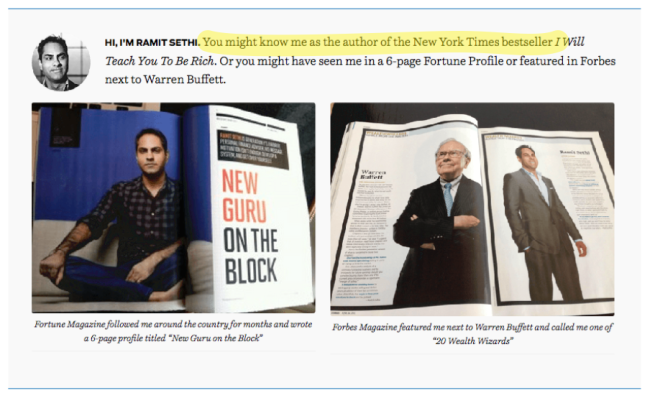
And depending on how famous you are, you can add some bling to make it more persuasive. If you're a New York Time bestseller, you probably want to mention that.
This part includes stories and anecdotes about the hardships they went through before they figured out what worked for them, and what they want to teach their students.
10. Introducing... your magic solution
Once you've gotten people excited about the benefits and the outcomes of using your product it's time to actually introduce your product.
So far — and it's pretty far, considering we're about a third to a half of the whole page — nothing has been said about the details of the product!
Creating build-up, curiosity and anticipation is necessary to produce the greatest effect when revealing a product.
Think about Apple product launches, or Game of Throne teasers. Same principle.

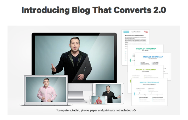
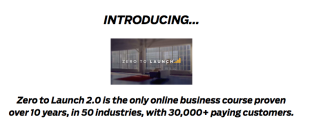
Notice how they use the same copy? Makes you wonder who's copying who, doesn't it?
11. Give a Physical representation of your product
One of the hard things about selling stuff online is the lack of physical immediacy.
People can't touch products, they can't look at them like they'd like to.
And if you're not showing them anything, you're not creating the kind of visceral connection people generally have with the stuff they buy in real life.
That's why info product marketers use images of their products to create this sense of a physical connection.
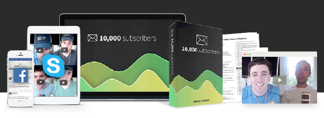
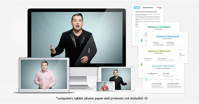
Although people now are less reluctant to buying virtual goods, for a long time, buying PDF files and a video seemed ridiculous to people. They wanted books and DVDs.
You can see Derek cracking a little joke about it here:
12. Break down your product in big sections and modules
Well, it's about time we started talking about what the product IS, right?
Most courses are broken down into modules, and that's what we see here:
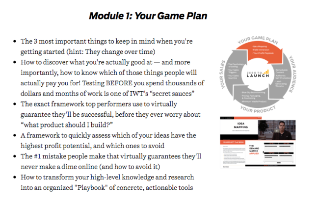
So, what's a module exactly?
It's a big ol' list of bullets. You can add a little summary, like here, but the bullets are really the most essential part:
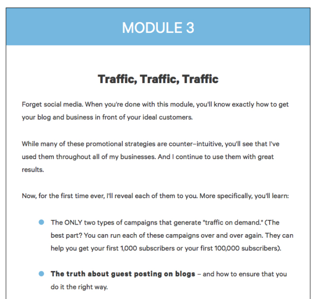
And the trick to writing good bullets is to tease. You need to hint at what they're going to get from the course, but not reveal the secret sauce. That's why they're often called "blind bullets."
You need to create curiosity, and show that you're going to teach something incredibly valuable.
If you've got a Master's degree in writing BuzzFeed article titles, you're going to love that. If not, this article can help.
13. Add bonuses on top
After the course itself comes the traditional series of bonuses.
Which means... more bullet points.
Bonuses in a course often include things that go beyond the educational material. Accountability. Support. Templates. Access to a community.
You need to find something that helps leverage what they've learned in the modules.
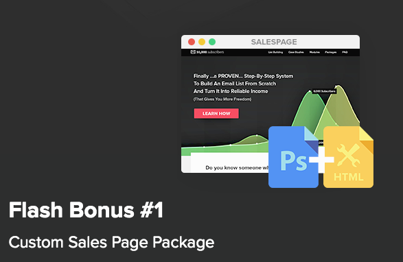
For example, Bryan offers a template for a sales page so that his students can get their own sales page up rapidly once they've built their email list.
If you've already run the same course before and you're now on version 2.0, you can use that to show what you've added in the new version:
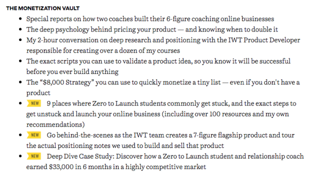
People always like to get the better, newer version, and that's a good place to use that bias.
14. Make the bonuses time-limited
Creating urgency is a necessity on a good landing page.
You don't just want people to like your product, and think about buying it eventually. You want them to buy ASAP.
Don't bookmark it, click on that buy button!
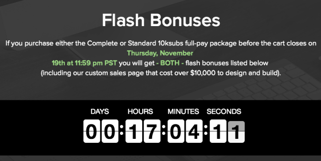
A possible way to go to create a bit of urgency here is to put a time limit on the bonuses.
Here's what it looks like:
15. Set a time limit to create urgency
If you don't go for the time-limited bonus, there are other ways.
The most classic way to create urgency is to time-limit the whole offer.
And that's the approach both Ramit and Derek use for their product:


The ticking clock works on a symbolic level too, as Neil Patel puts it:

In out modern industrialized world, the clock is the symbol of time. More specifically, it is the symbol of passing time.
If you remind users that time is passing — that the clock is ticking — it raises the urgency level and compels action.
16. Anticipate and address every. possible. objection.
Every long form sales page worth its salt must anticipate and counter objections.
As people start developing an interest in something, they start looking for more answers about the questions they have about it.
The most classic way to do that is with an FAQ.
Contrary to what less marketing-savvy people might believe, the goal of an FAQ isn't to answer boring troubleshooting questions like "I LOST MY PASSWORD, WHAT DO I DO?"
FAQs are made to answer sales objections.
And when people are reading a sales page for an expensive product, they're going to come up with a lot of 'em.
What if I don't have an idea? What if I have too many ideas? What if the course doesn't work for me? What if I've already taken other courses? Etc. Etc.
The best in class FAQ for me here is Ramit's, because he does something particularly brilliant, take a look:
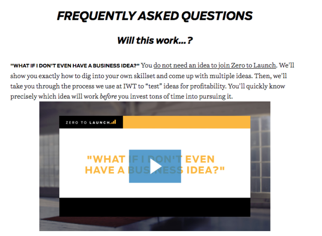
See what's going on there?
He starts answering a classic objection of people who want to start a business: they have no business idea.
Unsurprisingly, you don't need one to follow Ramit's course. But what's particularly effective is that he adds an excerpt from the course as a free sample to answer that question.
He repeats that throughout the FAQ. Not only does he answer the objection, he shows how the product answers that objection.
But how do you come up with a good list of objections?
You can always start with common hesitations people have about all sorts of things. How much time is it going to take. How expensive is it going to be. Etc.
But the best way is simply to pitch your idea to someone live, and listen to their objections. Write them down, and then add them to your FAQ with an appropriate answer.
Don't hesitate to go in depth with the questions. Ramit answers questions like "How do I convince my husband/wife to let me buy this product?"
Your readers should feel as reassured as possible that your product will be perfect for them.
17. Bombard the reader with testimonials
I already mentioned the incredible number of testimonials you could find on those landing pages.
A classic technique here is that of the waterfall of testimonials. It looks like this:

Nine video testimonials in a row. I had to unzoom to take the screenshot properly. That's several pages worth of scrolling right there.
Can you imagine the psychological effect of this never ending series of favorable testimonials on the trust of the reader?
Obviously, it's not always possible to have nine beautiful, professionally shot video testimonials to go with all of your sales pages.
One can only wish.
But along with the classic text testimonials we saw at the beginning, there are other interesting options you can go with that don't require you to be Steven Spielberg or have a multi-million dollar budget.
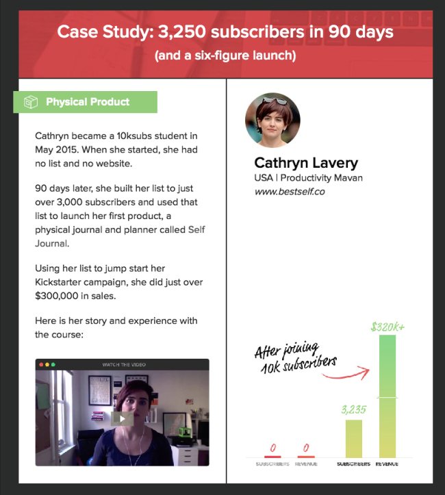
For example, you can use mini-case-studies like that:
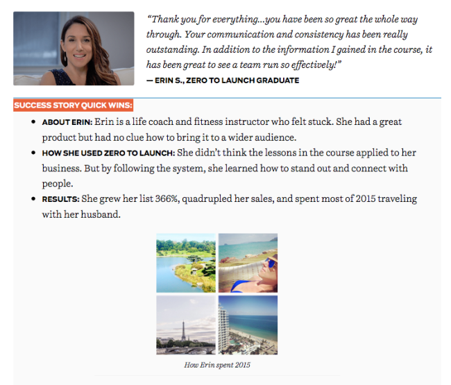
They are much easier to parse than your usual text testimonials, and they also create a visual break from the rest of the letter, which means they will attract attention directly on the results of the product.
18. Destroy all other alternatives
Once you get someone to read your page, there are essentially three scenarios that could happen:
- They buy something from you
- They keep shopping and buy something from someone else
- They don't buy anything
Since you're not sure people will come back, the goal of a long sales page is to close the sale now. Most of the page is devoted to avoiding scenario 3 (people not buying) by increasing the perceived value of the product, and decreasing the perceived cost and risk.
All that's left to do is remove scenario 2 (buying from someone else).
There's the short, matter of fact way of doing that, as Bryan does here:

Or the longer way, which completely obliterates alternatives:
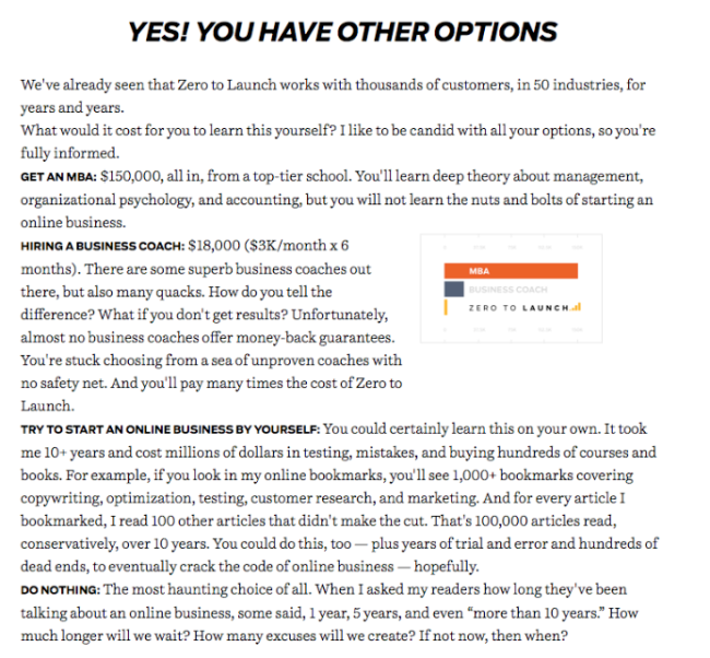
So, how can you destroy alternatives ?
- Show that they're more expensive (your course vs. a $150,000 MBA or a business coach). Notice the use of the graph to make the difference even more impressive, and make the course look like a complete bargain.
- Show that they're more risky, and less likely to succeed (your course vs. trying to DIY and failing miserably).
- Show that they're sad and disappointing (not doing anything).
19. Make the product as demonstrable as possible
We've already seen why it's important to make the product more physical by giving it a visual representation.
In keeping with that, it's also important to make the value of the product demonstrable.
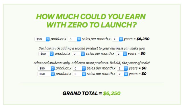
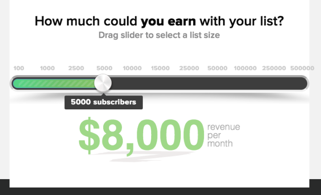
To increase demonstrability, you can add interaction on your page, in the form of little calculators like the following.
As the reader starts playing with the calculator, they start imagining different scenarios: what if I could get that money, what would I do with it, etc.
The goal put the reader in place where they are already benefiting from the product, as if they had already bought it.
20. Give a guarantee
Guarantees are a staple of information product sales letters. They're just one more element in the balance that removes risk for the buyer.
The consensus is that the longer the guarantee, the more likely people will buy.
The most common guarantee is the 30-day money-back guarantee, like the one you find on Derek's page:

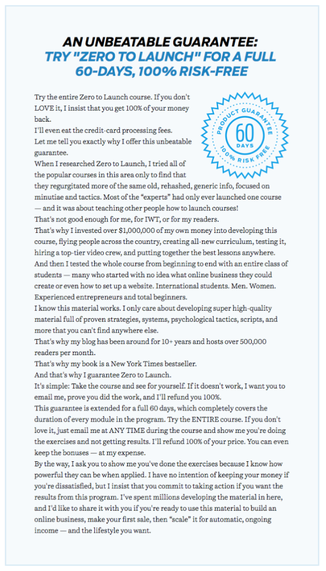
Ramit offers a 60-day guarantee, which is pretty rare. He goes a little bit further into explaining why he is offering that guarantee.
People will generally infer from the fact you're offering a guarantee that you're convinced people will NOT want their money back.
It proves you have faith in the quality of your product, and that's one of the roles it's supposed to play.
Bryan adds a different twist by offering a mandatory refund for people who do not get the promised results.
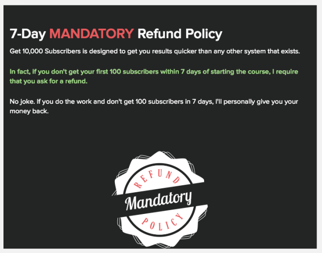
Is there any way you could sound more confident about the value of the product?
21. Give them an alternative... sort of


Before describing the contents of the plans, Derek and Ramit use the classic "Don't ask if, ask which" technique.
I've shown it on a different page before, and the idea is simple: don't make them think about whether they want your product or not, make them think about which of your products they want.
To do that, you need to have different plans, or tiers for your product.
The names of the plans here aren't very original (Starter, Standard, Pro, Master, Platinum), and I prefer the ones Noah Kagan used in a page I analysed earlier, because embedded in them is a psychological trick that attracts people toward the more expensive plans.
Here's a short clip from Elmer "America's No. 1 Salesman" Wheeler, who came up with the idea (or at least with the name):
22. describe your plans in detail
In this section, you simply list out the contents of each of the plans.
That means you need to summarize everything in the product you're selling.
Let's take Ramit's page as an example:
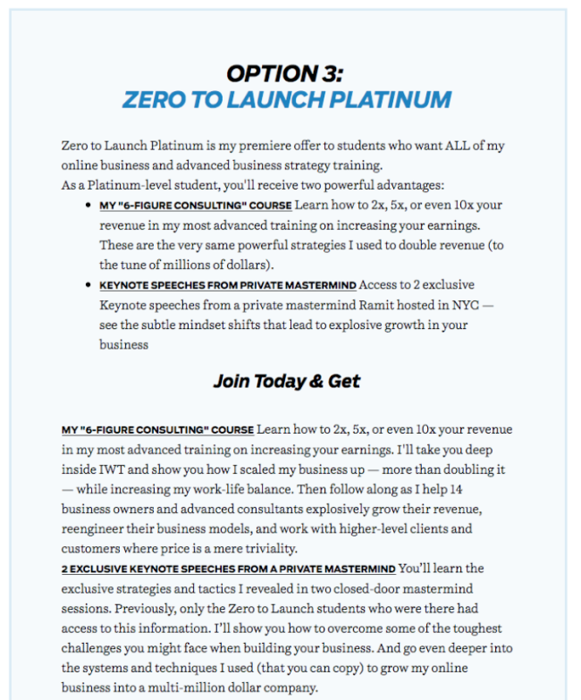
As you'll notice, most of the space is not used by the course modules themselves. But by the myriad bonuses that come with the course.
"Full Zero To Launch Course" (the actual videos of the course) is just 1 of 16 points in that offer. Other things that compose the offer are:
- Older products created by Ramit and repackaged as bonuses, like the 6-figure consulting course, or the Ramit Brain Trust interviews
- Interviews are a pretty common bonus. Whether with successful students, or with other experts.
- Case studies
- Templates and scripts. People love turn-key products.
- Accountability. This is a big one. A course does not just need to give information, it needs to make people do stuff. Give them homework.
- Multimedia. If you've got a video course, give transcripts. Give an audio version.
- Support. Have a forum or a community people can turn to when they have question during the course.
As mentioned earlier, what's important here is that you need to think beyond the educational material. Obviously, all of that content doesn't grow on trees, and it takes a proportionate amount of work to be able to offer it.
23. Make the expensive plans more attractive
Let's face it.
People selling stuff on the internet aren't philanthropists. They're trying to make money.
If they can sell the $899/mo plan more often than the $299/mo plan, they're going to do that.
And one way to do that is to emphasize how much more valuable the expensive plan is (or how comparatively less interesting the cheaper plan is).
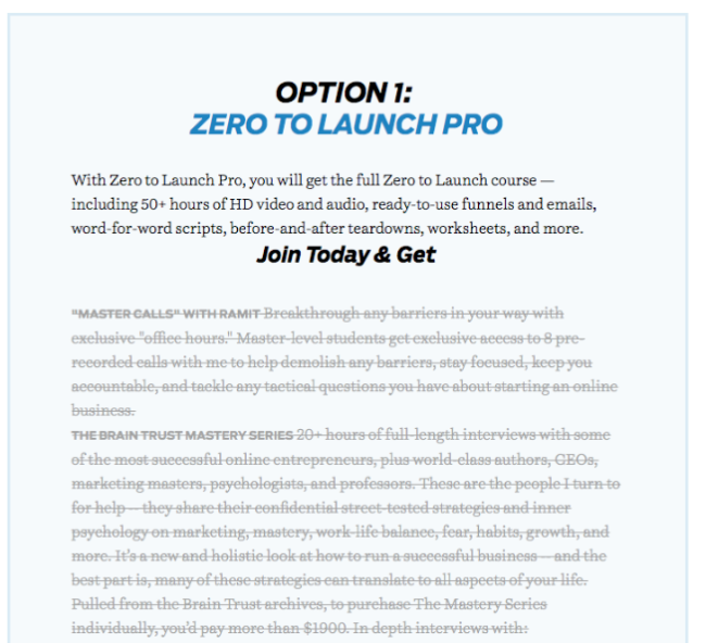
One thing all three letters do is emphasize what's missing in the cheaper plans.
For example, if you look at Ramit's cheapest plan, the first thing you're going to see is what you're not getting. Greyed out, struck out.
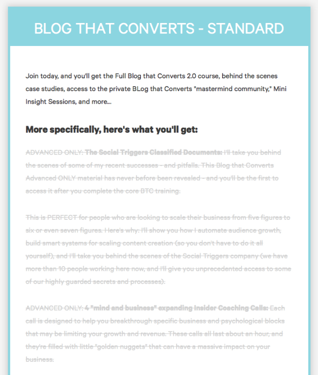
Derek goes a little further by adding "ADVANCED ONLY":
Bryan does the same thing but more visually, like so:
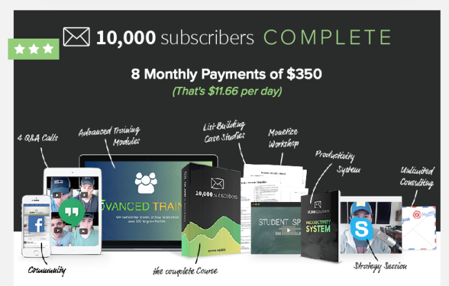
"Whoa, look at all this stuff I'm getting with my course!"
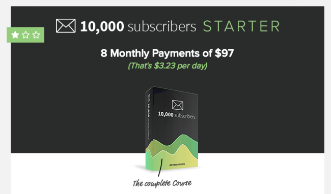
"Whaaat? Who wants that lame, cheap "starter" plan? Gimme all the other stuff!"
A little difference between the three here is that Ramit introduces the cheaper plan first, while the other two go with the most expensive plan first.
Now, a lot has been written about pricing strategies, with little conclusive evidence either way. So I guess it's up to you how to order the plans.
24. ask them to pull out their credit card
It's time to actually ask for the sale.
Look at the striking similarity on the three pages.
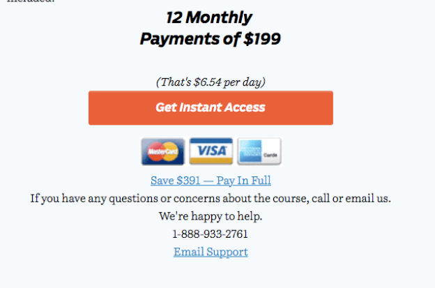
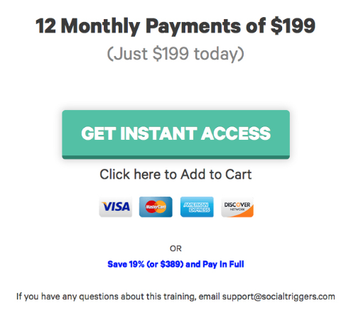
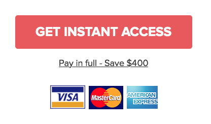
- Same call to action: GET INSTANT ACCESS. It's less brutal than "BUY NOW" and reminds the buyer that they get to benefit from it right away.
- Make the pill easier to swallow by breaking down price by day. Also known as "trivilializing" price. That tactic works as long as the daily price isn't too high. For example, Ramit doesn't use it on his more expensive plan, because it would bring the price to about $30/day. That's not chump change.
- Use credit card logos. They create an image of trustworthiness.
- Offer a discount for people who pay in full right away. Minor nitpick here: the copy in Bryan's page says "Pay in full — Save $400" while the two others reverse the order "Save $X — Pay in full." It's probably better to start with the idea of saving than that of paying.
- Make it as easy and riskless as possible. That's why Ramit and Derek offer people to ask more question by email if they need, or even to call them on the phone.
Here's Ramit:
Derek:
And Bryan:

25. Play on their fear of missing out
So, you've asked the readers to buy your product. But you're not going to let them go so easily now, are you?
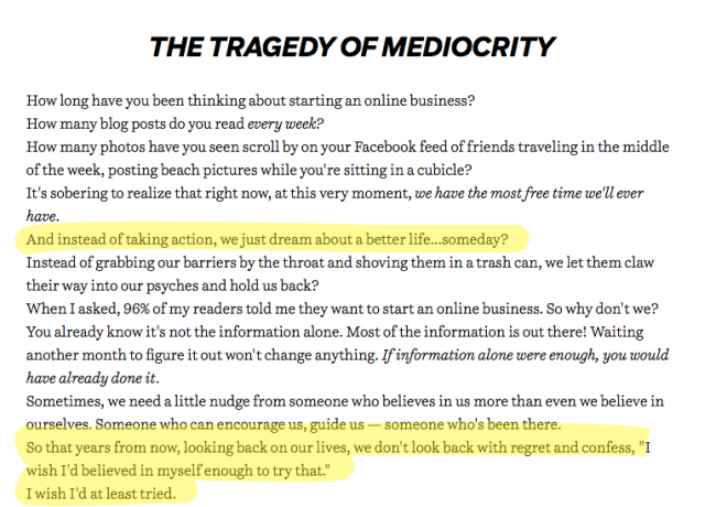
After introducing his offer, Ramit has two sections that are entirely devoted to fueling the reader's fear of missing out.
What's that?
The fear of what's going to happen if you DON'T buy the product.
We've spent a lot of time earlier trying to sell the dream. Sell the the good outcome that results from buying the product. But what about the other side of the coin?
What about what would happen if you did not buy?

A lot of horrible things, of course. Regret. Remorse. Boredom. We circle back to the problem agitation we saw earlier.
But, you might say, isn't it super sleazy to prey on people's fears?
Depends.
I'm mostly interested in whether it's effective as a persuasion technique here.
Whether it's ethical depends on what you're trying to get people to do.
If you're genuinely convinced that you're convincing them to do something good for them, it's probably okay.
If you're using fear to make them do something bad for them... you're probably an asshole.
26. Summarize and repeat your offer
Persistence is a quality among salespeople.
That's why you shouldn't be content with asking for the sale once.
You want to repeat your offer.
But this time, you don't need to give all the details that were given earlier.
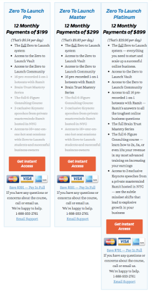
A simple summary that goes over the main benefits, listed as bullet points should do.
The same technique of striking out the bullets that are not part of the cheaper plans is used for this version of the offer too.
The copy is pretty much exactly the same as what we saw earlier, in a shorter version.
27. Use Your last chance to convince them
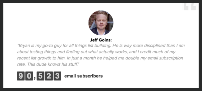
MORE TESTIMONIALS?
Why, yes. I told you there were lots of 'em.
At this point, the reader knows everything they could possibly know about the product and its benefits.
They've already seen how much it costs, they've seen all the testimonials, everything.
But all three sales pages add a last few proof elements before calling it quits.
Derek Halpern's page uses a particularly interesting type of testimonials here:
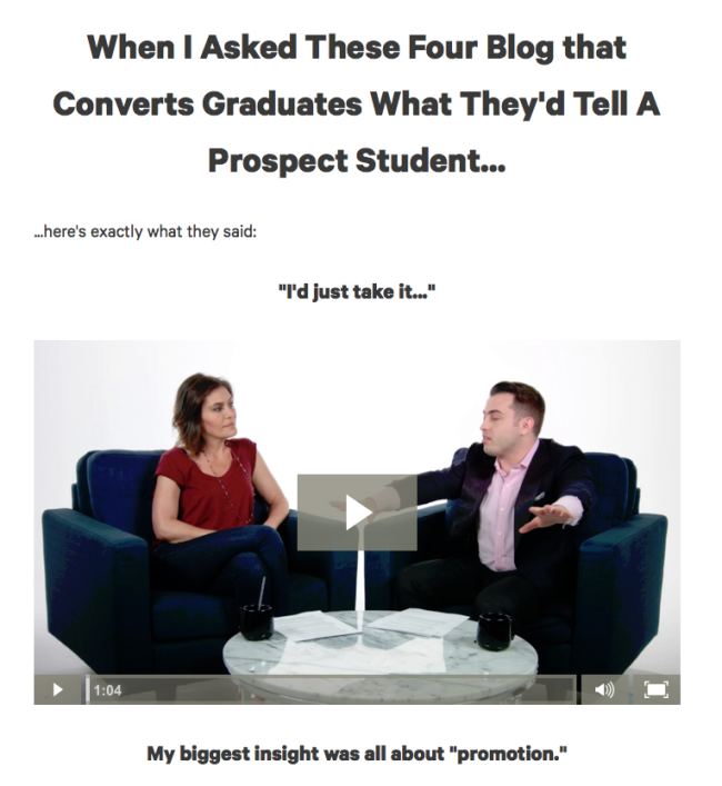
What's different here is that they're testimonials aimed directly at the reader.
Not just your regular testimonials about the personal experience of the student, or what they think about the product, but about what they'd tell people considering the course.
"I'd just take it..." Of course.
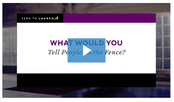
Ramit has a video that plays the same role entitled "What would you tell people on the fence?"
It's also possible to put your FAQ here, which is what Bryan and Derek do.
As we've seen earlier with Ramit's, it's a great device to crush objections, and particularly suited at this point of the conversation.
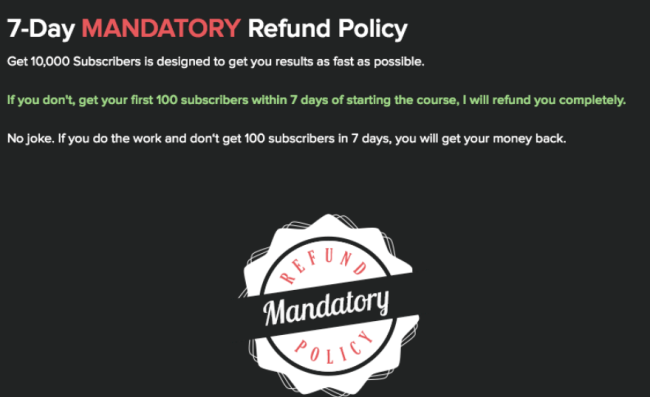
Bryan also repeats his guarantee here. As you can see, the possibilities to mix and match all of the different elements are endless, but the building blocks are the same.
What matters is that the goal of this section is to keep piling the reassurance elements before asking for the sale one last time.
28. Close by repeating your offer one last time
Whew! We're finally (almost) done.
All three letters end by repeating their summarized offer a second time.
Here's Derek's so you can see the similarity with the other ones.
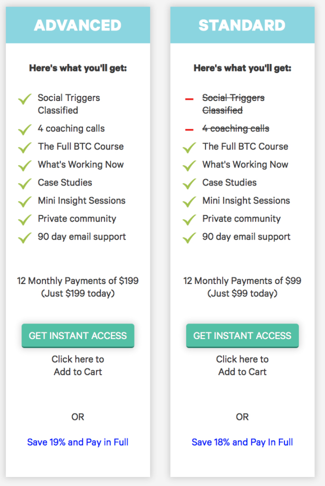
Same presentation. Same button copy. Same discount for paying in full.
Just giving them a last chance to buy.
