The Landing Page Nathan Barry Used to Get to $1+ million A.R.R.
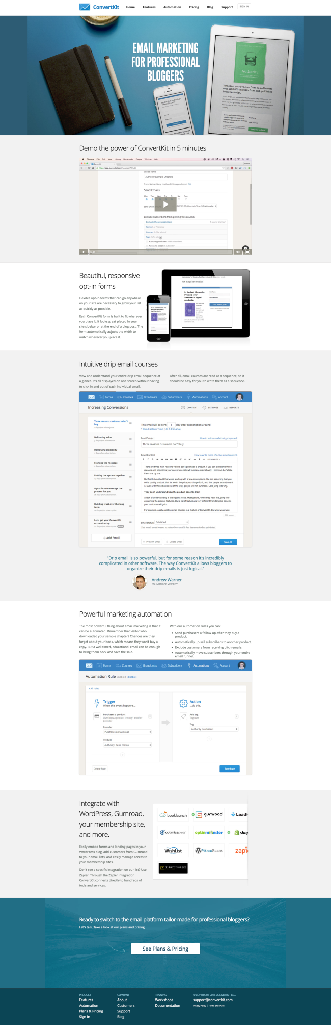
Click to open the full landing page
In the last few years, Nathan Barry has been killing it.
He started with a couple info products about web and app design that did very well, and since 2013 he's trying his hand at a SaaS product, with an email marketing solution called ConvertKit.
Unsurprisingly, he's also been killing it, since he's since reached $125,000 in monthly recurring revenue.
The landing page for ConvertKit is fairly short and to the point, so let's see if we can learn a thing a two.
1. Get Yourself a cool logo
Not everyone's a designer, but if you have the chops, there's something to be said about having a smart logo.
People from a more direct marketing background will tell you branding and design are a waste of time. People with a background in advertising and branding will tell you they're all that matters.
Maybe, maybe not.
As is often the case, extremes tend to be wrong.
Why not have the best of both worlds? Aim for the orange zone:
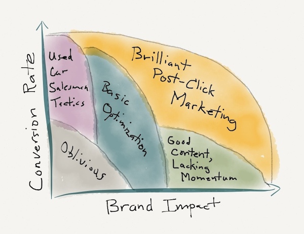
A good logo will definitely create a more professional and trustworthy look for your product. It also gives a visual clue and reinforces the positioning of the product, here as an email marketing solution (email icon and "up and to the right" graph).
Will it move product by itself? Probably not. But that's asking too much from a logo.
2. Let your audience identify with your product through imagery
A picture is worth a thousand words.
Yada, yada, yada. You've heard this one a million times.
But how do you actually use it?
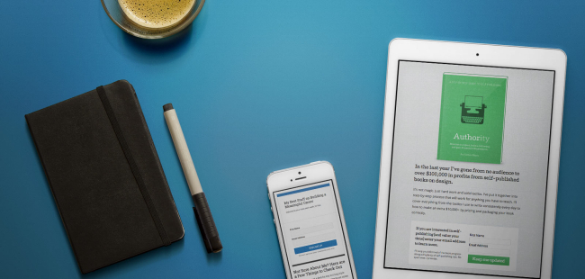
If you want people to buy your product, you have to make them identify with the product.
Make them see themselves as users.
Make them feel like you get what makes them tick, what their preferences are.
Show them that you and they belong to the same club.
Here, Nathan is trying to sell a product to professional bloggers.
And what best represents the professional blogger than typical millennial (some would say hipster) imagery like what you see above.
- The espresso made by your favorite barista, featured a gazillion times on Instagram.
- The Moleskine notebook, so that you can take notes on all your trips as a digital nomad.
- The iPhone and iPad.
These objects resonate with the audience who identifies with them right away.
What you what to do then is enter that world with your product, as Nathan does here by displaying a ConvertKit opt-in form and a ConvertKit landing page on the devices.
3. Understand the Law of the Category
In The 22 Immutable Laws of Marketing, there's a law called the Law of the Category that says:
If you can’t be first in a category, set up a new category you can be first in.
Email marketing is a huge market. With well entrenched actors.
There's no way Nathan could just go head to head with the likes of Mailchimp, Aweber, InfusionSoft, and many others.
It would be suicidal.
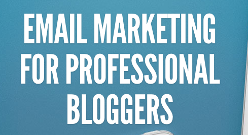
That's why Nathan does not pitch his product as your typical email marketing solution.
Instead, it's Email marketing for professional bloggers. It's a new category.
You can generally carve out a new category inside a bigger, established category.
For example, back in the days, computers were just computers.
But gradually that huge category was split into smaller ones: mainframes, workstations, minicomputers (anyone remember those?), personal computers, laptops, notebooks, etc.
If you're in a situation where there a huge incumbents, don't trying going head to head with them. Create a new category you can be first in.
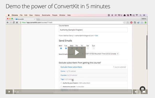
4. Make a quick video screencast demo (Script included)
People generally get a little scared when trying to come up with a video for their product.
They want to hire a team of professional actors and expect it to cost a boatload of money so they can create a "viral" video everyone will love and share.
That's... not a very rational way to approach the issue.
You can create a simple, ~5 minute screencast that covers the main benefits or features of your product. It will take you... about 5 minutes to make, and will be PERFECT to give people a good idea of your product.
"But, won't I need a script for that?" you say. Well, sure. Here's Nathan's script for his 5 minute video:
- 00:00—00:10 : Give them a short introduction. I mean really short. As in one sentence that repeats your main value proposition. "In this video, I will show you why ConvertKit is the future of email for professional bloggers." THAT'S IT.
- 00:10—00:20 : Overview of what the app looks like when you open it.
- 00:20—1:40 : Tour of the most important, basic feature. Here Nathan shows how forms work in ConvertKit, because forms are the basis for all email marketing.
- 1:40—2:00 : Tour of a second feature. Here Nathan briefly talks about landing pages.
- 2:00—3:00 : Tour of the third feature. Nathan talks about how ConvertKit can help people easily build email courses.
- 3:00—3:30 : Tour of the fourth feature. In this case, email campaigns, a.k.a. broadcasts.
- 3:30—4:45 : Tour of the fifth feature. Next up is a list management.
- 4:45—End : Tour of the last feature. Email automation.
Can things get any more simple?
Notice how he alternates features that are short (~30 seconds) and features that are longer to present (~ 1 minute). It may not be intentional, but it helps create a rhythm and make it less boring.
The only thing missing from this script is a call to action at the end. He could use Wistia to have a call to action redirect to his pricing plan for people who want to proceed now.
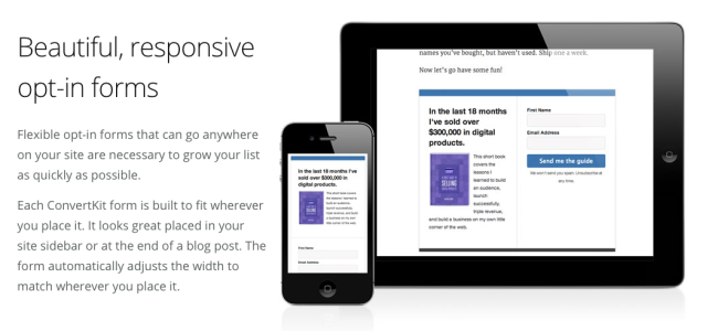
5. Use relevant visuals
I know it's obvious.
But many times the images used to illustrate features and benefits on SaaS landing pages are just random screenshots that are barely legible, and it's impossible to understand how they're supposed to explain anything.
Here, Nathan wants to show that ConvertKit forms are responsive. So he shows how they look on different devices.
And you can see perfectly how the form adapts to the screen size.
UNLIKE most use of device pictures that seem to just say "it works on different devices" (no shit?), this it actually a legit use of such images.
6. Don't hesitate to use BIG screenshots
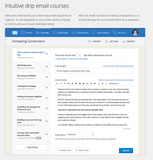
I'm showing the whole thing here so you can get a sense of how huge that screenshot is, compared to your average app screenshot.
But guess what? People want to know what it looks like. They want to see for themselves.
And having a tiny ass screenshot isn't always the best way to convey what it's going to look like.
Here you have a pretty much 1 to 1 view of what ConvertKit is going to look like when I want to build a course there.
And again after to show the email automation panel:
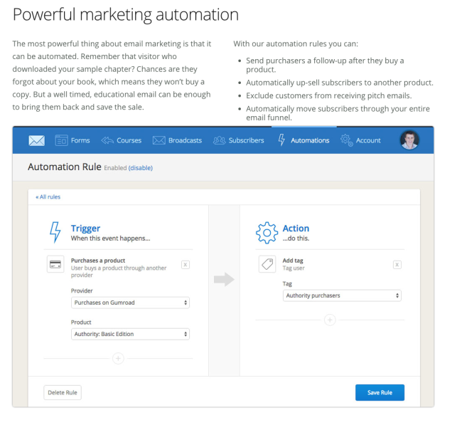
The only thing that bothers me here as an OCD nerd is the lack of white space between the picture and the text of the second column.
But the big images are definitely something you want to try.
Of course, it's a double-edged sword. If your app looks terrible, it won't look good.
7. Testimonials, testimonials, testimonials
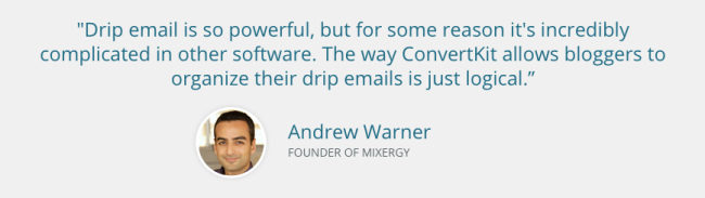
A nice example of a good testimonial. Just to recap what makes it good here:
- Good Design: the author is identified with a picture and a title, which proves it's a real person.
- In context: If you look at the landing page, this testimonials is not located in random area. It's right after the drip email feature has been introduced. Given that the testimonial is about drip email, that makes it particularly relevant.
- From an authority: Andrew Warner is famous among professional bloggers, and people who might buy ConvertKit will probably be familiar with him.
I'm a bit surprised Nathan hasn't put more testimonials, especially because he's signed up some blogging heavyweights like Pat Flynn.
8. Leverage Integrations
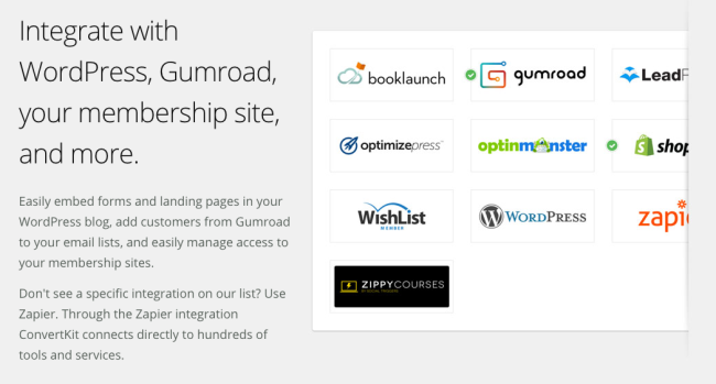
If you have a SaaS product, offering integrations could be a smart move.
We've already talked about that with the Unbounce landing page, but it bears repeating.
9. Always end with a call to action
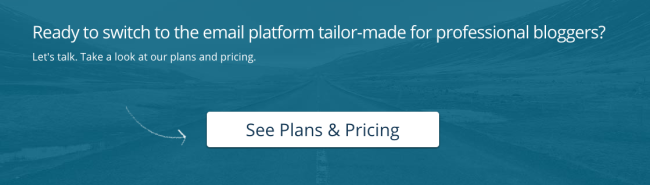
The call to action at the end repeats the main benefit of the product ("the email platform tailor-made for professional bloggers"), and leads the visitor to the pricing plans.
Nothing unusual.
The use of the arrow to direct the visitor to the CTA button is nicely done.
The only thing I find weird here is the second line of copy here.
"Let's talk. Take a look at our plans and pricing." Well, which is it?
