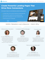
No one knows more about landing pages Than these guys
14 Tactics Swiped From Unbounce's PPC Landing Page
Today we're looking at one of Unbounce's PPC landing pages.
For those of you who've been sleeping for the last couple years, Unbounce is a service that lets you build, publish and test landing pages.
They also have one of the best blogs on the topic of landing pages and best practices.
Their in-house landing page specialist Oli Gardner has published a bunch of really cool stuff on the subject, and even created the first (as far as I know) show about landing pages.
So, clearly, these guys know what they're talking about.
Here's what you can learn from their landing page.
1. Match your landing page and PPC messaging

Google AdWords ad for Unbounce...

...and the copy that matches on the landing page.
It may sound obvious, but landing pages don't live in a vacuum.
They have a context.
And the immediate context of a PPC landing page is the PPC ad that drove the traffic to that landing page.
If you don't want your reader to feel lost, those two experiences need to be connected in a very clear way, i.e. you must use the same text in your ad as in your headline (that's also good for your AdWords quality score).
You can call that consistency, congruence, or, as Unbounce themselves call it, message match.
Quite simply, your landing page must reflect what's at the top of the reader's mind when she gets there.
If she's looking for a solution to create landing pages, talk about how she will be able to create landing pages. NOT something completely unrelated and irrelevant.
I know, it's obvious. Click a couple PPC ads, and you'll see how it's not so obvious for a lot of advertisers.
2. Start your page with a good structure
The easiest way to create a crappy landing page is to start from scratch and not plan anything.
Just like good presentations, good landing pages have a solid structure.
The structure of Unbounce's landing page is very easy to see.
It's made up of around 11 chunks of content that are separated on the page by different background colors.
It's important that it looks structured visually, so that you can see at a glance that it's not just a nondescript wall of text. But more important is that the message is structured, because each chunk plays a particular role.
And how do you add a good structure to your page? By making an outline.
If you look at the Unbounce page, it's very easy to see the underlying outline:
- A hero section with main benefits in a bullet list that summarizes what is to come
- Social proof and testimonials to reassure the reader right away about the reliability of the product
- A "How it works" section to explain some of the secret sauce that makes Unbounce work
- An in-depth look at a first benefit (No need for IT)
- An in-depth look at a second benefit (Integration)
- An in-depth look at a third benefit (A/B testing)
- An in-depth look at a fourth benefit (Templates)
- An in-depth look at a fifth benefit (Customer support)
- An offer with a pricing table and a list of features
- A section explaining what landing pages are (weird)
- A "Hail Mary" call to action for people who have more questions and want them answered by email or by phone before signing up
How you order the different chunks is up to you, although a good way to go would be to experiment with different copywriting formulas that can guide you.
3. Don't accept best practices blindly
Navigation on a landing page? Impossible! Unless...
When you have no idea what you're doing, learning a bit about best practices can be helpful to give you some direction.
But you shouldn't become a slave to best practices.
A commonly repeated trope about landing pages is that they should have no navigation.
Except that's not exactly right. Landing pages should have no navigation that leads the visitor away from the page (even that is debatable, but it makes more sense).
The navigation the Unbounce landing page only helps you navigate this page.
In fact, thinking in terms of navigation can help you structure your page. Take a look:
- Why Unbounce? provides social proof
- How it works explains how the benefits are delivered
- Templates shows one of the most sought after features
- Free trials shows the offer
- Why landing pages? ... I have a harder time explaining. Why would people want to know what landing pages are at this point? Oh well, logic can't explain everything. I suppose Unbounce tested it and it performed well.
Links in the navigation have been carefully picked to lead toward the most important aspects of the product: it's main benefits, how it works, the templates, and the price.
All elements that potential buyers will be interested in.
4. Don’t be afraid to push your CTA down the page
Here's another one about best practices : Notice how there’s NO CTA BEFORE THE FOLD?
Actually, the CTA does not appear before 3 quarters of the page have been displayed!
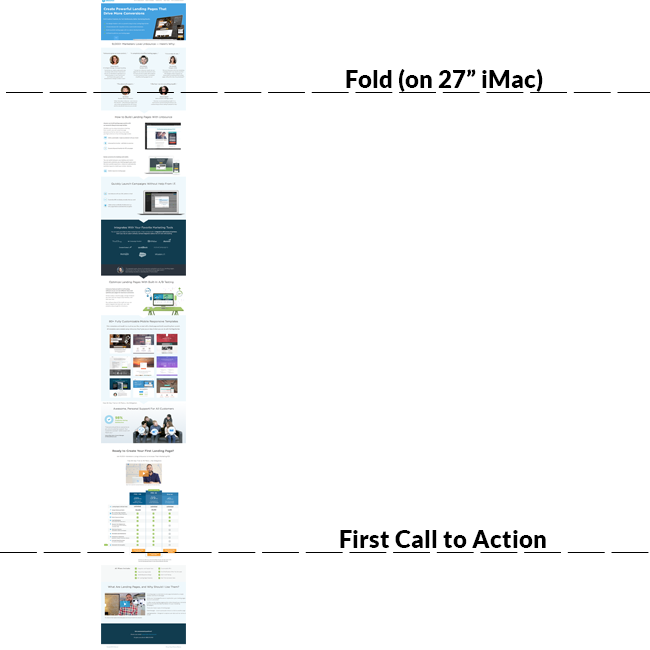
There's no point in having a call to action before you've made your pitch. People don't buy things if they don't know what they're buying.
Only the simplest product can afford to ask for the sale before the fold.
However, it's possible to have a "lighter" call to action at the beginning that lets the reader "learn more", for example.
5. Give your visitors more to chew on in the hero section
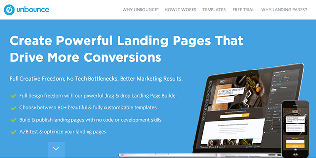
Good ol' bullet points are still effective as ever
Hero sections very often miss a good opportunity to give more value right away by using bullet points.
Mostly due to design fads, people have lately been making their hero sections more and more void of any information.
Another problem is young startups try to copy the websites of established startups.
You probably want to have a look at the website startup timelines.
Take Basecamp for example.
Today, Basecamp is a successful business everyone working for a startup knows. So it makes sense people would try to emulate them.
They go to their home page and see this something fairly terse, like this:
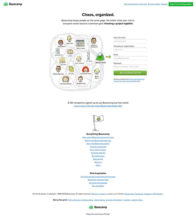
But they don't see what the website looked like at the same stage of development as their own startup. Namely, like this:
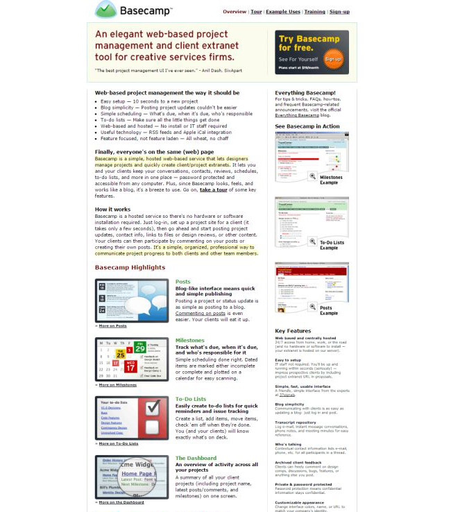
If you paper over the design differences that are mostly due to design trends, the quantity of content and information is quite staggering. Not to mention I actually cut the page short here.
The point is simple — if no one knows you, don't pretend like everyone knows you.
People need information about your product to make a decision. A clever headline on its own isn't going to cut it.
6. Tie in social proof with testimonials
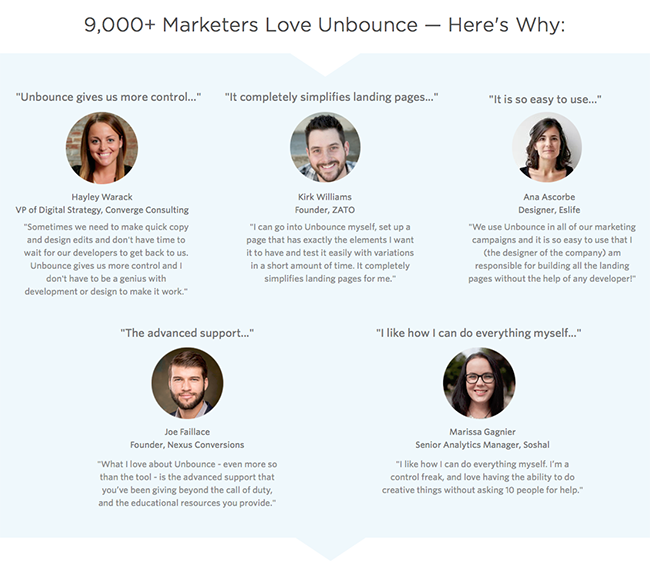
It can always sound a bit self-serving to announce big, impressive numbers like, "Hey, we have 3894309 users!!!"
Besides, although social proof works as a psychological trigger, it doesn't do much on a more logical basis. After all, people have been known to suffer mass delusions in the past.
Buy our tulips!!! 200000 people can't be wrong!!
So you need a little more proof to back up the numbers. To show that there is substance behind the success.
That's what Unbounce does here with their testimonial section.
They don't just tell you they have 9000 users. They explain why they have 9000 users. It's a simple trick, that can be summed up by the three words "Here's why", but it gives super powers to your social proof.
7. Extract the best bits of your testimonials for the lazy reader
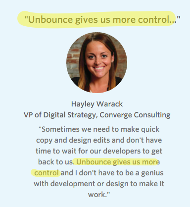
I don't think it's necessary to stress how important testimonials can be to give proof to your reader that your product is the real deal.
There's only so much convincing you can do yourself.
One thing good marketers and good landing pages do is present their testimonials better so they can make clients sell for them.
And what that means is that you must do the reader's work for them.
Don't make them read the whole testimonial to find the juicy bits.
Highlight them. Or, as Unbounce did here, extract them and use them as a title.
8. Pick testimonials from your best clients

When choosing testimonials (assuming you have enough to choose from), there are two criteria that are important:
- Relevance — pick people who are representative of a group your reader is likely to belong to. If your product is sold to small businesses, maybe showing testimonials from huge companies isn't your best bet. And vice versa.
- Popularity — all things being equal, it's better if your testimonials come from people or businesses that are popular rather than unknown.
If you have someone famous among your clients, or someone who's an established expert in your field (or both!), having their testimonial on your landing page can be a great credibility booster.
9. Pick diverse testimonials
It's always better to pick testimonials the reader can easily identify with.
But sometimes it's hard to know who your reader is beforehand, because the demographic is not defined as precisely.
So you need to cast a wider net.
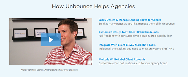
If we take a look at Unbounce's testimonials, we'll notice that they cover a fairly broad set of client types (agencies, consultants, founders), both male and female.
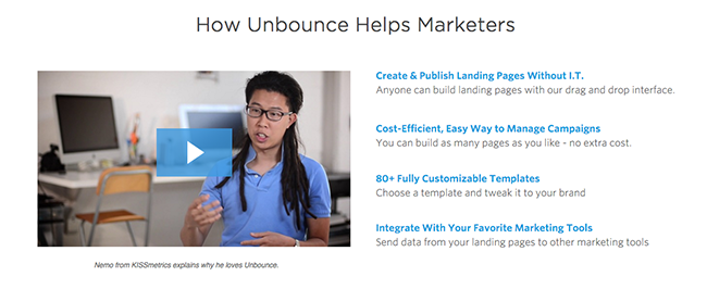
If your audience isn't homogenous, you don't want to alienate any subsegment.
10. Keep them going down with visual cues

Small detail, but every detail that can help you squeeze a few more readers down your page means more of your message is getting through

So don't forget to show explicitly that there is more to come on your page.

The good news is, most good landing page templates include such elements, as designers have wised up to this practice.
11. Explain how your product works and how it will deliver benefits
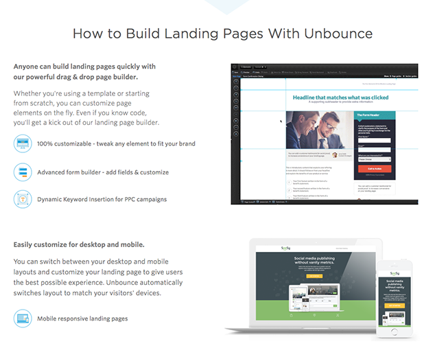
Once people get what the point of your product is, they often start wondering how you propose to deliver the goods.
"Sure, Unbounce says I'll be able to create great, powerful landing pages, but I've tried in the past and I never managed to build anything decent. How are they going to help me do better?"
That's where the "secret sauce" comes in.
Unbounce has a very aptly named "How to Build Landing Pages With Unbounce" section that explains exactly that.
Now, I'm not super crazy about this explainer section, because it doesn't really break down the process.
People want to have a high level conceptual understanding of what they'll have to do once they've bought the product (pick a template or start from scratch, use the WYSIWYG editor, customize the template, add your own stuff, etc.).
Here the list of benefits lacks this sort of step-by-step structure that is expected in how-tos. Something to test for Unbounce?
12. Use .gifs to illustrate benefits, but do it sparsely
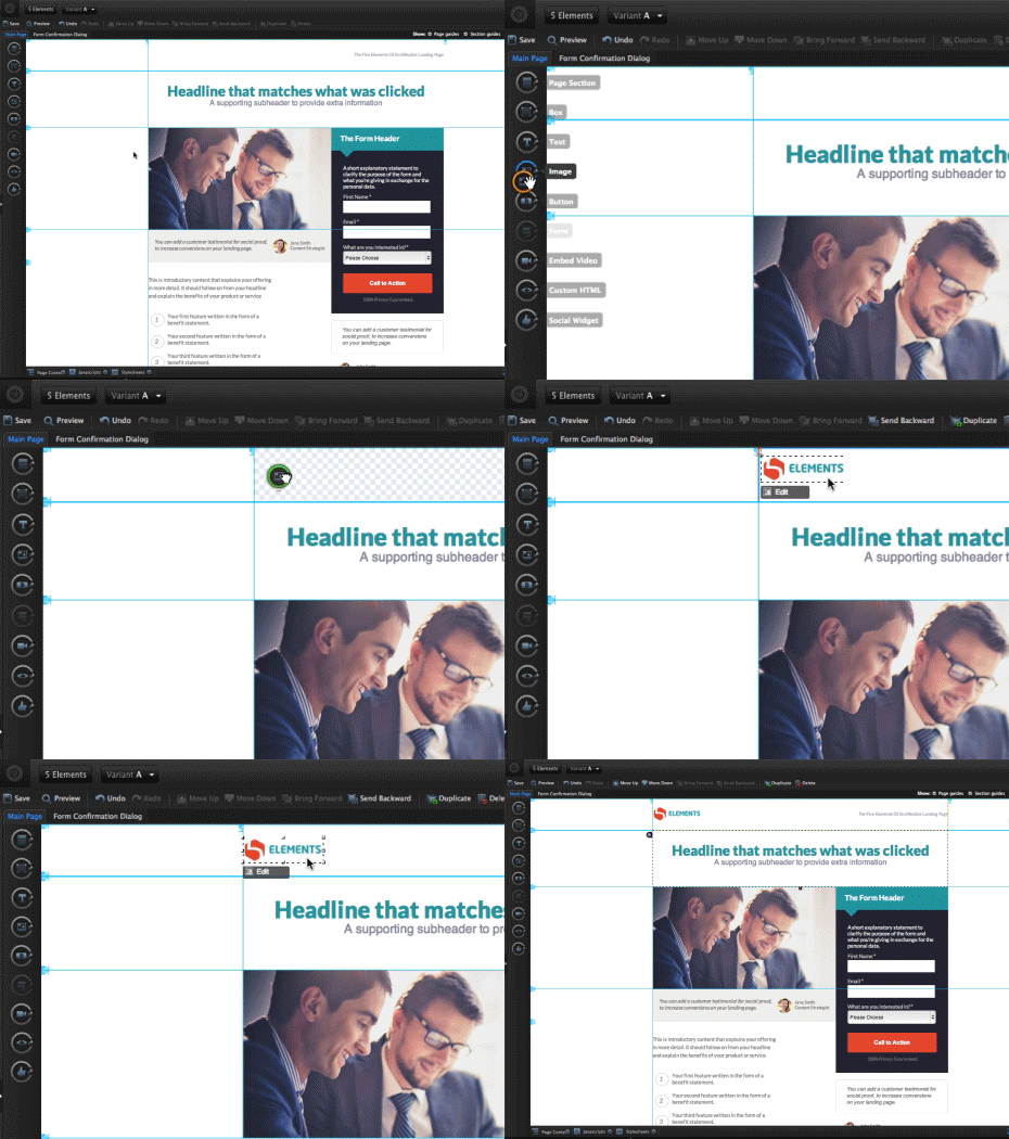
A picture is worth a thousand words, yada, yada.
Pictures and video are great, but you have to use them the right way.
Animated .GIFs have become all the rage lately, and they do work quite nicely sometimes, for example to show details in a user interface.
Careful with the animations though. They take away the attention of the reader, and they can make reading the accompanying text uncomfortable if there are too many.
13. Position your product like a complement
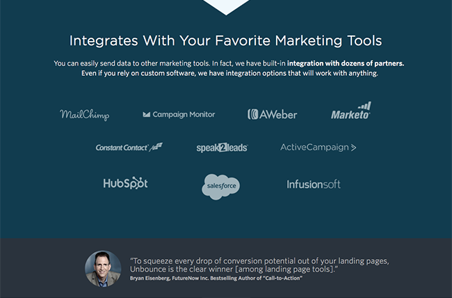
This is a more of a general marketing point, but still interesting.
Why are integrations all the rage these days? Every other SaaS product seems to offer them.
The answer is — for at least two reasons :
- It makes your product an economic complement — a bit like iPhone accessories, you build a product that enhances the value that people can get out of their existing tools, which makes it more valuable than if it stood on its own
- It allows you to tap into additional marketing channels — if you're lucky, you'll be featured among the most valuable integrations offered, which will bring you additional customers
See, I told you looking at landing pages was a great way to get new ideas!
14. You know what's better than a great landing pages? Two great landing pages!
Sorry, guys.
I cheated a bit.
All the images above don't come from the same landing page.
That's because Unbounce actually uses several different landing pages for their campaigns. As you should.
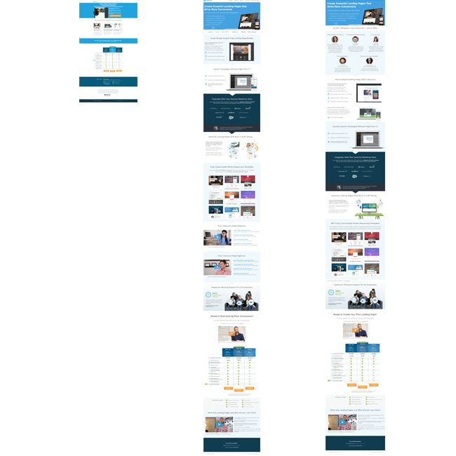
Three of the PPC landing pages used by Unbounce
It's impossible to have a message that is perfectly tailored to everyone. You have different traffic sources, people look for different things, etc.
That's why you should never look for the (illusory) perfect landing page, because you will most likely need many of them at some point if you want to optimize your sales in each segment.
