How to Sell a Smart Physical Product the Nest Way
16 ways to improve your landing page from a billion dollar smart product brand
Most of the advice you find about landing pages tends to deal with software products, or with services.
But what about physical products? Is there anything special about them?
With the rise of the Internet of Things, we're seeing more and more "smart" "connected" products, and maybe you're trying to sell one too.
To see how you can best sell your physical product online, I've looked at three product pages from Nest.
There are many other examples I could have taken and will look at later, but Nest has a solid track record and I found interesting aspects to cover that I hadn't talked about before.
In case you don't know, Nest is a company that was started by an ex-Apple engineer, that became famous for creating the first successful smart thermostat, and that went on to sell millions of units before getting acquired by Google for $3.2 billion.
Let's see how they do it (the selling, we'll see about the acquisition later).
1. Understand your audience's state of awareness
When creating a landing page, that should probably be the first thing to do: understand how much your visitor knows about you and your product.
If you don't know that, there's no way you can bring them from where they are mentally to where they need to be to make a purchase decision.
Of course, some readers will know more than others, and ideally you would (or will) have different landing pages for each of these "levels of awareness", but you should at least have one that covers the most unaware of your prospects.
What does that mean concretely?
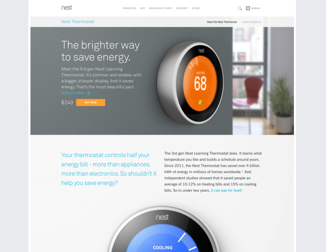
If we look at the "above the fold" part of the page for the Nest Thermostat, here's what we see:
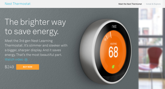
What kind of information do we get from this, right away?
- The main benefit (save energy)
- The main features (slimmer, sleeker, better display, good design)
- A link to a video
- The price
- A call to action
This in itself is a self-contained ad for the product. It covers all the main points that a longer ad would cover, gives the price and asks for the sale.
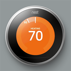
Why can they do that? Because their readers are super aware of the product.
The Nest has been all over the web for the last few years, it's won a lot of awards, been featured in tons of magazines and TV shows. People who come to the website know exactly what to expect, and many are already ready to buy.
That's why there's a "Buy Now" button.
And conversely, that's why you should not necessarily have a "Buy Now" button super early on your page when your product has received very little publicity.
That's also why the page doesn't stop there. Some (most) people still need some convincing before buying.
2. Use the second most powerful word after "Free"
Can you guess what word that is?
"New."
Or in this case, "all-new" (newer than new!).
Actually, I have no idea if it's the second, third or fifth most powerful word, but it's damn powerful.
Why is it that, you say? A few reasons:
When you see the word ‘new‘ you subconsciously think improved, exciting, and I want. According to several behavioral psychology studies, new products, novel solutions, and a sense of adventure draw shoppers to products with the ‘new’ label.
And Nest doesn't refrain from telling us their products are new at every occasion:
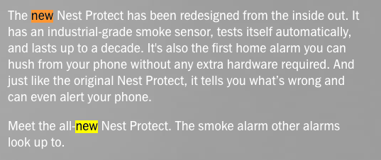
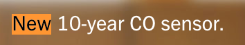
The good thing about "new" is that it doesn't take much to be "new." As long as you have a new product on the market, or a new version of your product, you can call yourself new. And you probably should.
3. Be smart about your color palette
This is something that might seem secondary, but sweating the details makes all the difference.
I already mentioned colors and branding when looking at Neil Patel's consulting page, and I talked about the importance of showing how the product blends in the buyer's world when looking at the landing page for ConvertKit.
But Nest takes it to a whole new level. (Or is it all-new?)
Let's look at a larger image of that landing page for a minute:
Might not look like much, but pay attention to everything that's going on here:
- The light to middle grey neutral tones around the page help blend in with the hero shot that features a dark grey wall, as well as act as a reminder of the color of the product itself (metallic grey).
- The only accent color is that of the product itself, namely the orange, that is reused for the call to action button. The visitor's gaze is naturally directed toward the splashes of vivid colors.
- The secondary color, blue, is also taken from the product, and used for the subheads and links.
- The grey, neutral color allows the product to stay in the foreground, but they're also relaxing, comforting tones that create an atmosphere of calm that reminds the reader of their home, which is where they're going to be using the product.
As you can see, there's more than meets the eye. In general, a good way to create a harmonious palette for your product is to pick colors that are on the product itself.
4. Shoot every angle of your product
Apple inaugurated the style of huge close-up pictures of their products, and it's something that's spread like wildfire over the internet.
Since people can't always touch the products (Nest also has retail locations), that's as good as it's going to get for them, and Nest embraces that:

See, I wasn't kidding when I said "every angle." By my count, there are 12 images of the Nest Thermostat (more if you add those from the installation page), and about as many for the Nest Protect.
And I'm not including the screens from the mobile app that comes with the product here, but they follow the same pattern: show every possible "state" or screen of the app.
5. Pick numbers that paint a clear picture
When trying to educate a prospect about a product, there often comes a time when you need to talk numbers. How powerful is it? How much is it going to save me? How big is it?
Numbers can also be used to support an argument you're making.
What's important when talking numbers is to focus on the ones that are expressive. The ones that speak directly to the listener and that can be understood right away. Like this:
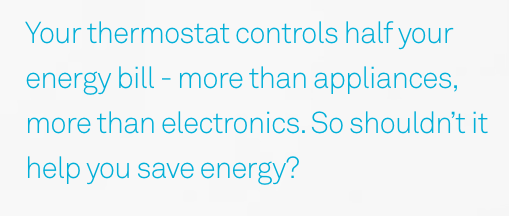
"Half your energy bill" Boom. That's crystal clear. (Notice the "yes inducing" question at the end, that gets the reader to agree with you).
And it's code for "It's reaaalllly important."
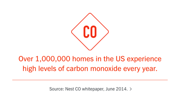
Again, "1,000,000 homes", a simple and very telling figure that tells the reader right away that there's a real danger and that it's common.
6. Prove you can achieve what you claim
The Nest thermostat is supposed to save energy for me.
But how much energy is it going to save me, if any?
I already have a thermostat, after all, do I really need a new one?
That's where you need proof.
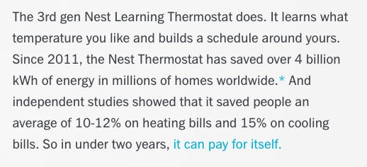
See? Now I know that they will actually deliver, especially since they had "independent studies" prove the result, and quantify it precisely, as opposed to making a vague claim like "it will substantially reduce your energy bill." (Says who? By how much?).
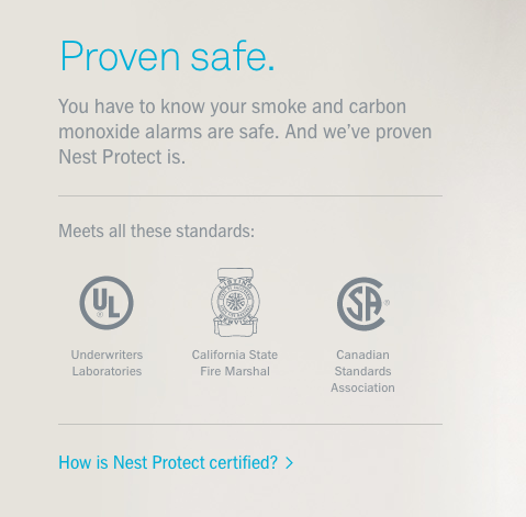
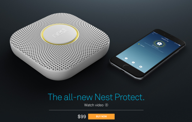
Same thing here with the logos that prove that the Nest Protect has been certified as safe.
7. Show how the product fits in the customer's life
Speaking of power words like "new", there's another very powerful word, and that is: imagine.
In fact, a large part of the role of a landing page (or of a salesperson) is to get the prospect to imagine their future self in a way that makes the product necessary to that future vision of themselves.
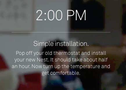
Nest takes that approach quite literally, and they have a whole section of the Thermostat's landing page dedicated to "Your life with Nest."
It’s almost like a mini commercial within the page describing the journey of the user from installing the product to using it for a whole day, in and out of the house though the mobile app.
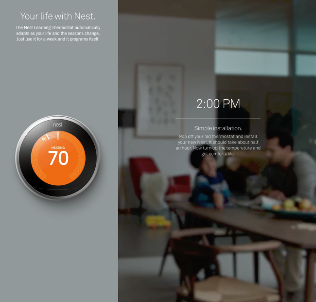
There are several things going on at once here:
- It builds a narrative with a chronology (starting at 2:00 PM and going through the day) that makes the use of the product very clear in the mind of the reader as they understand how the product works in a concrete, everyday situation.
- It keeps selling the benefits, you can see "Simple installation" on this screenshot. The next segments highlight the automatic learning of preferences by the thermostat and the energy savings.
- The video background immerses the reader in a home much like his or hers (presumably), which creates a sense of comfort and conditions them to feel the same emotions toward the Nest thermostat
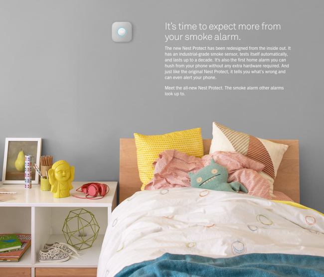
They resort to the same contextualisation technique with the pictures of their other products too, here with the smoke detector:
The product takes a back seat so that it blends more easily in the life of the customer. And here with the camera (can you see it?):
Or here with the thermostat, which almost becomes part of the family:
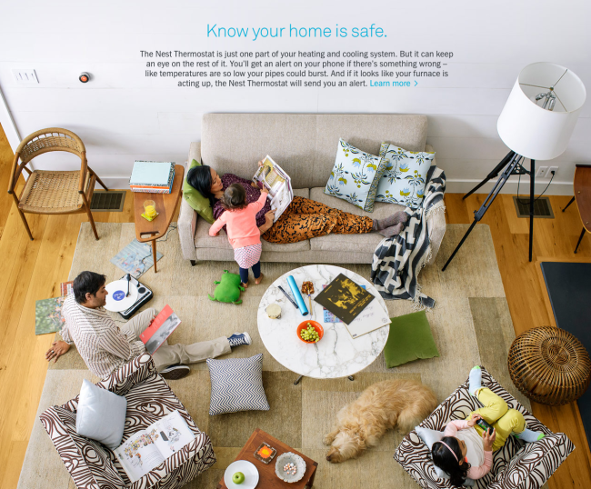
Notice how carefully produced the image is to reflect the tastes of the target market. Not everyone is going to be excited about dropping $250 for a thermostat. So the product is aimed at fairly affluent people (although it "pays for itself") who care about the environment and who like good design.
That's why you see the marble table, the tripod lamp, and the vinyls on the table. It creates a hip, modern, stylish atmosphere that the buyers either live in or aspire to live in — a living room they can identify with.
8. Tap into emotions that relate to your product category
Selling is not just about rationally demonstrating that a product is good.
It's acknowledged that people tend to buy based on their emotions, and only justify their purchase with logical, rational arguments.
Nest builds products for your home, and to convince their buyers, they must appeal to emotions and needs that stem from that category.
That's why although they do talk about rational concerns like energy savings, they heavily emphasize comfort and security, which are much more profound and basic desires that sit at the base of Maslow's hierarchy of needs.
There are examples of appeals to comfort and security all over these pages, whether textual or visual:
"Turn up the temperature and get comfortable"
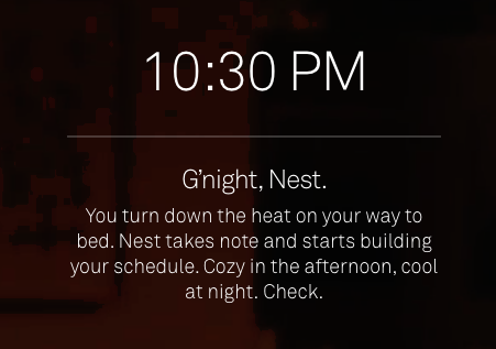
"Cozy in the afternoon."
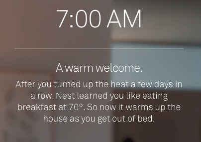
"A warm welcome."
They also mention getting out of bed (a symbol of coziness).
And there are many images of beds (see above) and other comfortable furniture like sofas and cushions.
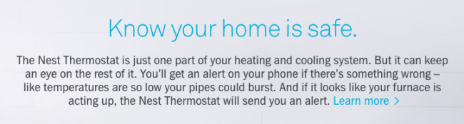
See, that's a claim that's a lot stronger than providing energy savings. Making someone's home safe is a fundamental need.
9. Cross sell your other products

This is a classic cross-sell, no special effects.
Nest emphasizes the complementarity of the products: if you buy other products, they start working together automatically.
That means there's more value in complementarity than just having the benefits of both products (the whole is more than the sum of its parts).
This isn't really something specific to physical products, but it's interesting to notice how Nest smartly extended their product line around the "Nest home" concept by adding new products that make their other products better.
10. Hint at the unboxing experience
This is something I found quite original on Nest's part — the last call to action features a picture of the product in its box:
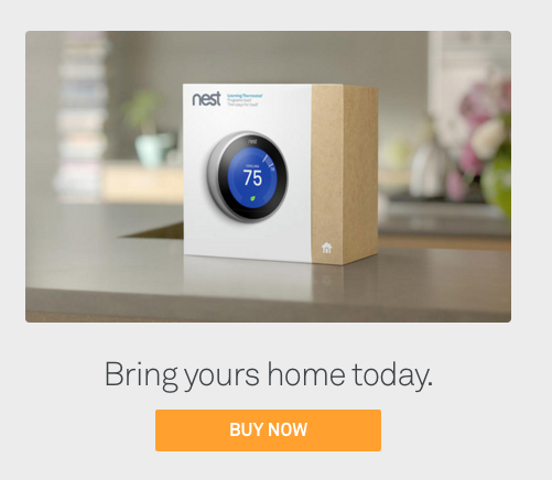
Now, that's something that might sound stupid at first: who wants to see the damn box, right? We want what's in it!
But that picture of the box sitting on the countertop at home hints at the imminent unboxing of the product, which is something people crave enough to make thousands of videos on Youtube.
It's trying to suggest the excitement and emotion of unpacking a new toy for the house, and gets the reader that much closer to the mindset that's going to be his after he buys.
Notice the emphasis on "home" that's always there ("Bring yours home today."). It almost sounds like they're talking about a puppy.
11. Trivialize price
As far as thermostats go, the Nest is a pretty expensive one. Not to mention you need to install it after you've paid, or get a pro to install it for you.
Luckily, Nest aren't completely stupid and they know exactly how to make that cost go away:
That's it right there: it can pay for itself.
And that's a great argument, isn't it?
Of course, it can’t be used with every product, but it works in many situations.
Any product that produces cost savings can pay for itself.
Any product that creates revenue increases (for a business) can pay for itself.
The question is how long does it take? If it takes 10 years, it’s probably not a very potent argument. If it’s a short enough time, probably worth a shot.
And if you're not convinced it's cheap yet, Nest does more to help you swallow the pill: they have a partnership program to get a rebate on their product:
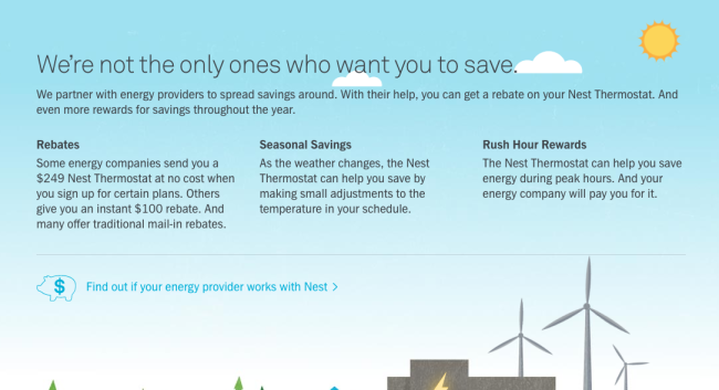
Creating a good offer is always about balancing value and cost. If you can find a way to put the burden of cost on someone else than your customer, you're making your offer far more attractive.
12. Appeal to the "dark side" of your product's benefits
What's the opposite of comfort and security?
Probably something like fear and danger, right?
Sometimes, talking about the benefits of your product is not quite as effective as talking about all the nasty stuff you will help your customers avoid.
You know, things like...
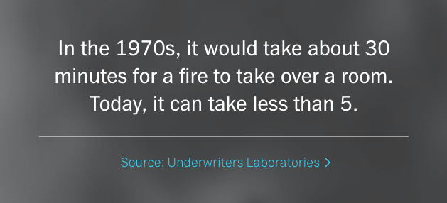
Your house going up in flames in less than 5 minutes?
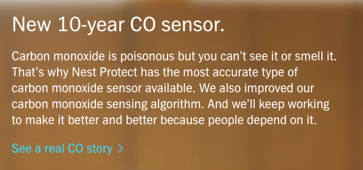
Or getting poisoned without being able to see it or smell it?
Yup. You wouldn't want that to happen. Good ol' fear is often a very effective emotion when you're trying to get a response from someone.
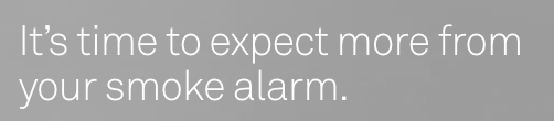
13. Be Subtle when criticizing your competitors
What does that mean?
It means every smoke alarm until now has been a letdown.
It also reinforces the customer's high opinion of himself as a person with high expectations.
And it sets Nest as the only offer on the market than can live up to those expectations.
No need to take jabs at competing products directly when you can do it like this.
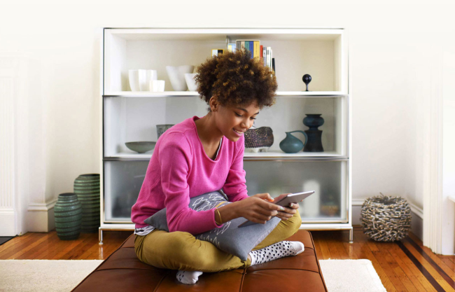
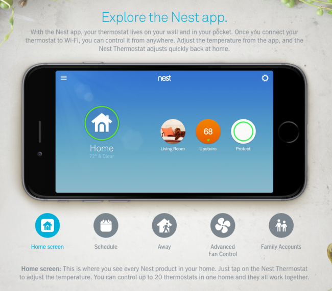
14. Give them a test drive
Well, it's not really a test drive, but they're trying.
Nest like to show you everything you can do with the app. And they do just that, by showing you every screen from the app, so you can see what the experience is going to be like as closely as possible.
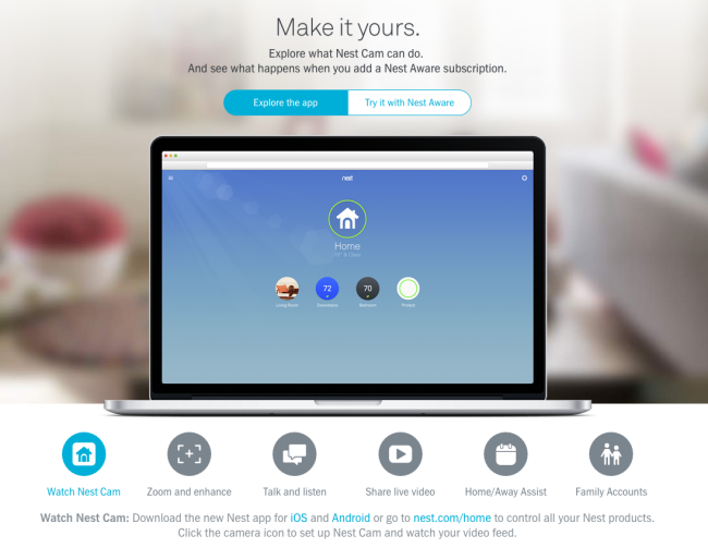
There's a similar section for the Nest Protect, called "Make it yours", which is exactly the point:
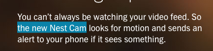
There's also a section of the landing page where you can "test" the voice feature of the Nest Cam app. It's a feature that let's you speak from your smartphone to whoever is near your cam at home.
For example, your dog:
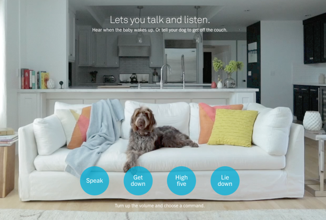
So Nest create 4 little scenarios and you can see what the dog does depending on what you tell him to do.
That kind of stuff tries to create an emotional bond with the product that goes beyond just seeing how it would work for you in a technical sense. It hints at the possibilities for stories that involve members of your family.
15. Show them what's under the hood
If you've ever been to a store selling home appliances, you've probably seen people who just loooove to talk about all the nitty-gritty technical details of the products.
They're people who need incredible amounts of information before they make a decision.
And contrary to popular belief, some people do like to talk about features (not just benefits), even when it includes jargon!
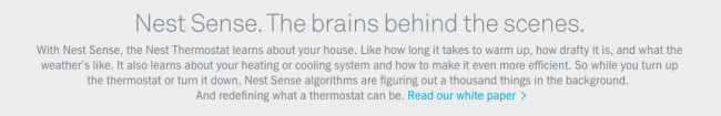
Nest has a lot to offer in that department, as they dig into the technical specs and the details of the architecture of their products quite a lot.
They have a whole section about each of the sensors of the Nest Thermostat:
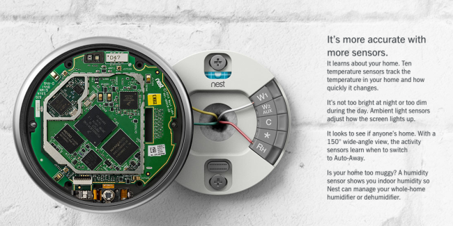
Including a link to a technical white paper:
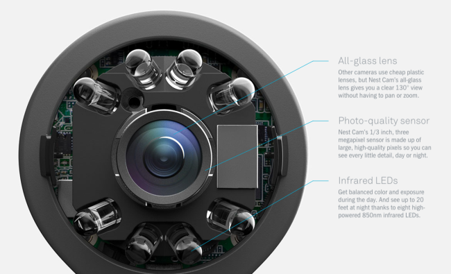
Similarly, they go show the internals of the Nest Protect in depth, with technical specifications for many of the components inside the product:
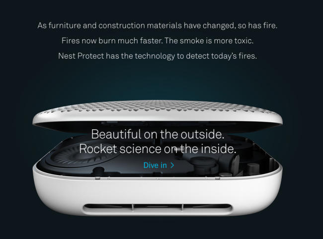
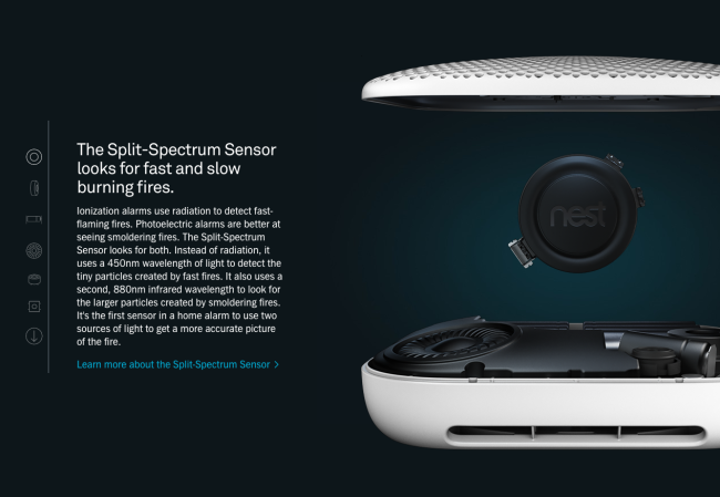
They also happen to have killer animation artists to make it even more attractive. It looks very much influenced by the now classic page for the Mac Pro.
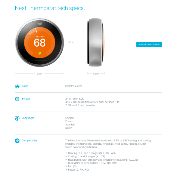
And don't forget the precise tech specs:
16. Tell them they're going to be fine
At the opposite of the spectrum from the techy people asking lots of questions, there's people who don't know much about technology and who are afraid it's going to be way too complex for them to get this thing working.
If you're selling a product that's not trivially simple to install, that's an objection you're going to face, and need to anticipate and address.
And that's how Nest does it:
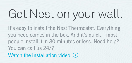
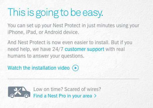
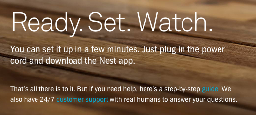
They actually have a whole page dedicated to installation and tech specs called "Install & Explore" that accompanies the other landing page that covers the main benefits.
