Is your landing page good enough to get into Y Combinator?
50 short lessons to improve your startup landing page
Twice a year, Y Combinator incubates a new batch of startups.
They're considered the cream of the crop of the startup world. A few of them go on to become billion dollar companies.
In a 2006 article, Paul Graham, founder of Y Combinator, explained what he considers to be 2 essential elements to grab attention on a startup website :

There are two things you have to do to make people pause. The most important is to explain, as concisely as possible, what the hell your site is about. How often have you visited a site that seemed to assume you already knew what they did?
The other thing I repeat is to give people everything you've got, right away. If you have something impressive, try to put it on the front page, because that's the only one most visitors will see. Though indeed there's a paradox here: the more you push the good stuff toward the front, the more likely visitors are to explore further.
How do you think Y Combinator startups fare?
Well, with a hundreds of startups every year, you're bound to see it all.
The good, the bad, and the ugly.
I looked at last summer's batch of startups (I felt it was a bit unfair to take startups with pages that were too young), and here are some lessons you can take home to improve you own startup's landing page.
1. Don't Use Automatic Sliders (a.k.a. carousels)
This one is starting to get a little old.
Why do you people still use sliders? Are you trying to make me go nuts?
Just a quick recap :
- Animated carousels are perceived as ads and viewers intuitively skip them
- They tend to be buggy and display poorly across browsers/devices
- They try to fit in too many vague messages which makes for unclear communication
- Plenty of damning case studies (YES I KNOW it doesn't mean it couldn't work for you, but still) show bad conversion performances
If you've got one, try to ditch it, just as an exercise. That will force you to make your message that much clearer.
Sliders are bad enough when they obfuscate the main value proposition of the startup, but they pop up in other places too.
For example, here's a slider that contains social proof in the form of clients the startup has worked for.
GetScale's got a bunch of clients... Why don't you take a seat and wait to see them all?
But do you really expect people to wait and see all the logos, and products of the clients you have? Or click to go faster? Just show all them at once.
You can find ideas for alternatives to carousels in this article.
2. Your Customer Is The Hero, Not You
What many startup landing pages look like.
What they should look like. Emphasis is on the customer, not the company.
Much like what Paul Graham explained, the first thing people see (which shouldn't be a slider, by the way) shouldn’t be a big logo with a meaningless strapline.
The hero section of your landing page is prime real estate. It accounts for a large part in the first impression you're going to make on your visitor.
So you don't want to waste it.
Showing a bigger version of your logo doesn't make what you do any clearer.
If you’re a startup, nobody knows you and your name means nothing to people who come to your page.
So explain clearly what your value proposition is right away.
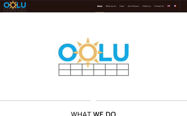
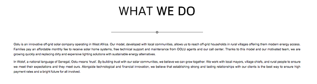
Wanna know what Oolu does? NOPE! Better look at the beautiful logo... Twice.
As a rule, don't use your company name as a headline, because it doesn't explain anything, or show any value.
Nobody knows who you are (yet), guys.
You need to interest us in what you do, what you can do for us and your clients, and THEN maybe we’ll try to remember your name. Before that you’re just ego stroking.
Keep the ego stroking for your memoirs. Talk to your customers.
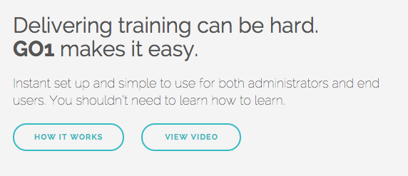
Take a look at this for a simple take on what a clear first impression should be:
Shoot for something like that. It's not always possible to distil a complex product down to a 5 word headline, but give it a try.
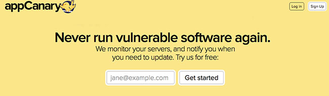
3. Make Your Value Proposition Crystal Clear
I know, I just talked about that. The point bears repeating.
If you're offering a new, innovative product, people will need to first understand what you're doing.
That's why your headline should explain your value proposition succinctly.
See how Sam Altman emphasizes the importance of clarity in his Startup Playbook:

We look for clear, concise answers here. This is both to evaluate you as a founder and the idea itself. It’s important to be able to think and communicate clearly as a founder—you’ll need it for recruiting, raising money, selling, etc. Ideas in general need to be clear to spread, and complex ideas are almost always a sign of muddled thinking or a made up problem.
Here's a handful of good examples :
Each of them gives you the main benefit for using their product.
It leaves no ambiguity whatsoever about what you can achieve by purchasing their product.
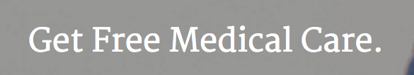
Make sure your value proposition really captures something people want.
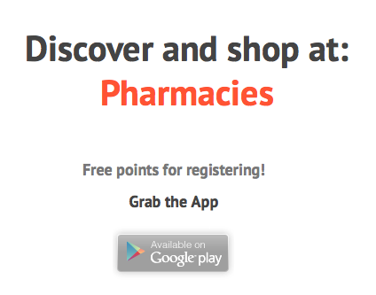
Do people REALLY want to “discover” pharmacies? Hey, you ever heard about Pharmacy Inc. on the corner of Streets X and Y? Their aspirin is rad.
4. Don't Use a Slogan As Your Headline
I'm really hammering this one home, aren't I?
We just saw what you should try to do, now here's what you should try to avoid.
Don’t try to be cute, “creative” or clever when coming up with your headline.
Start with something clear and simple. It’s harder than it looks.
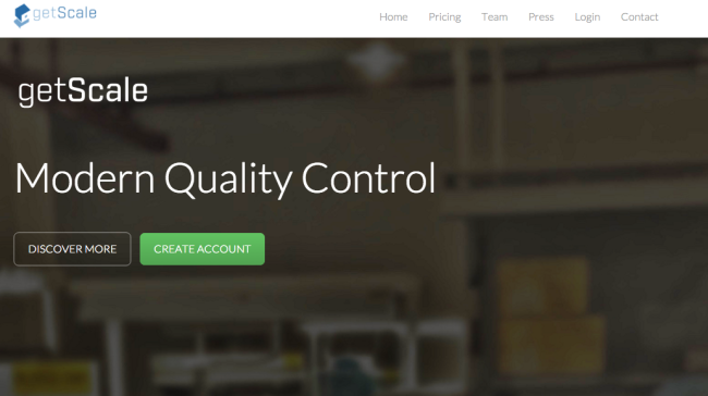
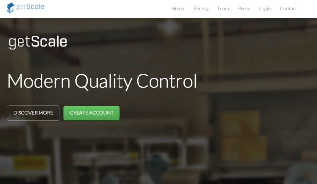
Typical case of a slogan used as a headline.
"Modern Quality Control" doesn't tell me anything about what getScale does concretely. What's modern about it? Why should I care?
Similarly, you want to avoid grandiose claims that are hard to live up to.
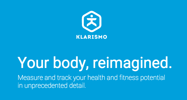
A revolution in biology, or just another fitness app?
Slogans have their place, but it's generally in small print near your logo, or at the end of your TV commercials when you'll be able to afford them.
To explain what a yet unknown product is and what value it can offer, it's best to avoid them.
5. Don't use buzzwords
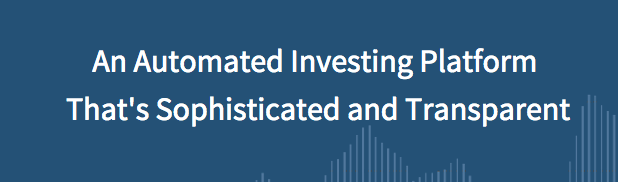
The only thing that should be described as "sophisticated and transparent" is lingerie.
Avoid buzzwordy and vague language like the plague. Being specific is key if you want to be clear.
"Platforms" and "solutions" generally don't mean anything.
Talk about what the product actually does. Yes, I know it sounds stupid and obvious.
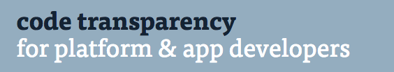
While some developers might understand what you mean by “code transparency”, not all of them will, and more importantly, it doesn’t tell us anything about the benefits of code transparency.
Why would platform & app developers be interested in that?
That's what you should be talking about.
Come on, guys.
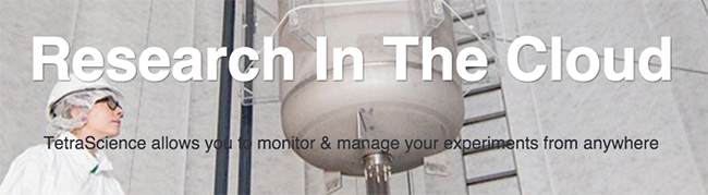
Being "in the cloud" is about as differentiating a feature as a computer working "on electricity" these days.
6. Avoid conflicting calls to action
4 calls to action on the same page — a little hierarchy could help
I know some of these pages are actually home pages rather than proper targeted landing pages, but it's probably a good idea to maintain at least a hierarchy between your calls to action.
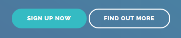
A simple way to prioritise your calls to action through design.
What's the main action you want people to take on your website? What are secondary, less important actions?
The ideal to aim for is to have a single purpose page, with a single call to action, to create a 1:1 attention ratio.
The more links, the more chances for people to follow the "wrong" one and go on a tangent and never see what matters about your product.
7. Don't just fill a template randomly
Templates are very useful to get a landing page done quickly.
But you should still take some time to understand how the template you pick works, and why its elements are located in certain spots, and what their role is.
Because you see a template that features logos at some point doesn't mean you should just put any random logo there.
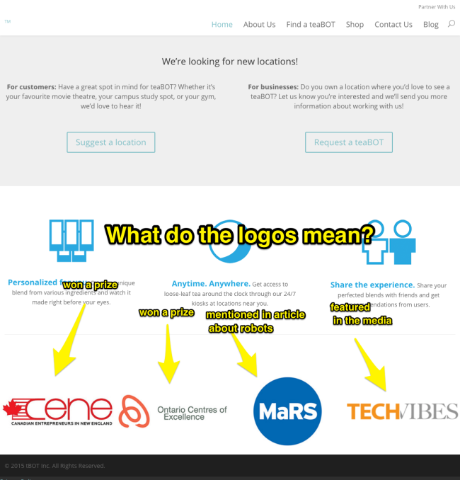
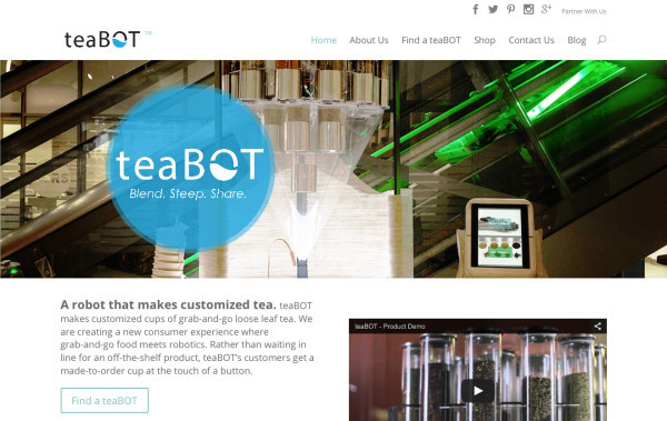
If you're going to use logos, explain what they mean : are they satisfied clients ("They all love teaBOT [insert logos]")? Places where the product has been mentioned in the media ("As seen on [insert logos]")? Organizations that gave the startup a prize?
Not a big change, but it goes a long way in making your presentation clearer.

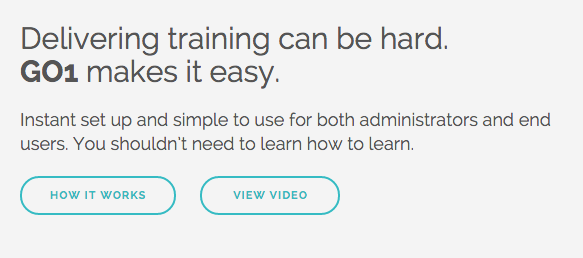
8. Make it obvious when there's a video
If you bother to make a video, you want to make sure it doesn’t go unnoticed.
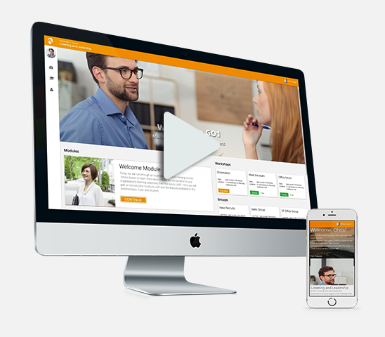
Do you find the play button easy to see here?
How about here:
I frankly completely missed it the first time I visited the page.
It's tiny, it looks like other round design elements, and there's no text call to action to tell me to watch the video.
Now that's a lot more obvious design-wise.
Don't forget you can simply add a bit of text above or below your video to ask people to watch your video, or use directional cues like arrows to point them towards it.
Also, remember that some people STILL won't ever watch a video, either because they don’t like video, or because of the context — they could be on a train or at work without headphones and not want to bother people nearby.
So make sure your whole message is contained in text form somewhere on your page.
9. Make sure your copy passes the "so what" test
The "So What?" test is a pretty nifty tool used by copywriters to gauge whether a piece of copy deserves to stay on a page.
I learned it from Joanna Wiebe at CopyHackers (check out her stuff), but I think it originally came from copywriting guru John Carlton.
The idea is quite simple.
You don't want to just tell me what your product is. You want to tell me why I should care.
Take a look at this example:

Great.
So what? You're not telling me why I should care about it. Why would my company want to buy one? Why would I bring my friends to a place that has one?
Another way to think about it is that on a fundamental level, your copy must answer the question: what's in it for me?
Where's the value?
10. Make sure you're talking to someone with b.A.N.T.
Bistrobot makes robots that prepare food.
I guess that sounds pretty cool, but who's going to buy that?
Restaurants. Businesses. Various organizations. Probably not individuals.
Here's how they describe their product:
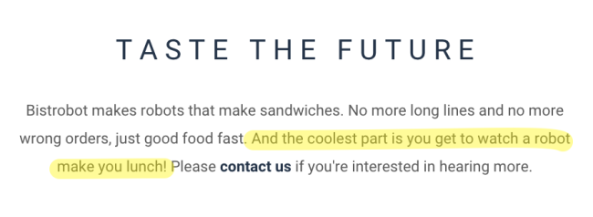
But... That speaks to the end users.
I'm sure lots of people would find it fun to watch a robot prepare their lunch. But they're not the ones buying the product.
You need to think of who you're really trying to convince.
Think about it.
When you're selling toys, who are you really selling to? Kids, or parents? Do they respond to the same arguments? Doubtful.
Take a look at this other example:
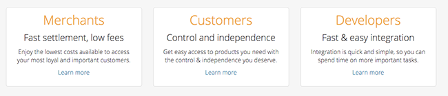
Serica is a payment processing platform. On their home page, they segment their users into three categories: merchants, customers, developers.
Now, who's going to buy services from Serica?
Probably not customers. Customers aren't the ones who are going to decide on the payment platform. They'll use what the merchant picked and is most convenient.
Serica's goal isn't to convince buyers to use their services, but to convince merchants, first and foremost.
(Of course, when customers are offered several options, they'll need to prove they're better, but that's putting the cart before the horse).
A helpful framework here is the BANT formula commonly used by salespeople for lead qualification. To make sure you're talking to the right audience, your audience must satisfy the BANT criteria :
- Budget: the people you talk to have enough money to buy what you're selling
- Authority: the people you talk to call the shots, they're the ones who decide whether to buy or not (parents vs. children), they are the "economic buyer"
- Need: the people you talk to have a real need for your product
- Timing: the people you talk to are the ones who need your solution the most, now
Like all formulas, it's not perfect, but it helps you think about your audience and ask yourself useful questions.
11. Don't write meaningless B.S. and banalities
It can be tempting to come up with a very pithy headline.
Most of the time you'll just come up with something bland that won't tell the reader much about your business.

Taste the future?
Why? What does that even mean? Does the future taste good? Are we talking about a drink? A meal? It could be anything.
Yeah... How about you tell me what that means first.
Be specific about what you're offering. People don't have the time to figure it out themselves.

It’s precisely because my time is valuable that you shouldn’t tell me things like “Your time is valuable”.
I already know that. Get to the point.
12. Make your call to action visible
Your landing page will most likely have a button that corresponds to your main call to action (try our software, request a quote, download our app, whatever).
You want to make that button as visible and clear as possible:
- Use a contrasting color that separates the button from the background
- Use a legible font at a legible size (not tiny Comic Sans)
- Make the button large enough
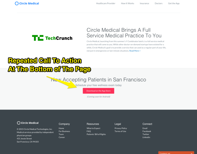
13. Repeat your call to action throughout the page
You don't want people to have to scroll back all the way to the top, especially if your page is long.
So just pepper your landing page with call to action buttons to make sure they only have to do the least amount of work to convert.
14. Reassure your reader, especially when trust is crucial

If your company works in healthcare or finance, trust is paramount.
People will just not put their health or their money in the hands of someone they don't trust.
It's fundamental that you provide trust elements that are relevant and persuasive.
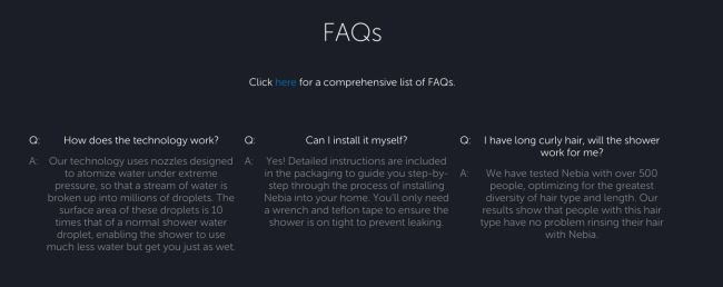
15. Anticipate and answer all objections
Your landing page does the job of a salesperson, and as such, it must know how to answer objections.
The easiest way to do it is by using an FAQ, preferably near your call to action so that people can be relieved of their doubts before they act.
But it's even better if you answer objections right as they pop in the mind of the reader.
You need to anticipate what the reader is going to think, and present him the evidence that will satisfy him.
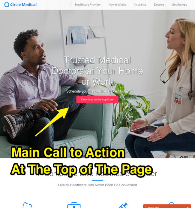
In the case of Circle Medical, the first question their would-be customers ask is probably: will it work with my insurance?
And boom:
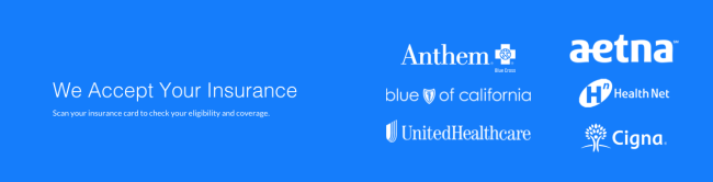
It's great that they anticipated that and answered the question right away, before the reader even has the time to worry about it.
16. Don't ask for too much too early
In other words, don't put a call to action before you've told your visitors what to expect.
People aren’t going to sign up for a product they don’t understand.
You often hear that you should have a CTA before the fold.
First, this is false.
Second, if you want to have a CTA before the fold, you still need all the other elements that come before the CTA to come BEFORE it.
You need to explain what the product is, who it’s for, etc. You need to cover AID before you can reach the A (or whatever your favorite copywriting formula is).
Take a look at this:
Who is going to click Create Account based on the information provided before that call to action (namely, none)?
My guess is not many.
17. Don't use boring iconography
Most startup landing pages use boring, generic, non-descriptive icons to illustrate their features.
Raise your hand if you've seen a cogwheel icon used to describe a feature.
Yep, that's right. Everyone.
And yet it's really the modern equivalent of using clip art drawings in your Powerpoint presentations.
If your images don’t explain anything and don’t show anything, how about you ditch them or think of something better?
Of course, it's possible to do a lot better with a little bit of effort.
Take a look at what Ohm did on their page:
Similarly, because you're a "cloud" service doesn't mean the logo of your company should be a damn cloud.
Does every electrical appliance use a spark or a plug as their logo? Does every physical product use an atom logo? Come on.
A common problem with tech startups is that they figure that because they use technology to solve a problem, it means it’s the technology that’s valuable. It isn’t. What’s valuable is the fact it’s a solution.
People couldn't care less that you're using a cloud in the background to do your business.
18. Pick a name people can pronounce
Picking a good name for your startup could be the subject of a complete article, but here we're mostly concerned with avoiding the most egregious mistakes.
How do you pronounce "Ixchel"? Apparently, not the way you think.
It's Ish-tshell.
That means that when you tell people the name of your company, they're likely to never find your website when they look for you on Google.
19. Make sure your page has a call to action
Even though the call to action may be the last thing the visitor will see, it's probably the first thing you should think about.
If your page has no call to action, it's pointless.
Why did you create a website in the first place if you don't want people who read it to do something?
You created that page expecting people to do WHAT when they get there? Then tell them to do that!
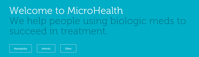
What do you think MicroHealth wants from their visitors? Very unclear.
Let's scroll a bit more.
Hum. Okay. Still don't know what they want. Let's see the end of the page.
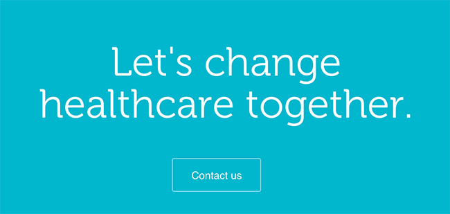
That's it? But why would I want to contact them? To change healthcare together? Come on.
If you only looked at that, you would completely miss what their product is.
20. Speak to your client
A mistake people often make in communication is to talk in general terms, without talking to their audience.
Luckily, it's very easy to fix that problem.
Just use the word YOU.
Write your landing page like you're speaking to someone, and tell them what they will get from your product.
Don't tell them about you. People don't care about you. They care about themselves.
21. Don't be a smartass
Any idea what these guys do? I sure don't.
Keep the big words and the latin for r/iamverysmart.
Just tell people what you do, and what you can do for them. There's no need for such plaisanteries.
When you have to pick between clever and clear, try to be clear.
22. Tell people when they need to scroll
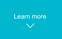
Full page background images are all the rage, but there's a little problem with them: false bottoms.
If you don't want people to bounce after they've seen your beautiful background image, you better tell them there's more to come.
You can do that with a text link telling people to "Learn more" or with arrows pointing downwards (or both).
23. Don't just make statements, show value
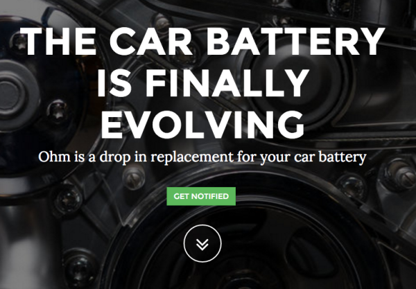
This is the kind of headline that does not pass the "so what?" test.
The car battery is finally evolving? So what? *crickets*
Why would I want it? What's so great about the new evolution of the battery?
Is that so? So what? How does that concern me?
Readers who do not immediately perceive something of value to them will completely skip that kind of copy.
Does it? So what do you expect me to make of that information?
24. Don't show social media numbers if they're not good
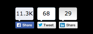
Ever read some blog where every article had ZERO comments, and a measly 5 tweets or Facebook share?
How did that make you feel about it? Did it make the website look more authoritative? Probably not.
The point of showing your social media stats is to create social proof. By leveraging the bandwagon effect, you hope that people will buy more of your product because, hey, those 200,000 Facebook likes must be something, right?
But if you've got TWO tweets, it probably means... your product isn't up to snuff.
So, be careful with how people will interpret your numbers.
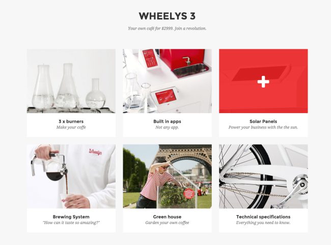
25. Don't hide content people want to see
That might seem obvious but apparently it isn't.
As Steve Krug says, you just don't want to make people think. Just show the content right away. Don't make me click. Don't make me think.
WheelysCafé want me to click on each one of these boxes to see each feature.
Why not just describe each feature on the page right away?
People on the internet are lazy, so you want to make sure you make them do the least effort.
In the case of an FAQ, people will not always be interested in answers to all the questions, so it kind of makes sense to hide some of the answers so they can scan questions faster.
But you could achieve the same thing with a little bit of design help :
26. Make your stuff legible
Text is a big part of the web, and it's crucial that you make it legible.
Ready? Here comes the tiniest type setting lesson ever.
Make your text big enough
If you expect someone to read this paragraph of text, you're NUTS.
What you should aim for is to reproduce the experience you get from reading a book or a magazine.
Bear in mind that your monitor is sitting further away from you than a typical book when you're reading.
That means you must use a larger font size than you would in print.
Make your text thick enough
You can thank Apple for making thin fonts all the rage, but the fact is that thin fonts, except in titles, are harder to read.
The text almost seems to fade into the background. And now the same with a more sensible font weight:
Make your text narrow enough
Example of type set too wide
To be legible, text must be set in columns that are quite narrow.
Typographer Matthew Butterick recommends you:
Aim for an average line length of 45–90 characters, including spaces.
Make your text contrasted enough
If you're using light text, make the background dark. If you're using dark text, make the background light.
Something else you want to avoid is busy backgrounds, especially with text. Text overlapping text is just painful to read.
Make your text left-aligned
Centered text is a pain in the butt to read. Just align your text to the left. Don't let your designer tell you it looks prettier centered.
27. Try inverting your headline and subhead
Very often, startups try to come up with some something pithy, funny, witty, or clever for their headline.
But they feel like something's missing and they add a subhead to explain what they're doing a little bit more.
And guess what?
Most of the time, the subhead is actually a much better headline.
Take a look at this headline/subhead from Xendit :
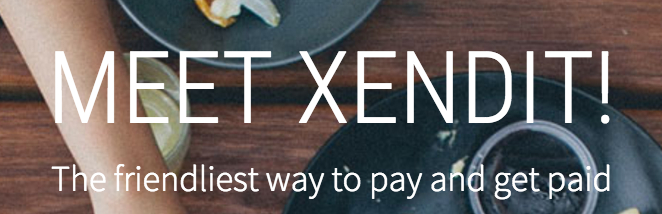
"Meet Xendit" falls squarely in the category of egocentric headlines that talk about the product or the company and completely forget about the customers and what they want.
Nobody wants to "Meet Xendit" before they know what it is.
But "The friendliest way to pay and get paid" is more interesting. It offers something that seems valuable.
Even better, further down the page is a headline that not only explains what the product is, but that gives something that seems particularly interesting:
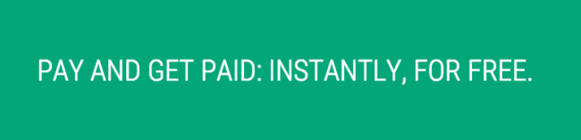
Wait, the product is FREE? And you didn't think of telling people that before?!
28. Explain why I should buy your product
If you don't spell it out, many people won't understand why they should buy your product.
You should never assume they're going to figure it out if it's not explicitly stated somewhere.
That kind of copy is called "reason why copy" (you can guess why), and it provides persuasive elements to the more rational readers.
It's generally admitted that people are more influenced by emotions than by reason when deciding to buy something.
But the reason why copy serves as a justification for the purchase decision.
29. Reassure people when they’re about to take action
It's important that you spend some time on calls to action and their direct environment.
After all, the call to action is the whole point of your landing page.
Readers who are about to click your call to action are presumably interested in your product.
They've most likely read a good part of your landing page — enough to want to proceed.
That's why you want to comfort them in their decision, and tell them that they can proceed safely.
You can do that by reinforcing the benefits of your product close to the call to action, by adding proof that supports the decision, or by lowering the risk.
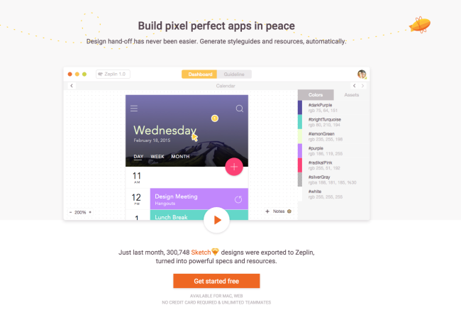
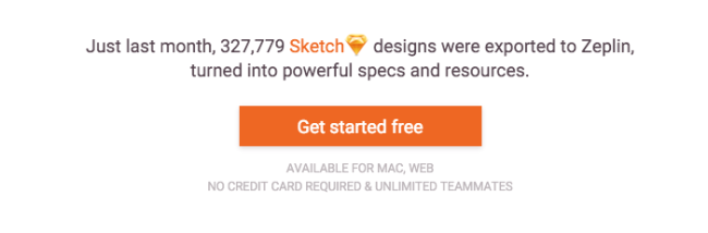
Take a look at this CTA from Zeplin:
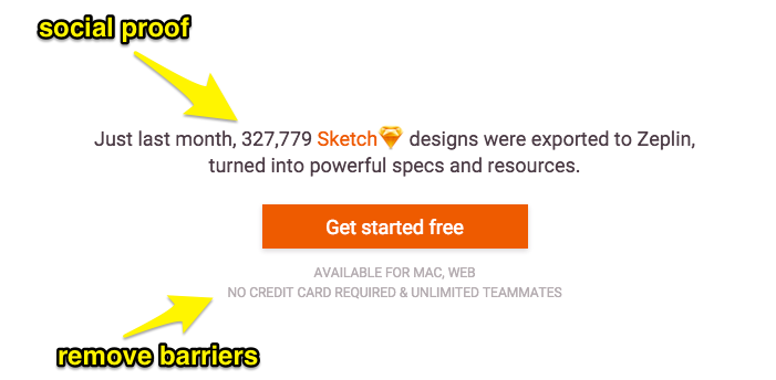
Many people already use the product, so you can't go wrong ("Nobody got fired for buying IBM", as the saying goes).
It's available on all platforms, so there won't be any technical issue to run it.
You don't need a credit card, so it's not a scam.
And "Unlimited Teammates" repeats one of the benefits of the product.
The whole CTA area basically acts as a tiny summary of all the stuff you saw on the page, with its own benefits (free, unlimited teammates) and justifications (social proof, no credit card).
Take a look at this article for more "click trigger" ideas that will improve your calls to action.
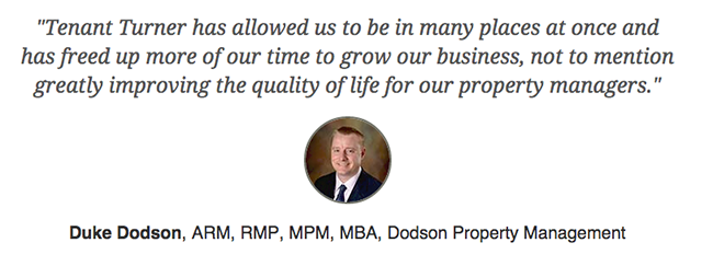
30. Give Testimonials The Attention They Deserve
You can only convince people so much about your own product.
At some point, people are going to wonder what others think about your product.
That's where testimonials come in.
But be careful. Testimonials aren't just a box you need to check on your way to a perfect landing page.
You need to treat testimonials just like the rest of the sales copy on your page.
That means your testimonial needs:
- To speak about the value of your product, in as specific terms as possible. It's not about how great your company is, or how nice the founders are.
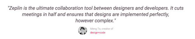
- To be believable. It needs to come from a real person, with a real name, a real face (use pictures), that is preferably well known within the community your product will serve, that has an occupation that is similar to that of your readers.
The specificity criterion can't be overstated. Take a look at this example:
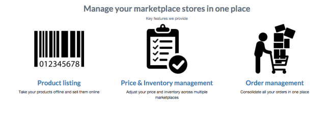
These are some of the features and benefits offered by Branch8. Now take a look at their testimonial:
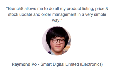
Notice how it repeats exactly what the benefits are? Sounds a little convenient (i.e. fake), doesn't it?
You don't want your testimonials to just restate what you said yourself on your page.
You want the testimonials to illustrate, preferably with numbers, the concrete results obtained by using the product.
Branch8's second testimonial is much better in that respect:
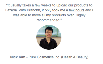
Now that's a concrete, quantitative benefit. It cut down the time needed to perform a particular task from weeks to hours.
Your testimonials must also look like they come from real people.
I know, it's obvious, but then why do I still see things like this:
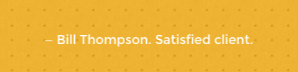
Satisfied client? Meh.
Testimonials are probably better than no testimonials, but don’t half-ass it.
Get pictures. Get their occupation, the name of their company, their location if it’s relevant. Show me I can trust they are real people.
31. Leverage Social Proof
Social proof is probably the most famous of Cialdini's 6 "weapons of influence."
If you haven't heard about the concept, it's pretty simple:

We view a behavior as correct in a given situation to the degree that we see others performing it.
So, to leverage that bias, the idea is to show that your product generates traction so that people see it as more valuable.
The most common way to do it is just to show how many users your product already has (especially if it's a big number):

But you can show other statistics that show your product enjoys some popularity:
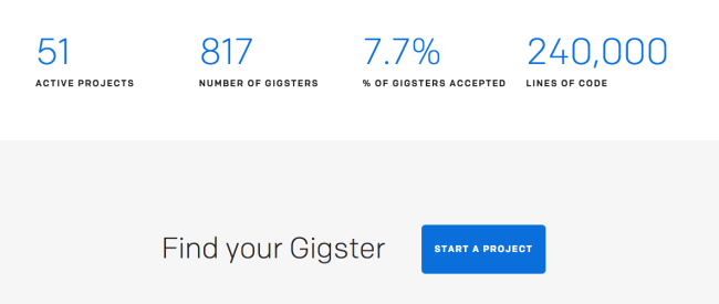
By the way, try not to pick numbers that are too "round". The more precise the number, the more believable it will be.
How likely is it that Gigster projects amount to exactly 240,000 lines of code?
Not very.
So, you either want to find some way to make the number more precise and believable (for example by making it dynamic), or you want to use the trick above and say "over 150,000".
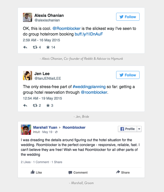
32. Use social media as social proof
You can try to use social media mentions as testimonials.
What tweets have going for them is that they're going to be seen as more authentic. You can't fake an embedded tweet coming from Alexis Ohanian.
33. Make your social proof believable
If you're going to use social proof, don't half-ass it.
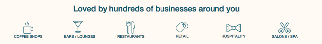
If you're loved by hundreds of businesses, then surely you can name some of them?
Maybe put some of their logos?
34. Explain how your product works
You can't make too many claims, especially when they're hard to believe, before people start to wonder how you propose to deliver on them.
When you see something like this:
Your first instinct is most likely not to think: AWESOME.
You're not thinking: Why didn't I think of doing that before?
You're probably thinking: That's too good to be true, where's the catch?
That's where How it works sections are the most useful.
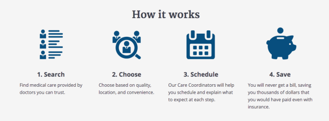
Now, this particular example doesn't answer all my doubts.
How I'm going to use the service is pretty clear, but how does CareLedger intend to deliver the benefit?
There's a common confusion about "How it works" sections: it is that they are the "instructions manual" for the website.
They're not.
They're meant to explain how your startup intends to deliver the benefits, so that the reader can see your offer makes sense.
When dealing with subjects like healthcare and finance, it's imperative that you show people can trust you, and that means that you must be able to explain how you're delivering your benefit.
But it doesn't have to be complicated:
It’s as simple as that. Explain the mechanism behind the product, and it will be seen as more trustworthy.
35. Don't assume people know who you are
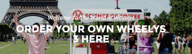
Take a look at this:
So? Are you ready to order your Wheelys 3 just yet?
I for one am not, because I have no idea what a Wheelys is, or why I would want one.
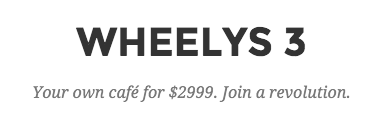
Now here's something interesting.
Start your own café for $2999.
Wouldn't that be much clearer as a headline? Wouldn't it actually tell us what we can do with the product?
(By the way, why call it Wheelys 3? Were the first two ones worldwide successes that require you to differentiate the new one?)
36. List your features/Benefits using... lists
If you’re going to describe the details of your product, a list is easier to parse than a block of text.
Which one is clearer here:
The text paragraph, or the bullets in the video (No mercury. 50,000 hours. Shatterproof. 5 year warranty.)?
37. Prove your claims, make them verifiable
Proof is an essential element of a good landing page.
Yet it's strangely missing in many of them.
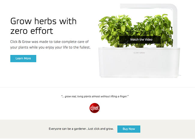
Take Transcend Lighting, for example:
If you say you’re the "world’s most efficient" something, you need to prove it conclusively.
If you say you have a “proven product”, you need to show the proof.
If Transcend Lighting can grow my plants better, show me examples of people who have grown their plants better using Transcend Lighting.
Otherwise it just comes off as hype.
The more hypey your copy, the earlier the proof needs to come in.
Same when you're describing the benefits of your product:
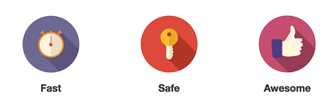
So your product is fast, safe, and awesome?
Am I supposed to take your word for it?
It's fast? Well, how fast? Compared to what?
How safe?
Awesome? No kidding?
I keep repeating it but: you have to be particularly cautious with your claims when you deal with people's health or their money.
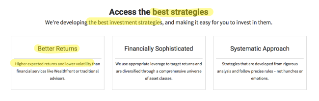
Notice here how "better returns" turns to "higher expected returns" within a few pixels?
That's a problem.
If you have the "best strategies" and you promise "better returns", they better materialise at some point or people are going to call you a scam.
Where’s the track record that proves you’re going to provide better returns? Why should I believe you?
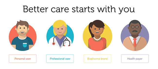
38. Talk to a single audience, or segment early
Do you now? Can you help me fix my car? Build a house? Didn't think so.
You shouldn't think of a landing page as a website. More than anything else, a landing page is a message.
It's communication.
And in communication, if you want to be understood, your message must be targeted to a precise audience.
The more different audiences you try to address at once, the more muddled and irrelevant your message becomes, and the less likely you are to convince anyone.
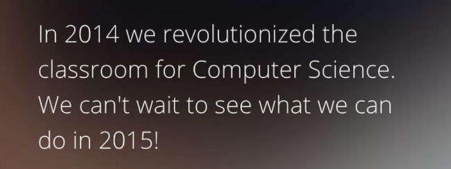
You don’t want to speak to EVERYONE, because few products appeal to everyone. And a platform to build computer science courses sure as hell doesn’t appeal to everyone.
So, how do you do that?
The ideal situation is to have many versions of your landing page, each targeted for a different audience.
For example, your AdWords campaigns target different keywords, and each of those keywords represents a different intent. So you match each intent to a landing page that builds on that intent.
But the ideal situation isn't always possible, because it's not always obvious how to segment the traffic before it comes to your landing page.
What you can do then is have your audience segment itself by choosing what they're interested in themselves:

39. Don't mess up your forms
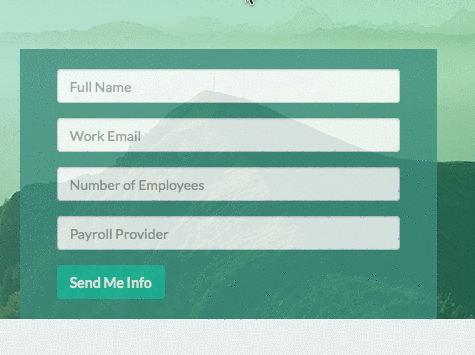
If the main job of your landing page is to collect leads, you probably want to make sure your form has some kind of validation to avoid people entering incorrect data.
What if someone made a typo in their email with the form above?
You'll never be able to contact them, and it'll be as if they never came to your website.
40. don't try to trick the reader
What would you guess the two buttons on this page do ?
One of them offers you to "learn more" while the other one lets you "buy now."
So, the first one probably gives you more details about the product and its features, while the second one is for people who are sold and want to get one now.
Except... Both buttons lead to the exact same page. A product page with a button to buy the product.
Probably not what the visitor expected. People who want to learn more need more information before they make a decision. Taking them to a page to buy now is going too fast for them.
If you don't want to go against the expectations of the reader, just make your CTA do what it says.
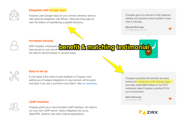
41. Match your testimonials to your benefits
It’s nice to have testimonials, but what’s the best place to put them?
The best place to put them is to put them when the reader wants them.
For example, just after you make a claim about something and the reader starts wondering "Oh yeah? Prove it!"
42. Phrase your benefits with active verbs
Benefits are all about what the customer gets.
That's why you want to phrase them using active verbs, like that:
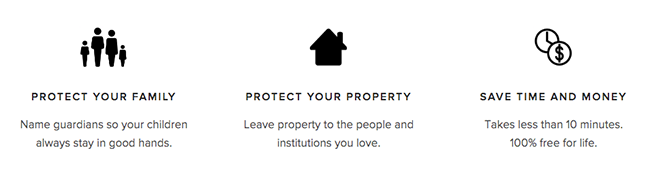
(We'll see later why "Save time and money" is lame as a benefit).
43. Make it look good on smaller screens
Your website has to look decent on mobile and tablet these days.
You don't have to do anything special about it as long as it's legible, but if you've got a good designer around, he'll probably know how to exploit the addition real estate you get on the desktop.
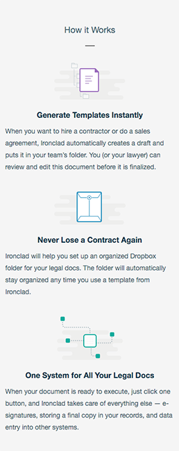
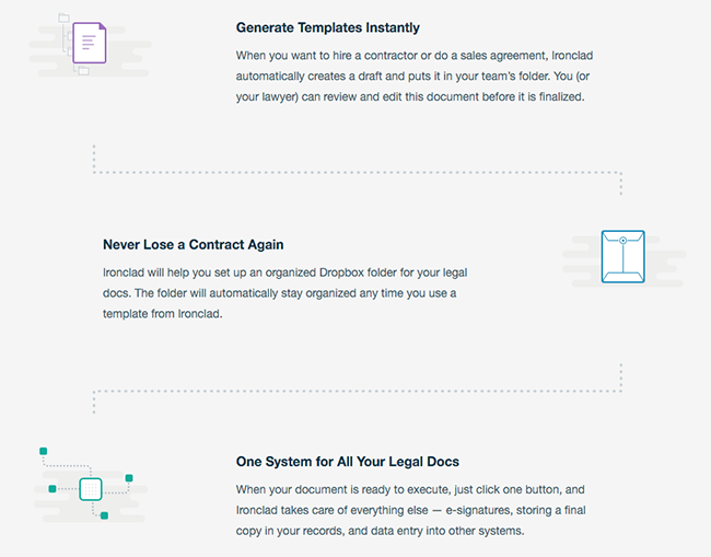
When seen on a desktop, IronClad's feature section expands and adds design elements that help guide the eye flow of the reader with a path.
44. Make the experience frictionless

Don't hesitate to remind your prospect how easy working with you is going to be. People are suckers for "quick & easy" ways to do stuff.
Why do you think get-rich-quick schemes are so successful? (No, I'm not saying you should scam people.)
Because people don't just want a solution to their problem. They want it now.
45. Make your benefits as simple as possible, but not simpler
You want your benefits to be as clear as possible so people understand them immediately and they don’t scratch their heads for 10 minutes trying to understand the value of your product.
For example, look at this:
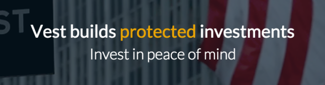
Mmm okay. It's short. But what's a "protected investment"?
The risk here is that by trying to be concise, you become too concise.
And when you follow that with a section called “What Vest means by “protection”" that links to a lot of small print, you’re starting to sound like a shady financial product salesman who redefines things to hide something.
Coining a new term, creating a new category is the wet dream of any marketer. But be careful not to raise doubts in the reader's mind.
Be simple, be clear, but be transparent.
46. Remove ambiguity
Take a look at this landing page headline.

What would you think if you read that?
That it’s some service you can use if you need a lawyer, obviously. Right? Or maybe it's for law firms who want to hire better lawyers?
WRONG!
It’s actually a product FOR lawyers who want to speed up their research by using AI.
ROSS is a digital legal expert that helps you power through your legal research.
So why not just say that? "Power through your legal research." Boom.
47. Experiment with video/animation
If there’s one thing you should know about landing pages, it’s that you should never been too dogmatic.
I generally HATE background videos.
They’re distracting and I feel like I can’t focus on the text below while a video is playing.
But experimenting with things out of your comfort zone is the only way to go and grab additional clients.
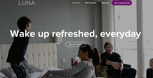
Luna uses a video background on their home page.
It’s all about experimenting and pushing your own boundaries to find things that WORK.
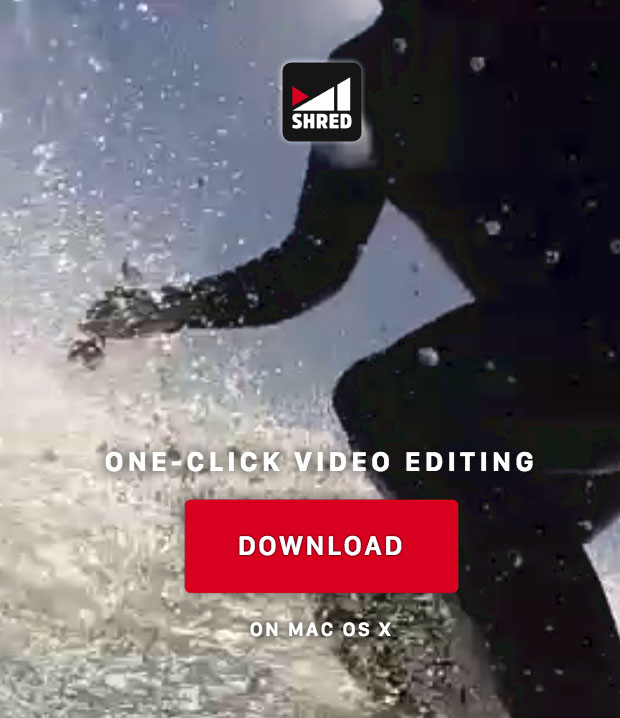
Shred here is a video editing product, so it probably makes sense to have video somewhere, so why not try a background video?
If I were Shred though, I would probably be biased in favor of video, and would do the opposite and experiment with a static page instead to compensate my bias.
48. Offer a quick demo
Although free trials have become kind of a de facto standard for startups, offering a live demo can be more effective if it’s done by a good sales rep.
It does create more friction, so if you want to go with it, you probably want to make the demo sound like it’s going to be short.
49. Use pictures of “real people”, i.e. not lame stock photos
You've probably witnessed enough terrible stock photos of people in suits, shaking hands in conference rooms, laughing hysterically over their last Powerpoint presentation.
So you know why stock photos look bad.
So don't use them.
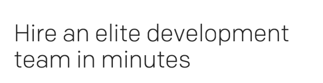
50. Offer a quick & easy way to the benefit
We mentioned how "quick & easy" was a powerful argument earlier with respect to UX ("Sign up in minutes"), but it can be more deeply involved in your product.
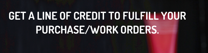
Think about this, for example.
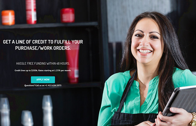
When people need a line a credit and they’re actively looking for it on the internet, they’re probably in a crisis.
They need the money NOW.
That’s particularly true for that kind of a product, but it’s true for many products.
People don’t just surf the web looking to buy stuff they might like.
When they’re looking for something, it’s because they’re in a situation that prompted that need, and they need the solution NOW.
So if you can not only deliver a benefit, but deliver it fast, or faster than your competitors, make sure people know it.
