Ramit Sethi's super simple & super effective lead gen template

If you don't know Ramit, quick intro:
- That's his face.
- He created I Will Teach You to Be Rich and is one of the most successful bloggers and marketers in the finance and business niche in the last few years.
- He's created over a dozen products in that space in the last few years, on anything from how to start or run a business, find a better job, get more productive or manage your money better.
- To sell his products, he generally gets people to 1) sign up on an email opt-in form, 2) funnels the sign ups through an email sequence, 3) and then sends them to a long form sales pages.
- What's interesting is that he uses the same landing page template for pretty much all of his products.
That's what his million dollar template looks like:
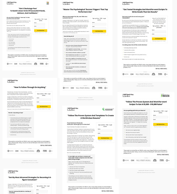
Not impressed?
Who cares! It seems to work like gangbusters for Ramit, doesn't it?
Here's what Ramit has to say about it (emphasis mine):

For landing-page conversion, the MOST impactful thing you can spend your time on is truly getting in your customers' heads.
Specifically...
Your headline: Does it speak to them? Is it compelling? Is it clear?
Your copy: Do you use the same words they do? Do you address the challenges they face? Do you show them the end result THEY want?
Your offer: Is it easy to understand? Do they WANT it? What do they have to do to get it?
Notice that, in general, elements like design, length of copy, and colors aren't anywhere near the top 3.
With that said...the best landing pages TEND to have shorter copy because they have made their value propositions very crisp.
It may not look like much, but as usual, if you really want to understand what's going on behind the scenes, you need to take a closer look.
Here's a breakdown of a the key elements of Ramit Sethi's lead generation landing page.
Let's start with his headlines.
1. Teach something (the "how to headline")
Ramit seems to favor headlines that fall into three big buckets:
The first category, which is an enduring classic, is the "how to" headline.
Here's what they look like:


Nothing fancy here. Ramit sells a lot of educational products, and it makes sense that they should imply he's going to teach something.
A slight variant on the how to headline is to write a how to headline but remove the actual words "how to".

This could just as well have been called "How to Earn Your First $1,000." The goal is still to educate the reader about something.
If you're selling a course, the how to headline is probably your safest best.
2. Give something (the "get" headline)
The second way Ramit uses to get people to sign up is to promise to give them something. Again, nothing that blows anybody's mind, especially if you already know about lead magnets.
Just common sense, efficient practice.
Many headlines suck because people who write them don't think about what's in it for the subscriber?
And starting your headline with GET is a good way to force yourself to think about the value you're delivering. What are your subscribers getting from you?
Then tell 'em you're going to give them that.


3. Create a system (the "proven formula" headline)
If you're not completely blind, you've noticed that all of the previous headlines talk about "tested" or "advanced" strategies.
That's because people crave not just information and education, but clear guidance. If you can show that your product will not just educate them, but help them achieve something, that's a lot more powerful.
Ramit satisfies that need by using "proven formula" or "proven system" headlines, like so:


People like the security and the promise of guaranteed success.
By the way, notice how he puts most of his headlines in quotes? It's an old copywriting trick. Here's John Carlton explaining why it works:
A "sneaky little trick" indeed.
4. Start with a small commitment
Ramit sells product that can have pretty hefty price tags (up to around $11,000 for a year, yes eleven thousand dollars).
There's no way he could just buy a bunch of ads on Facebook and get people on his sales pages right away.
So what he does instead is get people started on a journey towards that goal, by doing a first easy step. Just to get the ball rolling.
His Earn1k course is about $100/month. But he doesn't go for the sale right away. Instead he gets them started with a free tool.

If you're thinking about selling a high ticket item, consider using the Ramit method.
5. Keep the form as simple as possible
As we said, the goal is to get the ball rolling for now. Not to close anybody on a big sale and ask for their CC number right away.
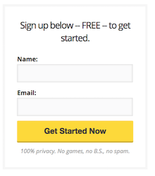
It's a well known rule of thumb that the longer a form, the fewer conversions you'll get (although there are some caveats, as usual).
Ramit only ever asks for two things: name, and email. That's it.
Many marketers with large email lists only ask for an email. It's kind of a tradeoff with personalization: if you grab a name, you can use the name in your emails afterwards, which can make you communication sounds more personal, and potentially more persuasive.
6. Remind them of what they're getting for signing up above the form
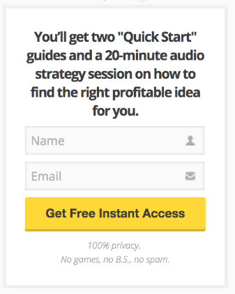
It's not uncommon to see "headless" sign up forms that are just a couple of fields and a button.
But a good practice here is to think of the signup form as a summary of the rest of the page. It must make sense on its own.
In particular, it should have its own headline to recap the main benefit the subscriber is getting.
Ramit's form here reminds the reader of exactly what he's getting for signing up: two guides and an audio file.
7. Make your CTA visible
As you might have noticed by now, the only thing that pops on that landing page's design is the call to action button.
If you take the squint test, you'll see what that means right away.
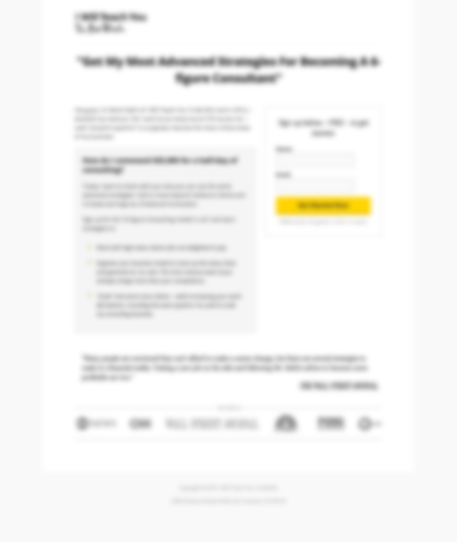
As Steve Krug puts it, the rule here is simple : don't make me think.
If you want your users to find your call to action, make it as obvious as it can possibly be: the two important aspects of doing that are to make it big, and make it colorful.
The rest of Ramit's page is in greyscale so the yellow stands out from the background. And the button is larger than his logo, so even the most eyesight-challenged readers won't miss it.
8. Ask questions that resonate with your audience's problems
Sometimes a good headline isn't enough to create the momentum you need for the reader to keep going through the rest of your copy.
A good way to follow up on the benefits of the headline is to hit on the main problem the reader identifies with in the form of a question.
An example will be clearer:
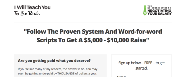
That's the top of the landing page for his salary negotiation product.
As we've seen above, the headline promises to give you a "proven system" to increase your salary. But maybe that's not enough to convince people to sign up just yet.
To lead people into the rest of his body copy, Ramit starts with a question: Are you getting paid what you deserve?
That question naturally leads people who feel they're not getting paid enough to read the rest of the copy. Questions hint at an answer, and create curiosity in the reader.
That's why they work so well here.

9. Keep your copy short
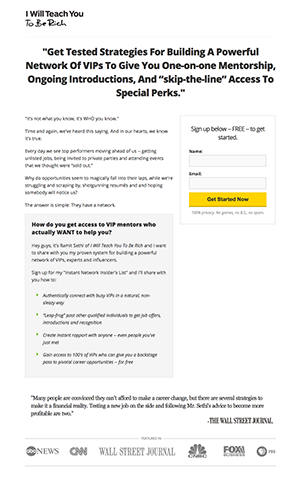
The whole point of pushing the sale back and to ask for a small first step is to avoid scaring people with a huge sales page and a product pitch when you barely know them.
The point is not to close the sale NOW.
So keep it short.
Most of Ramit's lead generation landing pages can fit in one screen on your desktop computer or laptop.
Three or four introductory paragraphs, a few bullet points, and that's it. Done.
Speaking of which.
10. Detail your offer with bullet points
Ramit pretty much always uses bullet points on his lead generation landing pages.
The reason is simple — bullet points work.
People like them.
They're easy to scan quickly.
And they're perfect to summarize the main benefits of an offer in just a few lines.
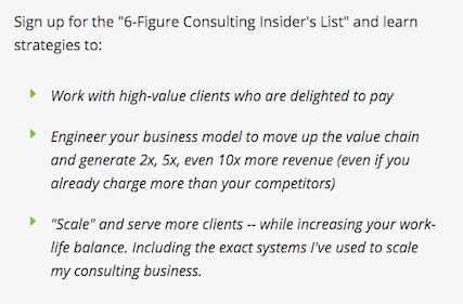
The important trick with bullet points is not to reveal everything right away. It's to hint at what will come with the product by creating enough curiosity to make it desirable.
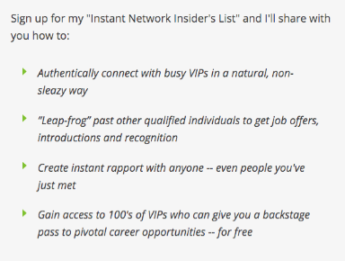
Take a look at the following bullets (they're from a slightly different template, but the point stands), for example "3 Embarrassing Interview Blunders that you probably don't even know you're making".
Well? Don't you really want to know what those blunders might be?
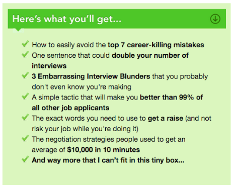
As mentioned earlier, the point of bullets is to summarize the offer, in other words, to list what you'll get. Just like it says at the top of the example above.
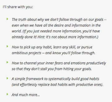
But in the following examples, Ramit introduces the bullets with "I'll share with you."
Typically, copywriters recommend not using introductions like "You will learn..." because learning can sound like a lot of hard work. And they prefer things like "You will discover", or simply, "You will get".
The idea here is the same, except it adds a bit of mystery, as Ramit will share what we assume are secrets.
11. Or remove risk with bullets
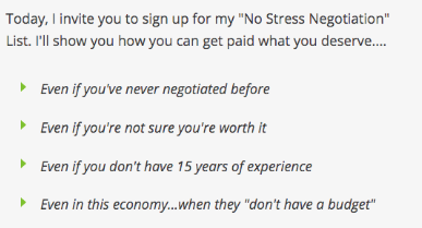
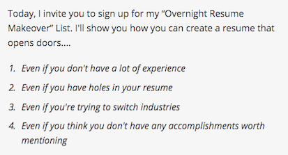
Another thing Ramit does with bullets is remove risks or doubts and answer objections.
To do that, you only need to use two words: even if.
If you've done a little bit of customer research, you'll know of the main objections people have to doing what you're suggesting.
Countering common objections is a good way to make your offer seem more valuable, because you're removing risk, and the prospect of painful moments.
12. Create an aura of authority with quotations and logos
Ramit uses the same quote and the same logos on most of his landing pages.
Here's what they look like:

Simple, isn't it?
Wait, but, how are you supposed to get a quote from the WSJ?
Or logos from big media companies?
Well. The good news is you probably don't have to.
Ramit sells products that have a wide appeal. Pretty much anyone could benefit from the information he gives about securing better jobs, or having a sane approach to personal finance.
That means to sound authoritative, he needs to rely on big, recognized brands like the Wall Street Journal.
But if your product is more niche, you need something that will sound authoritative to your audience. Maybe it's a specialized magazine or a famous blog, or simply someone famous in your niche.
Sure, it still requires some outreach, but it's more manageable.
