How Brennan Dunn Sold 6000+ Copies of His Freelancing Course
18 Lessons on How to better sell educational products

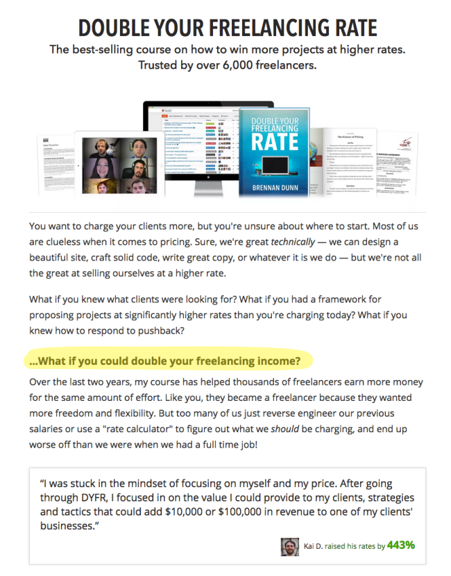
Click here to open the full page
Today we’re going to be looking at the landing page for Brennan Dunn’s Double Your Freelancing Rate.
It’s a fairly highly priced info product with a lot of great copy on the landing page.
Let’s check out what we can learn.
1. Keep Your Headline simple
“Double Your Freelancing Rate” seems like a very simple headline, and in a way, it is.
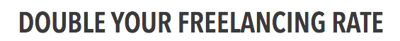
It doesn’t try to be funny. It doesn’t try to be clever. It doesn’t try to be mysterious, or anything of the kind.
What it does is exactly what John Caples used as the definition of a good advertisment:
A good advertisement is believable promise to the right audience.
Doubling your rate is a promise. It’s believable because it goes for the smallest possible multiple. He doesn’t promise you’ll 10x your rate. He doesn’t promise you’ll charge $1000/hr. He promises you’ll get to the next step.
He’s also talking to a well defined audience: freelancers.
So in four words, he both selects the audience, and makes a promise that is believable. You can’t ask much more from a headline. It’s really hard to pack more power in fewer words.
2. Clarify Your Headline With A Subhead
Now, what the headline doesn’t do (you can only say so many things in four words) is tell what the product is.
So Brennan goes on and adds a little more detail: it’s a course that will help you win more projects at higher rates.
What he does here is just rephrase the main benefit and clarify it. People can legitimately ask themselves, “Well, how do you suggest I’m going to double my rates?” and here’s the answer: win more projects at higher rates.
NB: Note that it’s generally less important to know what the product is than what its benefit is. People buy things to enjoy the result of using them, not because of the thing in itself. They care far more about doubling their rate than about what will get them there.
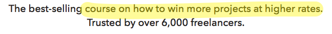
3. Supercharge Your Subhead With Proof
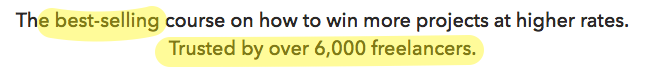
You’ll notice throughout the page that Brennan always follows his claims with proof. Promise. Proof. Promise. Proof.
That way the reader never really gets enough time to start questioning the claims made on the page. Brennan anticipates the next psychological stage of the reader.
Here, the reader gets his serving of proof right after the headline.
Best-selling. Trusted by over 6,000 freelancers.
That kind of proof plays off the “social proof” psychological trigger, and gives the product an aura of authority and respectability that will carry on as the reader moves down the page.
4. Show What Your Product Looks Like
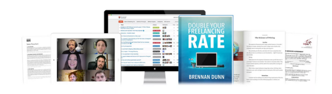
Show what your product looks like, what it looks like in use, or what benefits it can bring.
The number of landing pages that don’t even show what product they’ll selling is staggering.
There are several ways you can illustrate your product. The most common ways to do it are:
- Show the product itself
- Show the product in use
- Show the reward of using the product
Brennan went with the most straight forward here, but the other two approaches are always worth testing.
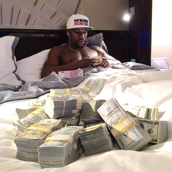
Maybe showing a freelancer in front of his computer listening to the lesson would work better (product in use).
Maybe showing a freelancer with a pile of cash would work better (reward of using the product).
Maybe it’s just a lot more tacky.
5. Make Your Page More Digestible By Breaking It Down In Chunks
People tend not to like reading very long unformatted text on the internet, so it’s essential to break down your text in chunks.
Here are 6 techniques you can use to do that on your landing pages.
Use Subheads
Use at least one subhead for each screen
A good rule of thumb is that it should be impossible to see a full screen height without a subhead. If it were printed, you’d want to have at the very least 1 subhead per page. Probably 2 or 3.
Brennan’s page has 15+ subheads (depending on what you consider a subhead — the page has 22 subheads if you include H3’s and the titles of the components of the course).
You should also introduce your first subhead early. After no more than two paragraphs.
Brennan’s first paragraphs are actually on the longer side here, and long sales pages usually have much shorter “leads”.
Put Important Content In Boxes
Want people to look at something in particular? Put it in a Johnson Box.
Benefits, bullets, testimonials, psychological triggers, anything you want to emphasize for maximum impact.
With a simple design element like boxes you can grab back the inattentive reader’s attention.
Make Lists of Bullet Points
Just like with boxes, people are naturally drawn to lists. You get bonus points if you make them a little bit less boring design-wise. Take a look at these bullets :
No boring Word-like “dots” for bullets. And you don’t need to be a color theory nerd to know what the color green means, right?
Emphasize Breaks Between Sections with Different Background Colors
Make parts of your page jump out by breaking the monotony.
Most of Brennan’s page is white (which is better for reading long pieces of text), but when he comes to his offer section, he switches to a darker background.
Include Images
Although classic sales letters used to be pure text, it doesn’t mean graphics can’t add a nice touch. Try to mix it up, photos, illustrations, product shots, etc.
Use Bold Type, Highlight Important Text
Simply bolding or highlighting text can be a good way to draw attention to important parts of your presentation.
Be careful not to overdo it.
6. Ask “What If” Questions
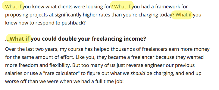
Marketers and copywriters are lazy people. (Aren’t we all?).
So what if… instead of working hard to convince people their products are good, they had people convince themselves?
“What if” questions are probably the ones that help do that the best.
When you ask someone “what if you could achieve this outcome”, they start picturing themselves like they’re already there. That little mind trick is very potent, and Brennan uses it repeatedly throughout the page.
7. Make Your Testimonials Matter
Although most people get that they need to put testimonials on their page, they often screw up badly.
The names sound fake. There are no pictures. No mention of who exactly is talking. The design doesn’t elevate the testimonial. And the text itself is often little more than vague praise
“Zomg product is so GREAT!” — John Smith
That’s not gonna cut it.
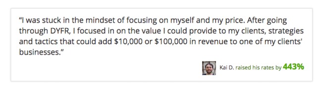
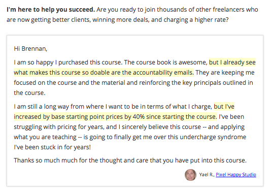
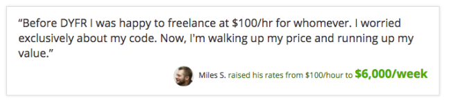
Now take a look at this baby:
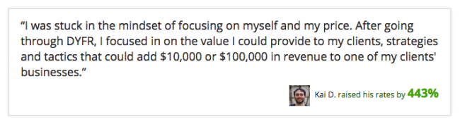
- The testimonial is emphasized by putting it in a Johnson box
- There’s a picture of the author
- There’s the name of the author (why hide the last name?)
- The testimonial highlights something precise about the product, citing precise dollar amounts
- There’s even an added element of proof with the rate augmentation percentage, nicely highlighted with color, which also repeats the main benefit of the product
That’s what you need to aim for. Even better if you can repeat it several times. Check this one out, with a slight variation:
8. Make The Reader Feel The Benefits
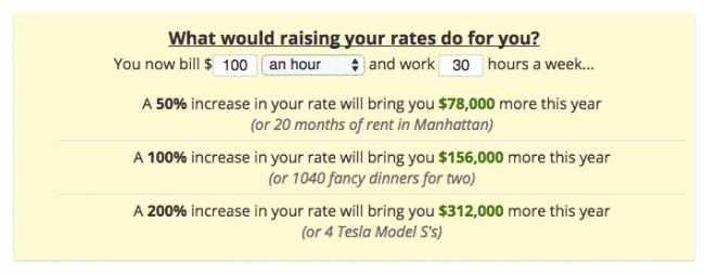
Probably my favorite thing on this landing page is this stupid little calculator.
At least that’s what you’d think it is if you were naturally hostile to good ol’ sales pages.
It builds up on the previous tactic of “what if” questions. What if you could raise your rates by an amount X?
Well, here’s what would happen.
It works as a sort of counterpart to the technique of “price trivialization”.
Price trivialization tries to make the price of your product look low by comparing it to trifles you spend money on.
Here the goal is to make the value of the product look high by comparing it to very valuable things you wish you could buy.
Notice the attention to detail: Brennan knows that his audience is mostly made up of sophisticated techies. So he makes a comparison with gizmos that sophisticated techies love: Macbook Pros, Tesla Model S’s, Toyota Prius’s, rent in Manhattan, flights to Europe.
Now they just CAN’T HELP but see themselves playing with all the new toys they’re going to be able to buy… IF they buy Brennan’s product.
9. Talk About Benefits… But Don’t Forget The Features
Probably the most often repeated piece of advice from copywriters: talk about the benefits, not the features. That’s a little simplistic.
Your reader will still want to know exactly what he’s buying. That’s what features are for.
Here, the main benefit of the product has already been made fairly clear: you’re going to double your freelancing rate.
So Brennan actually starts by describing the features of his product :

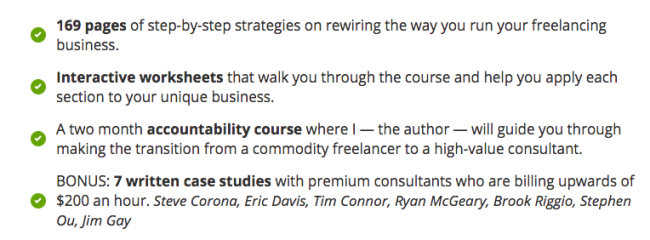
169 pages. Worksheets. 7 case studies. 14 videos.
This is a description of the things the product contains, but not of the actual benefits. The real benefit here is that the product contains everything you need.
Note that it’s quite unlike traditional sales letters to present features before benefits, so maybe that’s something you want to test.
10. Use Future Casting
After presenting the product, Brennan uses a tactic called future casting. Here he is essentially asking: What are you going to miss if you don’t buy the product now?
It plays on the natural human tendency for loss aversion. When people start reading about opportunities they’re missing, they feel compelled to act to prevent that from happening.
Am I going to be charging the same measly rate in two weeks when I could be charging twice as much? Hell no.
11. Show Them What It’s Going To Be Like After They’ve Bought The Product
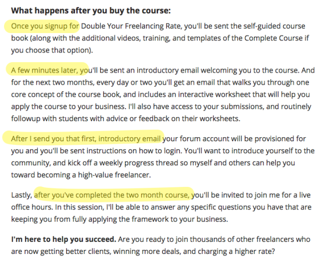
People who buy courses expect a little bit of hand-holding.
They don’t want to just buy a course, set it aside and never get to experience the benefits.
That’s why you want to tell them how things are going to play out once they’ve got the product. It removes risk for the buyer.
That also means that when they read this, people will imagine themselves having bought the product.
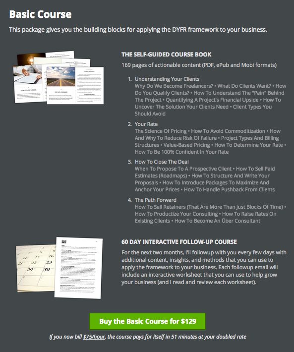
12. Break Down Your Product In Excruciating Details
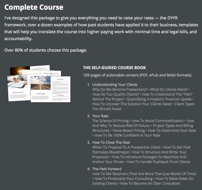
More than a third of the page is dedicated to describing the product details and the offer.
It doesn’t just say you’ll get “a book.”
It gives you:
- An illustration of the book
- The title of the book
- The length of the book
- The formats in which the book is available
- The titles for the main parts of the book
- The titles for all the chapters of the book
And look at those titles more closely.
How do you qualify clients? How to understand the pain behind the project? How to uncover the solution your clients need?
They answer all the questions freelancers ask themselves.
They’re the benefits of the book. They’re typically what you’d find in benefits bullet points.
So if you’re writing a book for a course, think about your chapter titles.
Of course, he does the same thing for other components of the product:
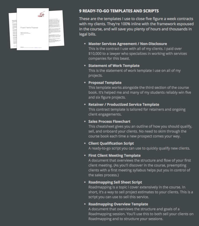
The introductory paragraph is full of benefits: the templates are battle tested by Brennan, they will save you time and money.
And each single template gets its own title and description with additional benefits.
13. Don’t Ask If, Ask Which
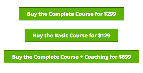
This is a common sales technique that has made its way onto the web.
You don’t want to make an offer where the alternative is buy or don’t buy. You want to offer options.
Don’t ask IF they want to buy, ask WHICH one of the options they want.
Here Brennan offers three variations on his product.
There are two reasons you want to do that:
- Psychology: as stated above, you want to create a mental context where the reader isn’t thinking about whether to buy or not, but whether to buy one option or another.
- Economics: if you only have one price, you’re leaving money on the table for buyers who would have spent more for your product. Inversely, you’re not getting sales from people who can’t afford your product if it’s too expensive. If you have several price points, you can capture more of that value.
Pricing is far too technical a topic to really delve in it here, but just note that the product roughly follows a 1x 2x 5x pricing scale that is common in info products.
14. Trivialize Price
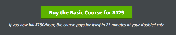
Price trivialization is a classic tactic usually comparing the cost of the product to the cost of guilty pleasures, or things people generally consider cheap (e.g. Starbucks lattes).
What’s interesting here is how it creates a consistency with what comes before on the page.
It reinforces the idea in the reader’s mind that he’s going to double his rate by assuming that benefit will come true.
And then it links it to the cost of the product by translating the product cost in terms of time to break even using the doubled rate.
Oh, that course will cost me 25 minutes of work? TAKE MY MONEY.
15. Answer All Objections
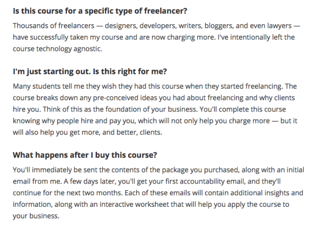
Few people are going to whip out their wallet and buy a high ticket item like this course without thinking about it for a little while.
That’s why you want to put an FAQ of some kinda to answer objections.
An FAQ is a straightforward way to cover the most common objections, and also to include more proof. Look at the first answer: “Thousands of freelancers have successfully taken my course and are now charging more.”
Don’t forget the FAQ is not the troubleshooting section of your page. It’s meant to sell. Just like the rest.
You can also add new answers easily based on the feedback you get from clients and would be clients (try asking your clients “What almost made you not buy the product?”).
16. Give A Guarantee
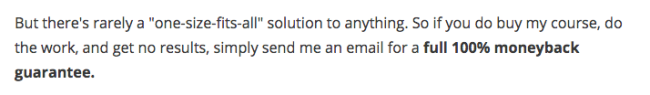
Guarantees are pretty much a must-have for a product at that price.
It’s quite understated on this page. You might want to make your guarantee more obvious.
17. Give The Reader A Feel For The Product
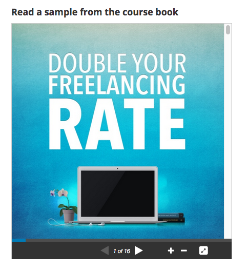
This one is a classic tactic: give out a sample.
When you give someone something for free, they feel like they have to give back. This is what Cialdini calls “reciprocity”.
If you give them a free chapter of your book, they’ll feel like buying the whole thing a little more.
Also, don’t forget that people who come to that page probably aren’t hearing about Brennan for the first time.
Often they’re people who have read many of his blog posts (for free), or received valuable information through his newsletter (for free).
They’ve already received a lot of stuff for free, so they’re all the more ready to give back.
18. Who Are You Again?
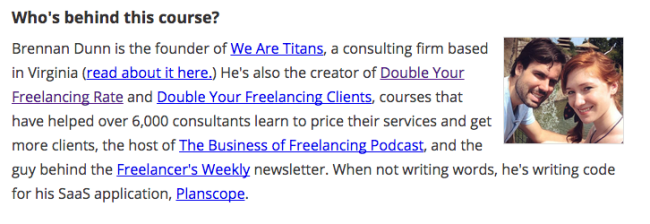
Brennan signs off with a little presentation of who he is, with some proof elements embedded here.
I’m not too crazy about this piece coming at the end. There are too many outbound links and it kind of falls flat instead of ending with a bang.
There are many ways it could be made stronger using classic tools for closing: repeated offer with CTA, a P.S., a time-limited bonus, etc. They’re probably worth a try.
