How Noah Kagan Gets tons of Signups on His Email Course
12 ways to improve your drip campaign landing page
All right guys, today’s tear down is for Noah Kagan’s Email 1k a.k.a Double Your Email List program.
It’s a pretty short page but there’s still a few interesting nuggets to learn from.
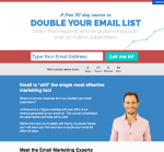
As usual, you can click on the thumbnail on the left to get a screenshot of the whole landing page.
Let's go.
1. Start With A Clear, Believable Promise

There’s a few things you can swipe from the get go.
Noah tends not to beat around the bush too much, and just starts with a clear promise in the headline : Double your email list.
There’s no possible ambiguity. The emphasis is on clarity.
He’s not going for an Upworthy-ish title like “What you’ll learn in this email sequence will BLOW YOUR MIND.”
Why?
Because curiosity and attention aren’t the main focus here.
He’s advertising mostly to people who already know him, and also who already know the value of doubling your email list.
That’s why he doesn’t spend too much time explaining the benefit. And that’s why targeting the right people is important.
Promise headlines like that are some of the easiest and clearest to write. A pretty safe bet when you suck at writing headlines. Just tell me what benefit your product is going to give me.
The promise is also believable. It’s aimed at people with moderately sized lists. If they’d claimed “Add 10,000 Subscribers To Your List”, it would have seemed harder to believe.
2. Use "Magic" Power Words
Let's look a little bit closer at the pre-headline here:

Free is probably the most potent marketing word along with a few others like you (present in the headline as YOUR), new, imagine, or because.
If you’re offering something for free, make sure people know about it.
3. Make Your Product Look As Good As You Can
There’s something interesting about the spin that Noah gives to the course by calling it a 30 day course.
If you look toward the bottom of the page, you’ll notice that the course is composed of 6 emails spread over 30 days.
Now, which one sounds better:
- A free 30 day course
- A free 6 email course
Kind of a no brainer, right?
“Oh, he’s just going to send me 6 blog posts by email, meh.”
vs.
“Nope, it’s 30 DAYS COURSE! A WHOLE MONTH OF VALUABLE INFORMATION!”
The “30 day” angle stresses the duration. It extends the value of the product in time, and it increases the power of the claim.
The course could also have been dripped at one email/week and be called a “6 week course”.
4. Show Your Street Cred

Authority is one of the 6 weapons of influence.
People tend to be swayed by experts as they’re natural figures of authority.
5. Ask For Action

Probably the single biggest mistake you can make on a landing page is not having a call to action.
I see it all the time, even on the most expertly "designed" landing pages.
People spend a lot of money showing their product with fancy design shit like parallax scrolling and animations, videos that cost a fortune to produce and they don’t ask for anything.
Why are you building a page for if you’re not asking for anything? It’s just pointless.
Now, let’s look at Noah’s form here.
One thing you should know is that UX specialists think in-line form labels are a bad idea. What happens is people start filling in the form and they forget exactly what box they’re in. It’s better to have the label right on top of the field.
That being said, it’s more of a problem for long forms. Here there’s just one field so people are unlikely to forget they were typing their email.
“Let me in!” as call to action text plays on the sense of exclusivity, which is reinforced by the urgency of the countdown below (see next point).
Another way to write the CTA text would be to repeat the main benefit (“Double my email list!”), or to introduce the outcome of the action (“Send me my lessons!”).
6. Create Urgency

If you not only want people to act, but to act now (which you do), you probably want to give them a reason to.
Countdowns are a classic technique to create urgency and force people to make a decision.
Now, I’m not sure this execution is the best I’ve ever seen: the first time I came across the page, I thought it meant I had to wait until the end of the countdown to be able to sign up.
Not so.
But I’m sure many people thought the same thing and didn’t bother trying to sign up.
Why not just say, “Next course starts soon. Sign up now!” It would have seemed clearer to me.
7. Create More Desire For Your Product
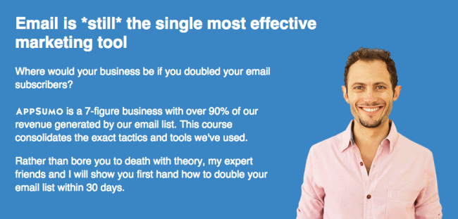
Even though people have already had the opportunity to sign up just based on the headline and subheadline, not everybody is yet convinced.
We get to the heart of the AIDA formula, where after getting attention, we must create interest and desire for the product in the body copy.
Now, I have to say I’m not crazy about this subheadline.
It states a fact, which is interesting to people who don’t know much about email marketing, but as we’ve mentioned earlier, people here are already quite sold on the idea.
The fact it’s a simple statement means it create very little momentum.
If I were to run a test on the page, I’d try using the question as a title here.
Where would your business be if you doubled your email subscribers?
Now THAT’s a question that makes me want to read on.
Questions like that are helpful to make the reader picture himself using the product and enjoying its benefits.
Once he starts doing that, it’s not the landing page that is trying to persuade him. He’s trying to persuade himself.
It’s an age-old technique called “future casting”: try to make the reader see himself in the future, using your product. Once he accepts that’s what his future is going to look like, with all its benefits, buying the product becomes the logical choice.
You could stress that technique a little bit more if you added something like:
Just imagine: Where would you business be if you doubled your email subscribers?
With a question like that, you can start painting a much more persuasive picture by adding more questions.
What if you doubled the number of leads? What if you doubled your conversions (and our experts will show you how to optimize your emails to boost your conversions — one of them got a 258% lift!).
You get the point.
8. Prove Your Point
Just like we saw earlier, you have to support your claims with proof. Here Noah leverages his experience with APPSUMO to show that he knows what he’s talking about.
Now, the proof here assumes that people know who Noah is and what Appsumo is.
It’s probably a fair assumption for the majority of the traffic sent to the page, but it may be worth testing.
9. Bring In The Experts
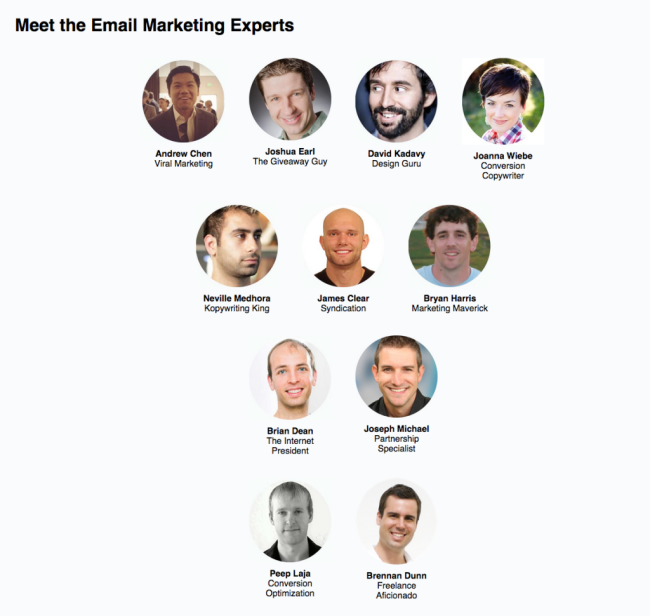
More experts can never hurt to support your own personal expertise.
But again, maybe people don’t know who half of them are (I like to think of myself a somewhat internet marketing savvy, and I didn’t know some of them).
So maybe the page could use a little more detail on who the experts are, what their credentials are, and what they’re going to teach.
If you go through the effort of assembling such an all star team for you content, you want to make sure people know how much value they're getting.
10. Throw In A Bunch Of Bonuses, Put A Price Tag On Them
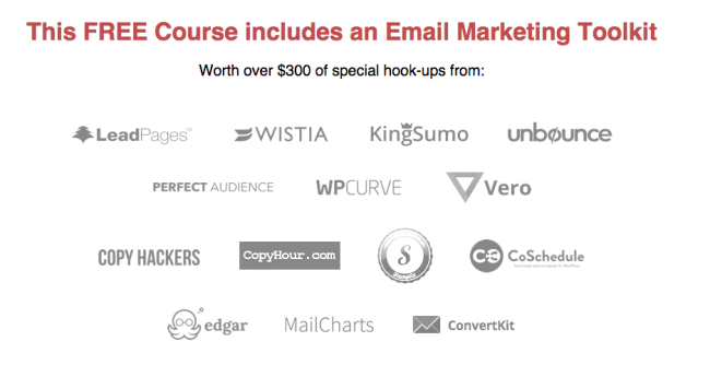
We’re now entering the closing section of the landing page.
In traditional direct marketing fashion, Noah throws in a bunch of bonuses.
The interesting part here is how he puts a price tag on them: $300.
So we’ve got a FREE newsletter that’s actually worth THREE HUNDRED DOLLARS.
That’s right.
Now, the bonuses could use a little bit more details too. Specificity is always appreciated. Here it may just sound like you’re going to get some random stuff from a bunch of companies you may not know.
If you knew you were going to get free ebooks, free trials for usually expensive software, and how they’re going to help you, you’d see a lot more value.
11. Summarize Your Offer

In this section, Noah breaks down what’s included in the course.
In classic sales letters, you often see some kind of “recap” before the final call to action, where everything included in the product is listed.
Here you get a breakdown of what each lesson is going to be able, but it could be a lot more detailed.
Why not describe the contents of each lesson with a couple of teasing bullet points, and put each expert in the right place?
Lesson 1: Optimizing your homepage
How to avoid the 13 most terrible mistakes that will tank your conversions
Peep Laja will set you up with the right tips to build a home page that will magically convert right away
The point is not to make it unnecessarily hype-y, but to describe exactly what the reader can expect.
12. Repeat Your Call To Action
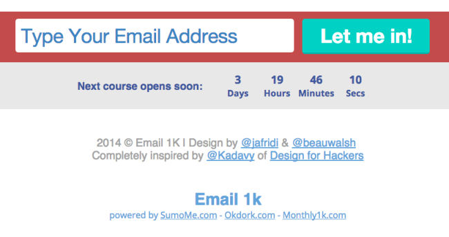
If you’re at the bottom of the page and people have finally decided to sign up or buy your product, you don’t want to have them need to scroll all the way back to the top.
You have to keep building on the momentum of the sale and close it ASAP.
Here the sign up form is the same as the one we saw above, so there’s nothing much to add
