how neil patel sells his consulting services
15 ideas to improve your own consulting offer
Click here to open the full landing page
Today we’re looking at a sales page for a consulting service by none other than Neil Patel, probably one of the most well-known digital marketers around.
He runs the QuickSprout blog, and he cofounded KISSMetrics and CrazyEgg. Needless to say, with a varied background like that, he knows a LOT about marketing and selling on the internet.
Let’s see what we can learn from his landing page.
1. You can always use a little bit of branding

The first thing you notice about this landing page is that there’s a whole lotta orange. That’s not by accident. It’s branding.
Branding is a complete topic of its own that goes waaaay beyond just color, but it doesn’t take much work to make the first step.
One of the most commonly repeated branding trop is that you should (try to) own a color. That means the simple sight of a given color should remind the reader of who you are.
How do you go about owning a color?
There’s a few principles you should follow:
a) Make sure nobody’s using it. Better yet, make sure nobody’s using it in your market. Neil Patel doesn’t own orange (Home Depot and Orange have a better claim to the title), but how many internet marketers use it?
In his 22 Immutable Laws of Branding, Al Ries even dedicates a law to that question, aptly named the Law of Color, which goes even further.
A brand should use a color that is the opposite of its major competitor’s.
Not a hard and fast rule, but you still probably want to use something different from your competitors.
b) Your color doesn’t have to be a super sexy color. Take a look at UPS, for example. Their brand color is called Pullman brown, or UPS brown. It was picked because it’s easier to keep UPS trucks clean than if they were painted yellow (as UPS founders originally intended).

Who would have thought brown could be a cool color?

PostIt yellow may not be the most exciting color, but it’s instantly recognizable.
c) What can separate your color from others and make it more memorable is picking a more distinctive, uncommon shade. Nobody really owns “blue” as a color, but Tiffany’s owns the instantly recognizable Tiffany Blue.

Boring, run-of-the-mill blue.

Tiffany blue.
d) Finally, you don’t have to pick A color. You could pick a palette of colors. Think of pre-rebrand AirBnB, or FourSquare, or John Deere.
Just make sure you pick something distinctive, that you like, and use it consistently, putting it front and center. Ironically, Neil used to use green pretty much everywhere, but decided to switch to orange. Why?
How to pick a color for your brand
Picking a color for your brand is probably not something you can do in five minutes, but here are a few helpful tools you can use:
- Check out what your competition is using or find inspiration from other markets using BrandColors
- Use Adobe Color, ColourLOVERS or Paletteon to pick & fine tune color schemes and palettes easily
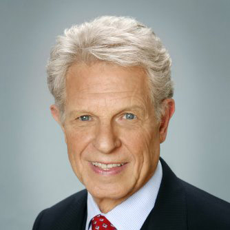
2. Make your headline stronger by appealing to the senses
On the face of it, a consulting service is probably one of the most boring service to advertise. Every consultant’s value proposition will revolve around the idea of making more money for your business.
That means you need to be a little more creative when you describe what you do. “Increase your profits” is a clear and nice value proposition, but it’s a little bland, obvious, and undifferentiated.
Neil gives it a more interesting twist: he will open the floodgates. That’s a much more evocative expression than “increase your profits”. Or “I’m going to substantially increase your traffic.” Bo-ring.
As it turns out, sensory language is also more persuasive than language that does not engage our senses like the usual businessy managerese you see everywhere.
Now, don’t jump on the thesaurus to use the longest or most hype-y word you can find.
Being clear is more important than sounding smart. But if you can find a synonym that has a sensory appeal and keeps your message clear, maybe it’s worth trying.
Where can I find more evocative words and expressions?
- The simplest (and cheapest!) way to go is to run some of your copy through the Idioms and Phrases dictionary. With a bit of research you should find expressions that fit your needs.
- If you're looking for more punchy alternatives to your boring adjectives, there's a series of books called Words that Sell, Phrases that Sell, etc. I'm not crazy about those books, but some people swear by them.
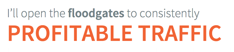
3. Explain what you do visually
Even the most narrow-minded copywriter recognizes the value of a good visual presentation.
It makes all the more of a difference when your competition is weak in that department.
Typical consulting business imagery tends to involve clichés like people in suits shaking hands and smiling in conference rooms. Boring as hell.
Up and to the right charts aren’t super sexy either, but Neil does a good job here by weaving in a case study with a famous client, with figures that speak for themselves. 6 months. 5 million increase in traffic. Boom.
You can find examples of well designed landing pages on Land Book. But careful, there's a lot more to a good landing page than good design.
4. Grab attention with controversy
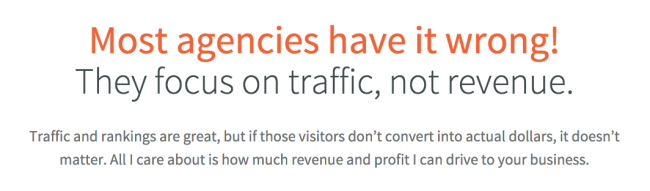
People love some controversy.
This is a typical "Us vs. Them" strategy that attempts to make the reader side with Neil.
It’s used very often in sales letters, often in more extravagant terms (“Why [Industry X] has been lying to you for years”).
The following arguments in the subhead are logical and crystal clear, which helps create credibility.
There's something interesting here though... Notice how the controversy is entirely manufactured?
Only bottom of the barrel marketers don’t understand what Neil is explaining here. But presenting it as a controversial point can cast you in a more favorable light, as more honest and more informed than everybody else.
5. Show me you're a real human being
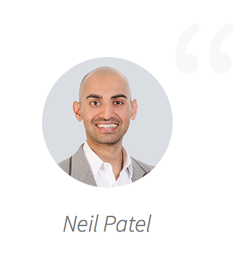
Consulting is a relationship business. Businesses who look for consultants to advise them on important questions expect they will come to know them in person at some point.
The least you can do is have a picture of who your client is going to be talking to.
Having a mug shot is kind of a must have if you want people to take you seriously at all.

Neil Patel is so cool he not only shows his face, but he also shows some of his wardrobe!
You don't have to get all fancy about it though, depending on what you're selling.
But if you're a freelance photographer, you'd better have a decent headshot.
6. Find the right appeal
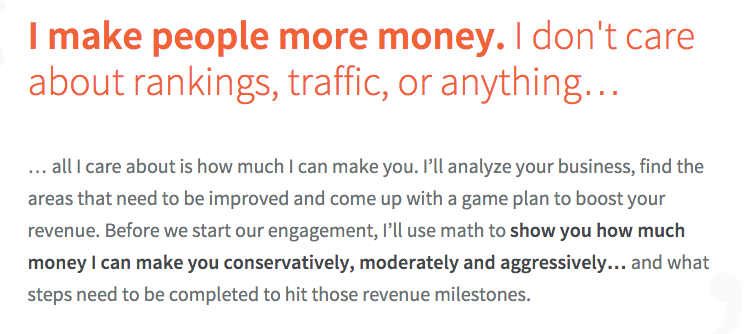
People are moved by emotions more than reason. And what emotion will drive businesses to hire someone to make them more money? Greed.
Pure, unadulterated, Gordon Gekko-esque greed. One of the most potent forces you can muster along with sex and fear.
That's the main appeal here.
Some people will think it's tacky to say "I make people more money", but guess what? That's EXACTLY what businesses are looking for. They're not looking for "consulting" and "strategy". They're looking for more money.
Not some guy who creates PowerPoint presentations that don't go anywhere, talking about nerdy digital marketing stuff, or write 300 page reports that no one reads.
When you know the main appeal or emotion you need to play on, you can use it as a backbone for the whole page.
7. Create a sense of exclusivity

Creating exclusivity or scarcity is nothing new in internet marketing, but the difference between slapping a random tactic on a webpage and doing it like a pro lies in the details
We know people value what is scarce and what is hard to access. They also value what is secret and mysterious.
Notice the language here: "confidential" is probably not the first word you would think of to describe a consultation. That's part of what makes it so enticing.
Subtle things like "Reserve Neil Now" as a call to action also reinforce the scarcity aspect.
We will see later on how Neil doubles down on this very tactic.
8. Leverage your experience
It's customary for landing pages to include elements of social proof like testimonials, but it's particularly important for a consultant who lives or dies based on reputation.
When you’ve worked with household names like Microsoft, GM, NBC or ebay, you’d have to be an idiot not to mention it.
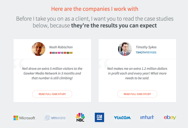
The copy is super simple and straightforward.
The testimonials don't blabber on and on about irrelevant stuff. You just get the essentials, which reinforces the main message of the page: Neil is all about getting big results, fast.
That also speaks to another important element of copywriting: specificity. If you have numbers, give the numbers. 5 million additional visitors. 1.2 million dollars in profit. It's not just to boast, it shows you're not bullshitting.
9. Reinforce your reader's commitment
The question that comes next is not there just to grab the visitor's attention.
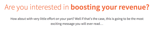
This one plays on the classic commitment and consistency principle. When people are committed to something verbally, they're likelier to engage in further actions that are consistent with their original commitment.
What that means here is that after Neil asks people if they're interested in boosting their revenue, they'll think "Of course I am!"... which makes them that much likely to hire someone who offers to deliver just that.
Saying no to someone offering to boost your revenue would break your original commitment, and people don't like to do that.
Robert Cialdini's 6 Weapons of Influence
Commitment and consistency are only one of the 6 weapons of influence originally outlined by Robert Cialdini in his classic book, Influence: The Psychology of Persuasion.
Many articles have been written over the years about ways you can apply those techniques on your landing pages, and here are some of the best ones :
- How to Use Cialdini’s 6 Principles of Persuasion to Boost Conversions on ConversionXL
- How to Use the 6 Principles of Persuasion to Create Landing Pages That Convert on Unbounce
You can see that technique used in some of my other tear downs, here and here.
10. Show your credentials
By this point, Neil's already shown what he's all about and proved he gets results by linking to two prominent case studies.
But more proof cannot hurt.
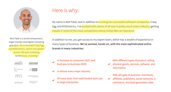
Take a look at this tiny section, and look at all the stuff you can find:
- Shows there's a real person behind the site with a new picture
- Shows relevant experience in founding and running well-known web companies
- Shows relevant experience with a wide array of types of clients
- Shows relevant experience working in difficult conditions
- Positions himself as a thought leader in the marketing space, has spoken at 100 conferences
- Adds logos to reinforce credibility
- Makes the content more easy to skim using bullet points
Not bad for such a small piece of real estate.
11. Use the classic "it's not for your" technique
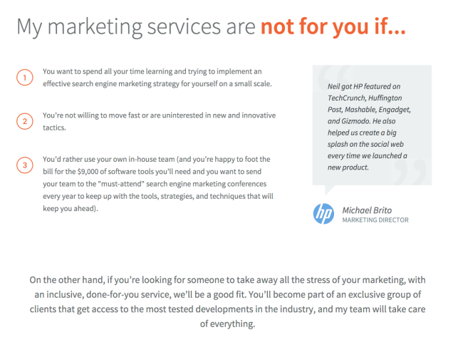
Don't be mistaken, this part is NOT meant to put people off. Sure, it teases and challenges the reader a little bit. "It's not for me? Who do you think you are!" But that's not really the point.
Every part of a sales page like this is meant to sell.
The general principle behind this technique is to say "This product is not for you if... you want these stupid things". People don't want them, ergo it means the product is for them.
Look at it more closely:
You want to spend all your time learning and trying to implement an effective search engine marketing strategy for yourself on a small scale
Translation: it's going to take you months of learning to implement something that probably won't work, and if it does, the results will still be tiny.
You’re not willing to move fast or are uninterested in new and innovative tactics.
Duh? Of course I am interested in moving fast and being innovative, who isn’t?
You’d rather use your own in-house team (and you’re happy to foot the bill for the $9,000 of software tools you’ll need and you want to send your team to the “must-attend” search engine marketing conferences every year to keep up with the tools, strategies, and techniques that will keep you ahead).
Again, nobody wants to pay an arm and a leg for software or engage in something that will take years to develop. They want results now. Which, conveniently, is exactly what Neil proposes!
12. Make it as easy as possible to contact you
Lots of people are reluctant to explain the simplest things in detail.
"Come on, people aren't dumb!" they say. "They'll understand"
Sure. Be my guest. But if 2 lines of text can make absolutely certain they will get it, why not just write them?
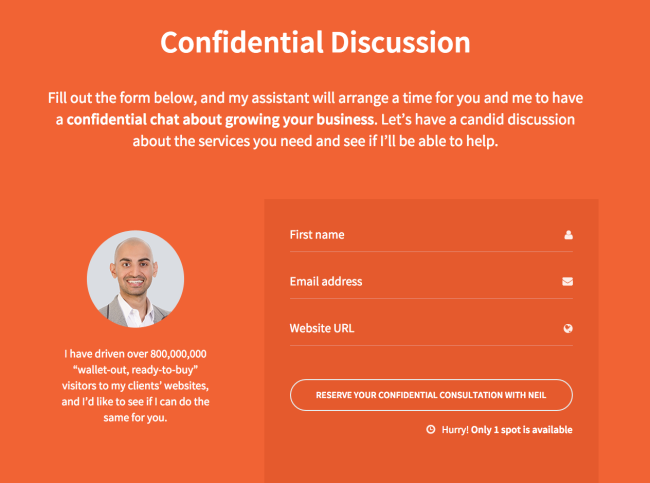
Maybe you don't need to tell people to fill out the form, but what does it cost you?
The other thing you want to look out for is not to ask for data you don't need. People don't like to fill out huge forms, so it's better to keep it down to the basics.
The use of in line labels is a contentious point among usability specialists, so you might want to avoid them.
13. Create urgency… AND JUSTIFY IT

If you looked at the previous screen shot closely enough, you've probably noticed this little detail.
There's nothing spectacular about it — it's a classic way to create urgency and making the visitor act NOW by limiting the supply.
The problem with this tactic is that it's often a little bit transparent, and people can be a bit suspicious about the reality of the claim.
That's why you need to JUSTIFY or explain why the supply is limited.
That's what Neil does next:
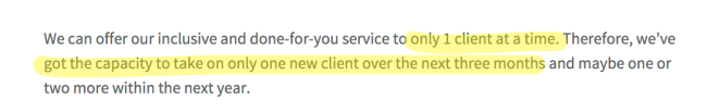
Now it sounds a lot more believable.
14. Sign your letter the old school way
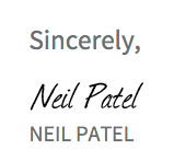
This is kind of an old trick you see in long form sales letters, but it can give an nice touch of authenticity, and it's particularly relevant for a one-on-one business like consulting.
15. Use a P.S., your last chance to get their attention
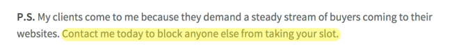
That's another one straight from the book of classic sales letters.
Using a postscript may seem a little dated, but people always read them, so they're a good occasion to repeat your message once more, or insist on the urgency, as Neil does here.
